
Designing More Efficient Forms: Structure, Inputs, Labels and Actions
by Nick Babich
People who use your app or site have a particular goal. Often the one thing that is standing between the user and his goal is a form. Forms are one of the most important type of interaction for users on the web and in the apps. In many cases, forms are often considered to be the final step of the journey to the completion of goals and users should be able to complete forms quickly and without confusion.
In this article, you’ll see practical guidelines that have been crafted from usability testing, field testing, eye tracking and actual complaints made by disgruntled users.
The Components Of Forms
The typical form has following five components:
- Structure. Order of fields and logical connections between individual fields.
- Input fields. Different types of input fields including text fields, password fields, check boxes, radio buttons, sliders.
- Field labels. Labels describe the meaning of input fields.
- Action buttons. When user presses the button, the action is performed (such as submitting the data).
- Feedback. Visual or (and) audio feedback that helps users understand the result of operation. Most apps or sites use messages as a form of visual feedback. Messages notify the user about result, they can be positive (indicating that the form was submitted successfully) or negative (indicating that the data provided by a user required modification).
Forms could also have following components:
- Assistance. Any help that explans how to fill out the form.
- Validation. Automatic check that ensures that user’s data is valid.
This article covers many aspects related to the structure, input fields, labels and action buttons.
Form Structure
A form is a conversation between a user and a system. The conversation should be clear and logical.
Only Ask What’s Required
Make sure you only ask what you really need. Every extra field you add to a form will affect its conversion rate. Typically, the more data you ask your users to provide the less chances that users will do it. That’s why you should always question why and how the information you request from your users is being used.
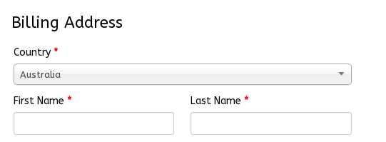
Order the Form Logically
Details in a the form should be asked logically from a user’s perspective, not the application logic. For example, when you ask billing details, it’s unusual to ask for the address before the full name.
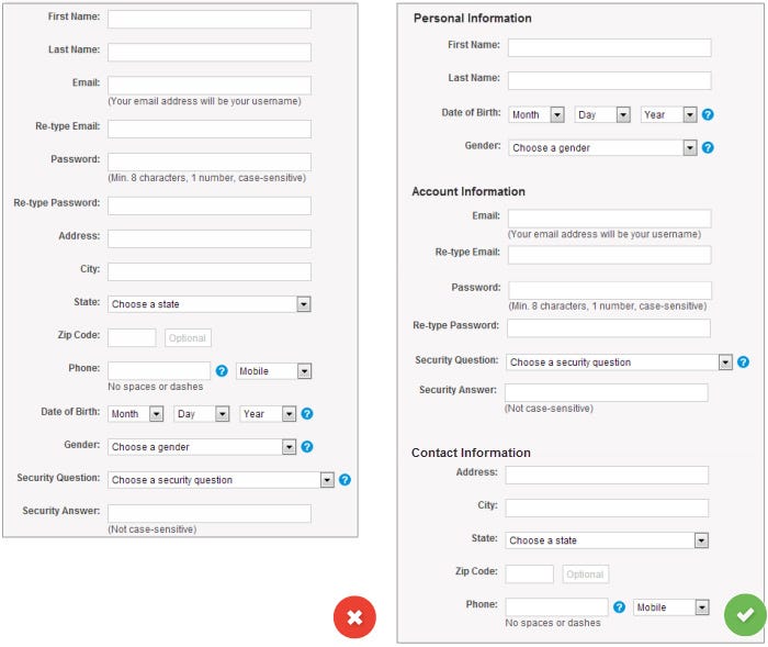
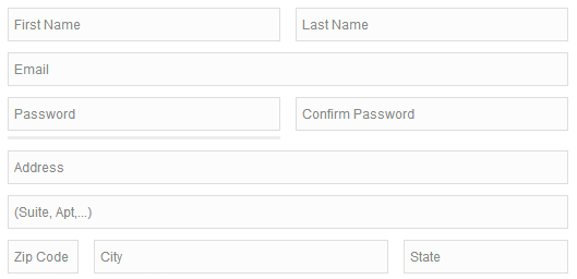
Group Related Information
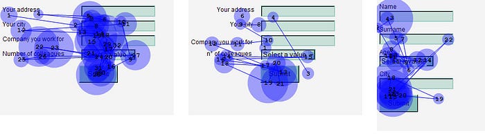
You should group related information in logical blocks or sets. The flow from one set of questions to the next will better resemble a conversation. Grouping related fields together also helps users make sense of the information that they must fill in. Below is an example for Contact Information.
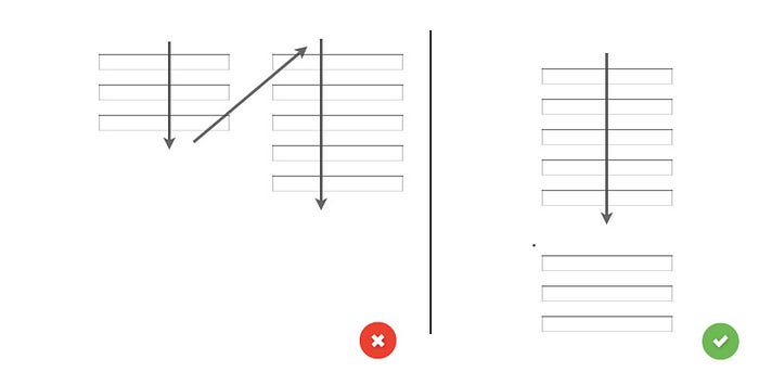
One Column vs. Multiple Columns
Forms should never consist of more than one column. One of the problems with form fields in multiple columns is that your users are likely to interpret the fields inconsistently. The user will scan the form in Z patterns, and this will slow the speed of comprehension and puzzling the clear path to completion. But if a form is in a single column, the path to completion is a straight line down the page.
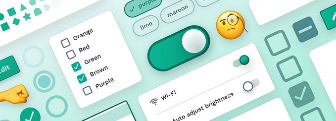
Input Fields
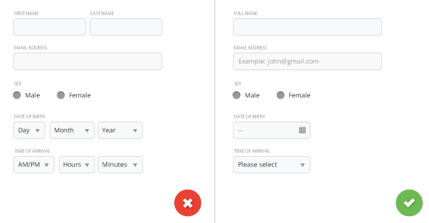
Input fields are what allow your users to fill in your form. Depending on what information you ask, there are various types of fields — text fields, password fields, dropdowns, check boxes, radio buttons, datepickers and others.
Number of Fields
Try to minimize the number of fields as much as possible. This makes your form less loaded, especially when you request a lot of information from your users.
Mandatory vs Optional
Try to avoid optional fields in forms. But if you use them, you should at least clearly distinguish which input fields cannot be left blank by the user. The convention is to use an asterisk (*) or ‘optional’ (which is a preferable for long forms with multiple required fields).

Setting Default Values
You should avoid having a static default unless you believe a large portion of your user’s (e.g. 90%) will select that value. Particularly if it’s a required field. Why? Because you’re likely to introduce errors because people scan forms quickly online — don’t assume they will take the time to parse through all the choices. They simply may skip fields that already has a value.
But smart defaults can make the user’s completion of the form faster and more accurate. For example, pre-select the user’s country based on their geo location data. But still you should use these with caution, because users tend to leave pre-selected fields as they are.
Desktop-only: Make Form Keyboard-friendly
Users should be able to trigger and edit every field using only the keyboard. Power users, who tend to use keyboards heavily, should be able to navigatethe form using Tab and make necessary edits, all without lifting their fingers off the keyboard. You can find detailed requirements for keyboard interaction pattern in W3C’s Authoring Practices for Design Patterns.

Desktop-only: Autofocus for Input Field
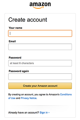
Autofocusing a field gives the users an indication and a starting point to quickly begin to fill out the form. You should provide a clear visual indication that the focus has moved there —such as change color, fade in a box. Amazon registration form has both autofocus and visual notification for the user.
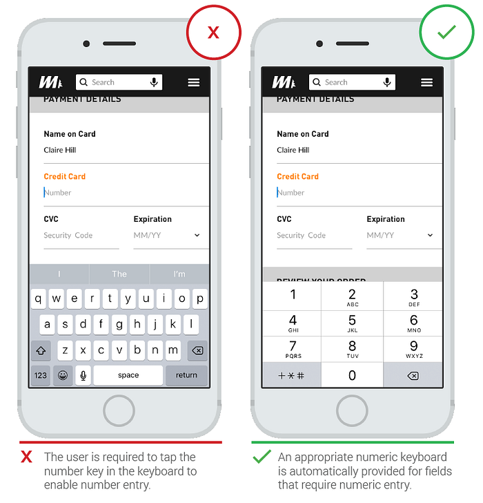
Mobile-only: Match the Keyboard With the Required Text Inputs
Mobile app users appreciate apps that provide an appropriate keyboard for text entry (i.e. numeric keyboard for a field that requires numbers). Ensure that this behavior is implemented consistently throughout the app rather than only for certain tasks but not others.
Labels
Clear label text is one of the primary ways to make UIs more accessible. Labels tell the user the purpose of the field and they should remain visbile even after completing the field.
Number of Words
Labels are not help texts. You should use succinct, short and descriptive labels (a word or two) so users can quickly scan your form. Previous version of the Amazon registration form contained a lot of extra words which resulted in slow completion rates.
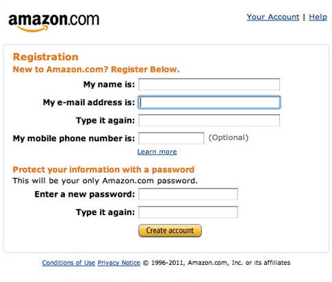
Current version is much better and has short labels.
Sentence Case vs Title Case
Should it be “Full Name” or “Full name”? Sentence case is slightly easier (and thus faster) for reading than title case. But one thing for sure — you should never use all caps, or else the form would be difficult to read and much harder to quickly scan, as there are no differences in character height any more.
Alignment of Labels: Left vs Right Aligned vs Top
Matteo Penzo’s 2006 article on label placement implies that forms are completed faster if the labels are on top of the fields. They are good if you want users to eye-scan the form as fast as possible.
However further research mentioned found no difference between labels above the fields and right-aligned labels.
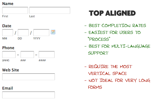
Top aligned labels. The biggest advantage to top-aligned labels — they make it easier for different sized labels and localized versions to fit easier within the UI (this is especially good for mobile screens with a limited estate).
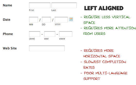
Left-aligned labels. The biggest disadvantage to left-aligned labels is the slowest completion times. This is likely because of the visual distance between the label and input field. The shorter the label, the further away it is from the input. But slow completion rates aren’t always a bad thing, especially if the form requires important data. If you are asking for things like Driver’s License or Social Security Number, you may implicitly want to slow users down a bit and make sure they enter things correctly.
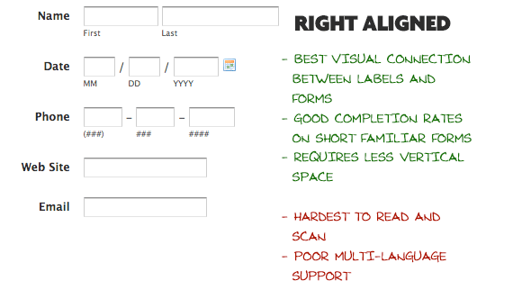
Right-aligned labels. The big advantage to right-aligned labels is the strong visual connection between label and input. Because items near each other appear related. This principle of placing related items closer to each other isn’t new; it’s actually the Law of Proximity from Gestalt psychology. For shorter forms, right-aligned labels can have great completion times. Right-aligned labels disadvantage comes from comfortability. Such form will lack that hard left edge, which makes it less comfortable to look at and harder to read.
Takeaway: If you want users to scan out a form fast, put your labels above each field. This layout is easier to scan as the eyes move straight down the page. However if you want your users to read carefully, put the labels to the left of the fields. This layout is read in a slower down and right (Z shape) motion.
Inline Labels (Placeholder Text)
Placeholder text works great for a simple username and password form.

But it’s a poor replacement for a visual label for forms that contain a lot of fields because inline labels create usability issues. Once the user clicks on the text box, the label disappears and thus the user cannot double check that what he/she has written is indeed what was meant to be written. Another thing is that when users see something written inside a text box, they may assume that it has already been prefilled in and may hence ignore it.
Good solution for the placeholder text is a floating label. The placeholder text is showing by default, but once an input field is tapped and text is entered the placeholder text fades out and a top aligned label animates in.
Action Buttons
When clicked, these buttons trigger an action such as submitting the form.
Do not disable Submit button
When designers disable the Submit button, they make their users scan the entire form to find the problem that doesn’t allow them to submit the data. When the Submit button is not disabled, users can click the button and see an error message that directs them towards that place.
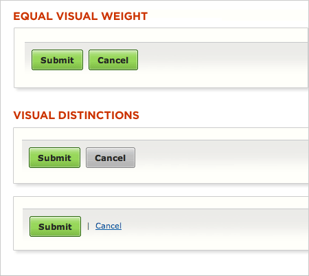
Primary vs Secondary Actions
When the form offers primary and secondary actions that do not have a visual distinction between them, users can easily make incorrect decisions. It’s essential to reduce the visual prominence of secondary actions to minimize the risk of potential errors. Visual weight will direct users towards the ‘right’ (most expected) action.
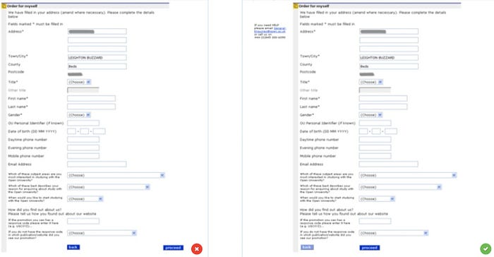
Button Location
Complex forms usually need a back button. If such button is located right below the input fields (like on the first shot) users can accidentally click it. As back button is a secondary action it should be placed out of sight (second form has right location for buttons).
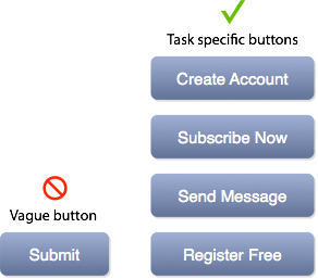
Naming Conventions
Avoid generic words such as “Submit” for actions, because they give the impression that the form itself is generic. Instead state what actions the buttons do when clicked, such as ‘Create my FREE account’ or ‘Send me weekly offers’.
Multiple Action Buttons
Avoid offering more than two action buttons because it might distract users from the goal (submitting the form).
The ‘Reset’ Button Is Pure Evil
Reset button allows users to erase all data in a form. When users don’t know how this button works, click on it and see that all their effort on filling out a form went to drain, it creates a lot of frustration. Thus, Don’t use a ‘reset’ button. This button almost never helps users, but often hurts them.

Visual Appearance
Design action buttons to look like buttons. Style them in a way that they give users a visual hint on what the element does (for example, it’s nice when a button lifts but it indicates that it is possible to click). For more information about the button you can read article Button UX Design: Best Practices, Types and States
Visual Feedback
At the time when the user provided all required data and clicked ‘Submit’ button, it’s extremely important to indicate that the form receives the user feedback. The visual feedback acts as an acknowledgment and prevents the user from clicking the same button again.

Conclusion
Users can be hesitant to fill out forms, so you should make this process as easy as possible. Changes mentioned in this article can significantly increase form usability. Remember that usability testing is simply indispensable in form design. Test early, test often and improve your form design based on the results of testing.
You can read about assistance and validation in article Designing More Efficient Forms: Assistance and Validation
Thank you!
Follow UX Planet: Twitter | Facebook
Originally published at babich.biz
Learn how to design better products
Interactions between computers and humans should be as intuitive as conversations between two humans. Interaction Design Foundation will help you to learn how to design for efficiency and persuasion.


