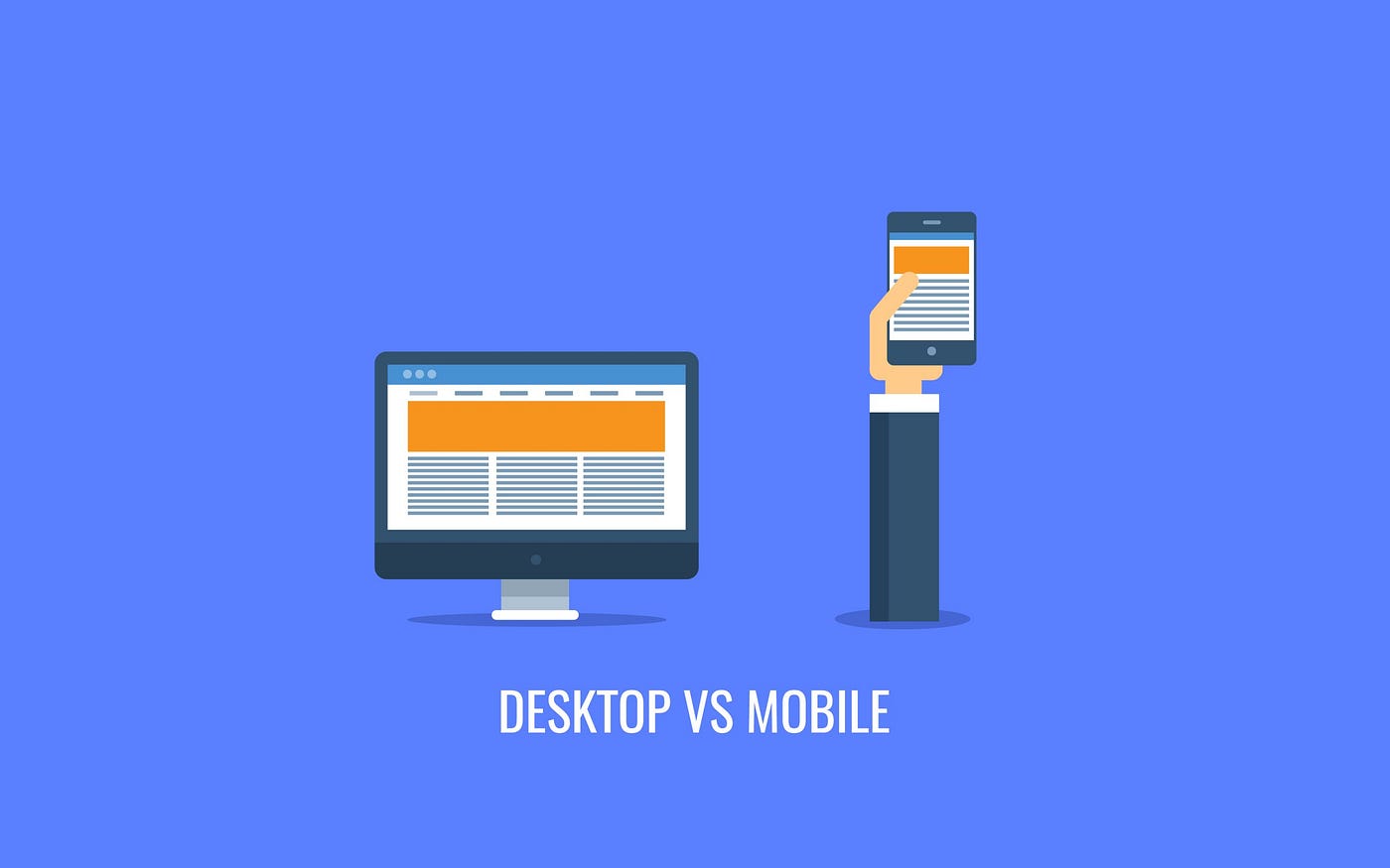
Desktop vs Mobile design: The only RULE you must know!
I have always been surprised by how many design students or boot camp grads focused solely on creating mobile apps for their portfolios. Oftentimes these look like uninspiring copy-paste screens I swore I saw somewhere on Behance.
Sure, Mobile design will always be HOT for the years to come. There are great mock-up resources and inspiration everywhere for mobile designs.
For my readers who follow me closely, I highlight my mobile product designs more often as well. However, designing for a desktop product or feature is extremely common and what many big tech companies are looking for. Even for companies with mobile-focused products, current trends have pushed for a heavy emphasis on cross-platform designs. For my current work at Amazon, and past contract roles at companies like Microsoft, designing for desktops is a skill you need.
So as a refresher for myself and to help those who might have never designed for desktop products get comfortable ASAP, I will share with you the most important rule I have for understanding the similarities and differences between desktop vs mobile.
I will also explain to you in-depth what are the reasons behind these similarities and differences with examples from real products. (So you can easily answer questions from your next client or future interviewer.)
On that note, Fall recruitment is coming up, click here to read my featured article on UX planet if you want to learn more about how to intern at your dream company right now. (Real Examples From Amazon, Google, Apple)

Now back to the topic, here is the number one rule for you below…
Thinking in one-dimension vs two-dimensions
To understand what makes up the overall consistency, design language and user flows of cross-platform designs, you must first familiarize yourself in thinking in one-dimension vs two-dimensions. This is the most imporatnt rule of mastering mobile vs desktop designs.
From a functional point of view, the functions of the desktop and mobile products should be more or less the same, meaning you should be able to do the same things with a desktop and mobile product. Wouldn’t it be weird if you can only shop online with the desktop Amazon website but have to return a package on Amazon’s mobile app? (Yes it would be very weird)
The differences will be at the view level layout and the control level user flows of the interface. (I will define these for you below)
1st Example using our 1#Rule: Visual Level Layout
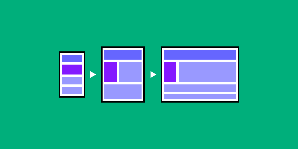
For those only familair with mobile UX designs, In terms of view level layout, the desktop interface can be understood as the splicing multiple interfaces of the mobile interface together.
Take a look at the desktop wireframe example below:
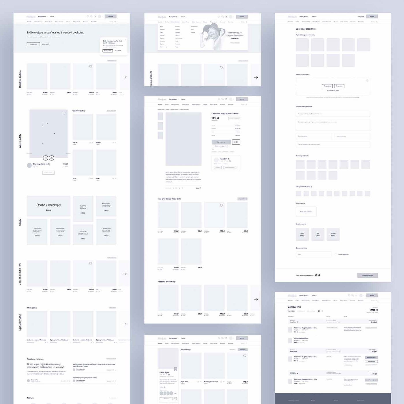
See how when desktop and mobile wireframes are placed side by side, every desktop wireframe seems similar to multiple individual phone screens? That's a great way to think of a desktop visual layout if you have only done design for mobile.
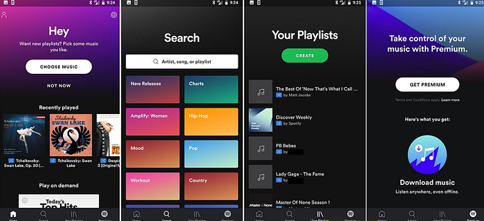
As you can see from the above mobile example, on the interface layout level, the layout of the mobile wireframes is generally one-dimensional. There is only the vertical layout because the screen space is limited. So it doesn't matter what you are designing, the overall layout will be relatively simple and the information will be constrained in “one dimension”
Now, let's take a look back at desktop layouts. Here is an example of Spotify on desktop, a popular mobile app.
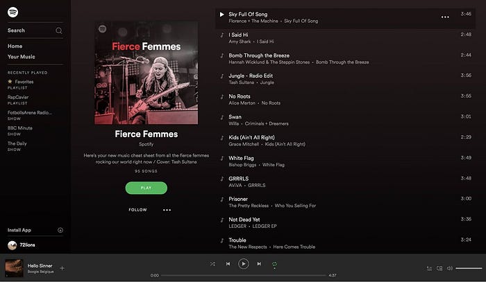
As you can see the desktop layout is generally “two-dimensional”. With the larger screen space, desktops can hold a lot more information. Not only are there vertical dimensions but also horizontal dimensions. Most of the information is spread based on horizontal dimensions (although this is not a strict requirement for most products). For example, the classic “side navigation” on the desktop can directly integrate multiple levels of a mobile interface into one interface (see how Spotify desktop captures multiple mobile screens on one interface?).
So what does this mean for you?
During a project or interview, you must be able to show that you understand the strength of a two-dimensional layout. You should be able to get to places quickly with a click. If your product doesn't have a complex task flow, then maybe you are taking advantage of the two dimensional layout by greatly increasing the amount of information on a single interface.
As you can imagine, because of the two-dimensional layout design, more effort is needed to categorize, layer, and sort interface elements. If not properly executed, your user flow will quickly become messy. I suspect this is why most beginners often steer away from creating desktop products as portfolio pieces.
As long as you fully understand the concept of thinking in one-dimension vs two-dimensions, all the other differences between desktop and mobile should come naturally to you. Master this most important rule with the two extra examples below.
2nd examples using our 1#RULE: Information Revealing
Another example is understanding how desktop and mobile share content and information with its user. Desktop often uses information hiding while mobile products opt for the common “scrolling”which I call information revealing.
If you understand the rule of one-dimensional vs two-dimensional thinking, the rationale for this should be super obvious to you. The desktop has a larger size, which has the advantage of layering, folding, and hiding information in different dimensions.
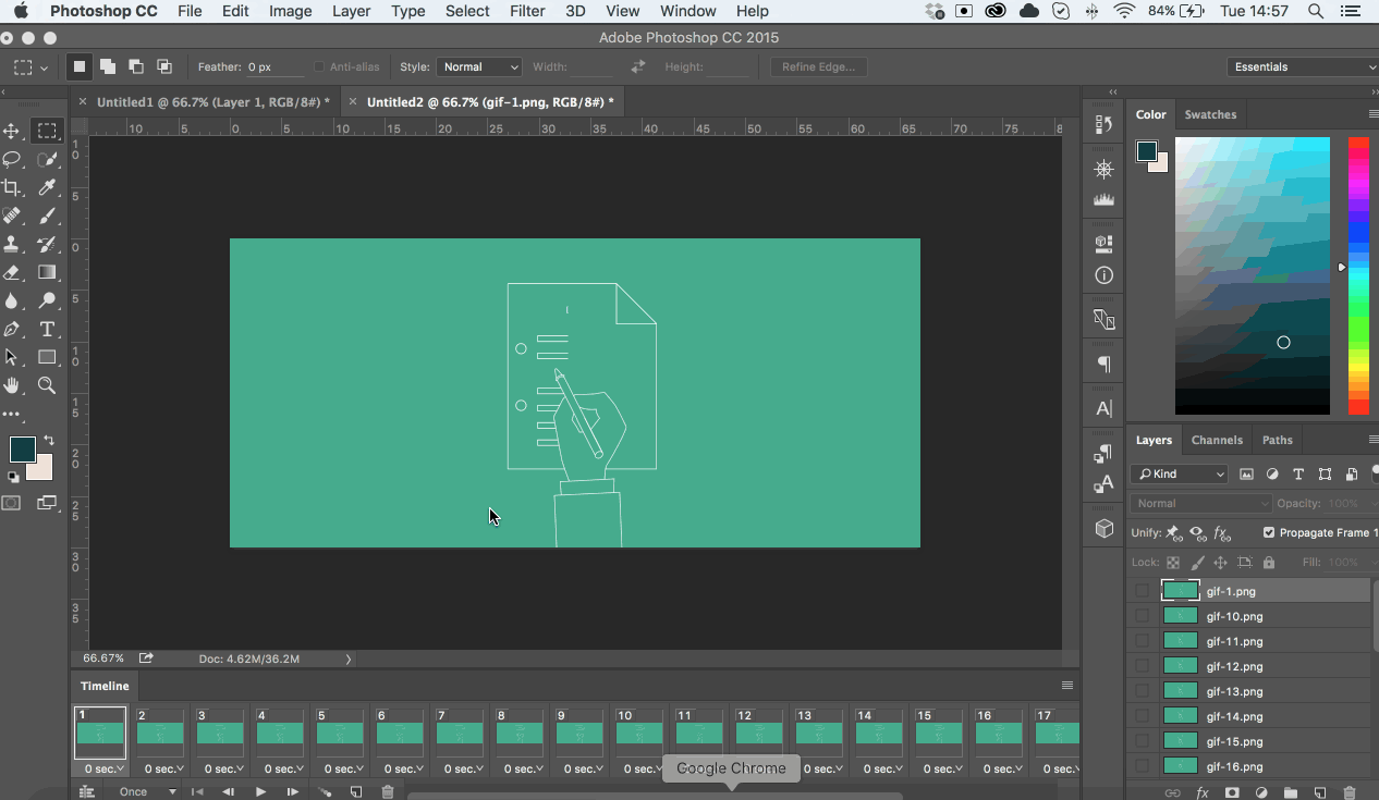
Look at this photoshop toolbar example below when trying to export a GIF. Multiple Functions can be completely exposed on the right, left even middle areas of the screen when needed. This makes editing photos or images easy because you have better accessibility and control over the functions you want.
This much information on mobile would mean your whole mobile screen is blocked out and impossible to use. So let us take a look at VSCO, an awesome mobile photo filtering app. Naturally, the information structure for accessing the different tools is adapted to a one-dimensional scrolling model. (See how the scrolling for VSCO does not have to be vertical, horizontal scrolling also works great)
Don't worry if you still want to hear a bit more, I have one last example for you from a UX-focused perspective.
3rd Example using our 1#Rule: Understand Usability
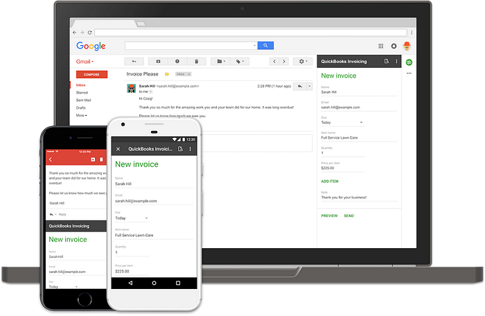
The last example is to show you that this rule goes beyond just visuals. From a usability standpoint, the same one-dimensional vs two-dimensional rule stands. For functions within a certain user flow, mobile products often need to “jump” to the interface to complete the action, while desktop products usually complete it on the same inetrface.

Think of any emailing app. Let us use Gmail as an example. If you write a new email with your desktop Gmail, a pop-up is on the bottom left corner. Two-dimensional right? Information is layered when needed, this is a good design. Would this pop-up email writing be a good design on mobile? Of course not, you can not type if only 10% of your screen has what you want, so naturally the whole interface “jumps” to the action you are trying to complete.
You mastered the rule!
At this point, I think you got my rule down! However, just remember the best way to learn in design is from hands-on practice, try to challenge yourself to design beyond your comfort space of mobile.

If you have any other questions, my name is Leon and I’m always happy to chat! Feel free to connect with me on LinkedIn or join our ever-growing design discord.
If you are looking for job opportunities, mentorship, or career advice, we have an active community with hundreds of verified interns, mentors, and professionals from big techs like Amazon, Google, Facebook, Apple, etc.
We have helped hundreds of students with interview questions, resume feedback, and portfolio reviews.
We highly encourage all students and enthusiasts to join! In our discord, students come from all sorts of majors across American campuses. (Yes, we also have lots of amazing Bootcamp grads) Everyone is welcome.
So if you want to learn more about design and use some of our resources, feel free to join here!

