Improving on Customer Relationship Management using Service Design — A UX Design case study
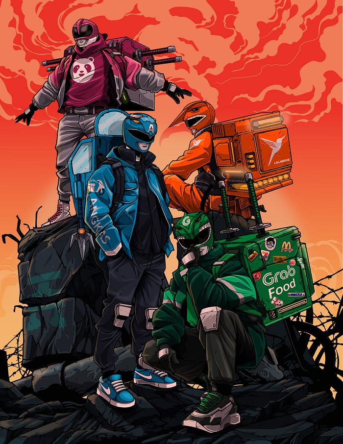
In our current time and age, food delivery has become the norm. Companies like GrabFood, Deliveroo and foodpanda are dominating the Southeast Asia markets. Ride-hailing giant Grab alone contributed to nearly half of Southeast Asia’s food delivery gross merchandize value in 2020, hitting US$5.9 billion.
The Hunch
Whenever people around me talk about their food delivery experiences, there is one popular and recurring user problem that everyone faces (myself included):
“It is absolutely impossible to find help on the app when we are facing problems with our delivery! Is this on purpose?”
I always had a hunch that there was something particular about the design behind the customer relationship management of food delivery apps and today I am going share with everyone what I found when I reverse engineered foodpanda’s customer relationship management design.
Disclaimer
This project is done in the pursuit of education and bears no affiliation to foodpanda. They are a remarkable company and I believe that they place the interests of their customers at heart. This case study is for the sole purpose of discussion, fun and joy.

Phase 1: Empathize
User Interviews
To support my hypothesize, I started off by interviewing users who used food delivery apps. My goal was to find out about the problematic experiences they had encountered before.
Demographics
- 20 users
- 21–39 years old
- Participants must have used an online food delivery service in the past year or so
Interview Results
Out of 20 users, 80% of them had actually suffered a bad experience with food delivery services in the form of late or missing deliveries.
1 user actually boycotted the service because of a traumatizing experience.
Usability Test
To simulate authentic interactions, I created an interactive prototype akin to the current version of the app for my test. I gave the participants scenarios of dealing with problems on their food delivery orders; showing me exactly what they would do in a real life situation.
Test Results
Evidently, frustration was observed among all users as they struggled to complete their tasks and 1 user actually surrendered during the test.
“I will just google my solution! Hmph! ”
“I am unable to get timely assistance when there is an issue with my order.”
“I am unsure how/whether my issues can be rectified.”
“There is a lack in direct access to assistance!”
“The app navigations are unclear on how I can find help.”
Customer Journey Map
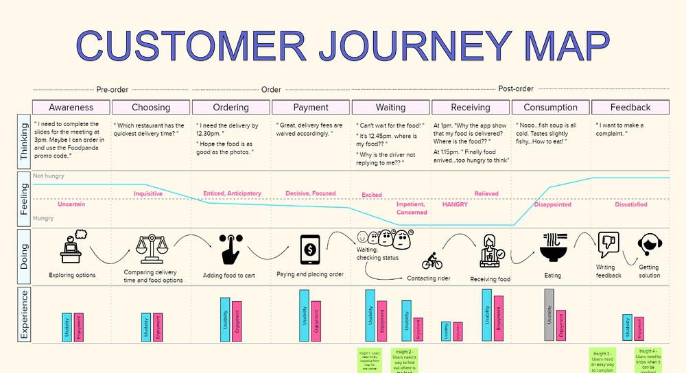
Using insights I gathered from the interviews & test, I created a visual story of all the customer’s interactions with the service to take a walk in their shoes.
Referring closely to the CJM, I identified key pain points such as impatience, concern, hanger (hunger & anger) during the waiting and receiving parts of their the journey.
Phase 2: Define
User Flow
Guided by my users’ pain points, I began to reverse engineer the app and mapped out every single step a user would take on the app in face of any problem when help was necessary.
As I went through each user flow in the present design, it felt as though I was going through a labyrinth.
“Hangry” users were being made to run like rats searching for cheese in a maze and this ultimately created disorientation & anxiety.

Design Problems
- When a delivery is in progress and help is needed, only 1 out of 7 call to action buttons presented a customer’s journey led to a solution; making it the user experience a really tedious and troublesome one.

2. After looking for answers in the help center, when a piece of information is presented to a user, the follow-up screen presents them with a question “ Was this information presented useful?”. Despite given a choice of a “Yes, I got my answer” or “No, add more info” buttons, they both lead to the same message “ Thank you! Keep Navigating?” where no solution was presented.
It definitely felt like users were given ‘a staircase’(solution) that led to nowhere.

Phase 3: Ideation
In an attempt to provide a resolution for the users, I came up a creative design:
1) Interactive Automated Assistant
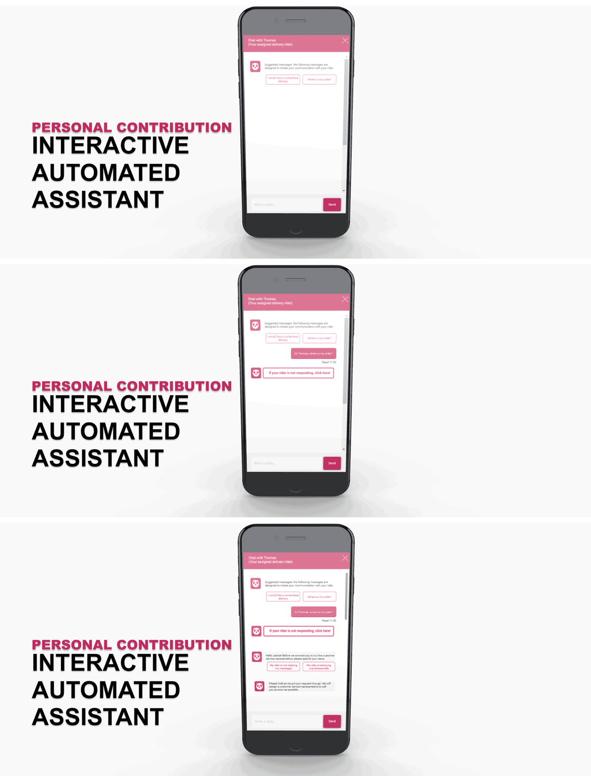
This automated assistant will be able to provide support to users whenever they encounter a problem.
Human-Like Interaction
I wanted to recreate the genuine experience that a user would feel if they were connected with an actual human customer service representative. I paid close attention to the copywriting, using a conversational tone, pronouns and polite mannerisms to design the content of the messages sent by the chatbot.
I also made sure to include subtle pauses and animations to mimic real life interactions, as though it was a real conversation.
I believe this approach would allow users to feel a sense of compassion and emotional intimacy despite this merely being just a computer-to-human interaction.
Automation Advantages
Chatbots are excellent at automating heavy chunks of low value work, which translates to cost effectiveness of the business.
They will be able to reduce the average handling time of calls by collecting the appropriate information about the customer’s problem before the introduction of human intervention.
Conclusion
In the fast-paced world we live in today, I believe that companies need to strike a balance between meeting business needs and user experiences. Instead of turning to dark UX patterns, research and innovation is the way forward.
This case study was done with the sole intention to raise awareness and spread the message to everyone, to be more conscious of the products and services we experience everyday. More often than not, the way we feel, is the very result of someone else’s design.
To my readers, thank you for your time and let me know if you share the same sentiments as the users from this research, or not.
Come and connect with me on LinkedIn, read more about the full project or watch video format of this very case study!


