Dr. Lal Path Lab — UI|UX redesign case study

Right off the hood, I’m not affiliated with “Dr. Lal Path Lab” in any capacity, and the views catered for this case study are strictly my own. Since I don’t have full access to all the user data that influenced their current design, this case study is not fully comprehensive. This case study was done to enhance my learning experience and challenge myself to redesign it to serve a specific purpose.
What is Dr. Lal Path Lab and What purpose does it serve?
Diagnostics play a vital role in the health care system that provides information needed by the patients to make informed decisions about their further health treatment.
Since the apt diagnostic reduces the risk factor of trial and error treatment which can result in saving a lot of things such as time, money, effort, and the most problematic thing is the unnecessary anxiety caused due to it, for the patient especially.
Now how about the things that could save your time as nowadays time is the most costly thing. There is one such app that has been in play for a long time known as Dr. Lal Path Labs App.
Dr. Lal PathLabs is one of the largest lab testing companies in India. It emerged and came on the android and ios mobile platform back in 2014 with headquarters centered in New Delhi.
Today it is serving around 70,000 patients a day through its mobile platforms.
Why run in this App Redesign?
I have been an avid user of the mobile app, from booking a cab late at night to use Amazon for shopping or even reading books on mobile apps like Kindle.
So I still remember, that I was having certain allergies and my doctor prescribed me some Lab tests and as usual being lazy as well as an avid mobile user I thought of booking the tests on this mobile app because I don’t remember when I visited the lab last time for tests.
So I preferred booking it online through the same lab as I was searching for the app and found it on the play store.
While booking the tests it was quite a cumbersome experience as I noticed certain things that were not proper and being an App Developer I always had a sight for good UX as well as UI which caused me the curiosity as well to look into it and see if the people who use this application also face the same.

GOALS AND INSPIRATION
My goals for the redesign:
- To deliver a seamlessly fast and smooth buttery experience as one does not want to cater more problems when he/she is already anxious about the tests that need to be done.
- To provide easy access to the answer user had already thought about regarding the questions in his/her head.
My Personal aim:
- To take full responsibility for the various roles involved in the process such as UX Researcher, UX designer, and UI Designer.
- To magnify the amplitude of my learnings by enforcing some design decisions and catering solutions to them.
LETS DIG IN THE ANALYSIS OF THE APP
While booking the test I scrolled through the app to look for some serious flaws and once I noticed some flaws I also went to the App store to get a bigger picture of what is missing and what the user is trying to find in the app.
This thing led me to do depth analysis of the app and I reached some of the pain points that are really bothering a wider number of the audiences.
I tried to make a list out of them to validate them after my user research.
USER RESEARCH
Before getting into the design and prototyping phase, I needed some user inputs to make decisions accordingly. Here is how I collected user feedback for the above app redesign.
What I did is, I asked some of my friends which are in the age group of 20–25. I also asked some of my uncles and aunts (age-group 35–50) to go through the app and tell me where they are facing the difficulty, which I think is a fair choice for the demographic change.
Moreover to get more depth in the study of what the app is lacking. I also got through the user reviews on the App store. Given below is the result. Here are a few of the most challenges faced by the people.

KEY INSIGHTS FROM THE PEOPLE ASKED
- Most of the users have complaints regarding the uncategorized cumbersome UI of the initial homepage.
- Users have complaints that they didn’t receive any notifications while booking the test, they only get SMS messages while the test has been booked.
- In some places they also complain regarding the availability of the tests should be made visible while booking that whether home pickup service is available or not.
- People were also perplexed when they tried the chat feature as initially, it offers a blank page.
- People were also skeptical about the location functionality as it didn’t offer them to quickly select it.
NOW FURTHER EXPLORING THE MAIN CRUNCH POINTS WHICH ALMOST EVERY 5 OUT OF 6 USERS WERE EXPERIENCING
I have listed down the main pain points that most users had issues with. After going all through all the process of myself using and suggesting some friends and my uncle and aunts as well as of the predefined user base.
Crunch Point -1: The issue of Cluttered UI of Homepage
Most of the users had a complaint regarding the cluttered UI and the multiple colors scheme used in the Homescreen. Moreover, they also had issues regarding the common tab of all Health Packages.
“Can’t we access the different category packages just by clicking on some common categories defined on the homepage itself”
Crunch Point-2: The issue of the empty chat screen and its accessibility
The second most common issue that I along with most of the existing, new users faced was that the accessibility button for the chat screen was not clear and at the time of clicking on that tab an abrupt empty screen occurred and after that one more screen appears and then the user is finally able to chat which was a completely horrible experience.
“I am just fed up of this empty screen every time I press the chat button”
Crunch Point -3: The problem of visibility of the tests whether its available for Home pickup at the moment or not
I saw various reviews of people complaining that the test is present on the app and after the payment and all the things have been made, they get a call from the lab that this test is not available for home pickup, so this is a serious issue as none of the users wants to get their money blocked when they already are going through some big issues.
“Is this justified not to tell us that a particular test is not available after we have already invested our time in booking and seeking the app and spending our hard-earned money on that”
Crunch Point-4: Problems faced when selecting the location
This was also one of the major issues users complained about as they were not able to select the location of the labs and moreover the location visibility at the top was also quite a bummer. It was at an awkward left position close to the sandwich button with no space to breathe you can also notice.
“Can’t even select the location properly”
Crunch Point-5: Instead of push message or in-app notification, SMS is received
This was a very huge drawback as the user might think, that the app is not working properly, as he/she doesn’t get the notification on the app for the test that has been booked and receives only an SMS message which quite makes the user experience worse.
“Is the app not updating properly or is there any bug in the app”
COMPETITIVE ANALYSIS
I did the Competitive Analysis by listing all the essential features in a structured tabular format to identify the competitors and mapping out their strengths and weaknesses.
For this, I chose the ones with maximum downloads and features.

PAPER PROTOTYPING
Next, I gathered all the feedback, insights, and crunch points listed above and grouped the similar ones. This helped me brainstorm and develop some potential ideas and gave me a brighter vision of what was important to users while keeping the business objective also in mind.
I did some paper prototyping before jumping into the pool of designing it on the software.
THE REDESIGN PROCESS
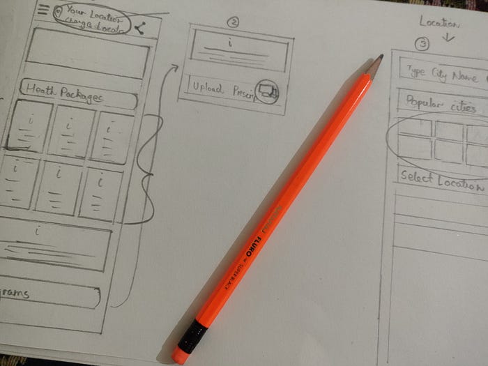
The Categorization of Heath Packages and improving the Clutter on the Home Screen:


So what I did is, I tried to remove the cluttering and the cumbersome experience of the Home Screen by rearranging and managing the tabs in a refined manner and also added some functionalities which you can notice.
2. The Location Screen:


As you can notice in Old Screen the position of the initial Location is very absurd so I modified it to a more refined position closer to the hamburger button.
Moreover, I also added the most popular cities option on New Screen and improved the sizing of the Use Current Location button.
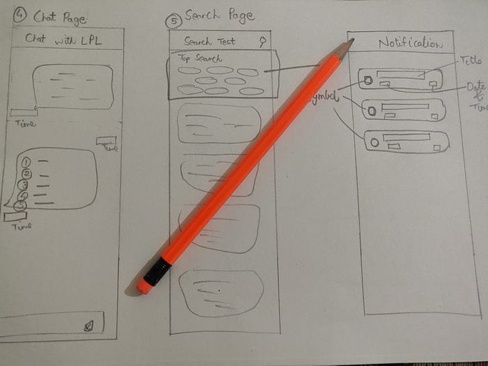
3. The Chat screen got more simplified


What I noticed and did here is, that I changed the chat button so that it becomes more clear to the user as this is the universal representation of chat support.
I also simplified the chat flow to a two-screen flow instead of a four-screen hefty and heavy procedure.
Added some predefined 5 options and a 6th option where user can customize their query and ask.
4. The Recent Top Suggestion and Test Availability Check


Two features that people were not directly pointing out but indirectly expecting were the Recent Top suggestion and the Test Availability Feature.
Basically, no Recent Top suggestion was present on specifically packages Test page and people were complaining that once the payment is made after that they got to know that Test is not available for home pickup so they have to call the Lab and tell them they have paid and after that, they got to know that they have to visit the lab for the test.
So added the Recent top suggestion and whether the Test is available for Home pickup or Lab visit is required feature, which helps the user to get to know prior booking that whether they should make the decision of buying on the app or not and their trust for app also gets much stronger.
5. Added the New Notification Feature

This feature was also highly required as nowadays no one checks their text message for any notification.
Users complained that whenever they booked a test or made a payment they got a text message and there was no way of knowing inside the app about the activity or event has been done.
So added this Notification bell whenever some event has happened, instead of the tedious task of opening the text message user gets notified inside the app.
WANT TO TRY THE NEW EXPERIENCE
<iframe style=”border: 1px solid rgba(0, 0, 0, 0.1);” width=”800" height=”450" src=”https://www.figma.com/embed?embed_host=share&url=https%3A%2F%2Fwww.figma.com%2Fproto%2F3FVDeVCwvUM0YeB9yDWAuQ%2FDr-Lal-Path-Lab%3Fnode-id%3D8%253A279%26viewport%3D231%252C535%252C0.25%26scaling%3Dscale-down" allowfullscreen></iframe>
VALIDATION TESTING
To validate my app, I surveyed 5–6 people with my prototype. I gave them around 2 questions on each of the features to test the redesigns performance and usability. For this, I supplied them with a questionnaire and also asked them physically about the problems they faced.

ITERATION DONE AFTER USER FEEDBACK
After getting the validation testing done I reiterated one of the feature's colors, that is the chat button, and changed it to the color of the logo that appears on the splash screen.

WHAT WAS THE MAIN CHALLENGE IN THE PROJECT?
The main challenge was the initial research of the Dr. Lal Path Lab app. The vision behind serving this app and to study how its direct competitors are taking part in the current market.
REFLECTION AND LESSON LEARNED
At first, I was very nervous as I knew this would be a lot of work. But, despite my nervousness, I knew this was the perfect opportunity to sharpen my design skills.
Now looking back at the whole process that I did, I felt that even the position of a small button can affect the user and can completely change their perspective regarding the app.
Also noticed that users will always be the centre of every design decision ever made.
I feel quite confident now that even though it was a whole lot of process but while carrying out the process, I learned a lot of things.
Today I am happy to be able to share my learnings and process through this wonderful platform.
And it’s a wrap. Thank you for reading!:)
I had a lot of fun doing this project, and I hope you enjoyed reading it too. Be sure to 👏🏽 below (You can give 50 claps at once, click and hold on the clap button) and leave your comments and suggestions.
If you have any feedback or want to chat with me, drop me a message at kalakaarabhishek@gmail.com or connect on https://www.linkedin.com/in/abhishek-ganotra-2b0211110/

