
Case Study: Medical Software Platform Development: Scope and Challenges
Not that long ago, a group of businessmen from California were looking to design and develop an eHealth platform that would be a safe space where patients, their relatives, their doctors & their health professionals could communicate and exchange information.
This platform would also help doctors remotely monitor their patients’ health. They called the platform eCuris.
eCuris occupies a unique niche. It needs to
- help health system, health plans & doctors keep track of their patients;
- help patients monitor their own health, be more informed and engaged and be aware of any changes;
- help US hospitals better manage patients with chronic conditions.
- use social networks to engage, inform and educate patients on their health
Another really important thing that eCuris was designed to do is help relatives monitor their family members’ health. The platform bridges the gap between doctors and family caregivers and builds relationships of trust between doctors and patients.
Our clients have a lot of experience in healthcare and know a lot about the US healthcare industry. Their target market eventually is global, but for the MVP they focused on US based health systems.. What they needed was a robust, reliable electronic medical platform whose architecture would allow for significant scaling in future.
Defining scope of features, eliciting requirements, and managing client expectations
Our business analysts worked closely with our clients to elicit requirements and ensure that we had a thorough understanding of their business needs and expectations.
Since this medical platform was being developed for the US market, we also had to consider FDA restrictions for medical software applications, including HIPAA regulations.
Based on the requirements, we decided to develop the application as a combination of several components:
- Admin panel
- Chat app
- Notification service
- API that connects frontend and backend parts of the app
- Frontend of the app

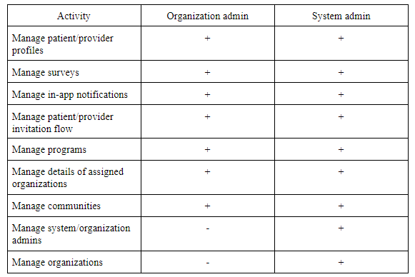
Admin panel
The admin panel is used to upload patient and health professional profiles. The majority of admin panel features are implemented through an API.
The admin panel is one of the central elements of the app: it’s where patient profiles and profiles of healthcare providers are managed. Programs that unite patients with similar chronic conditions into groups are also created within the admin panel.
The admin panel supports two user roles:
1. System admin, who has unlimited access to the admin panel
2. Organization admin, who can manage only an organization they’re assigned to, for instance a particular hospital

Here are their access rights on the platform:
Chat app
Chat allows doctors, patients, and relatives of patients to exchange messages. In-app chat is also used to send system notifications to patients, including surveys and alerts. Surveys are created by admins and are used to monitor a patient’s condition or collect patient satisfaction data, while alerts are triggered based on data that patients provide in surveys (for example, data showing rapid weight gain or fever).
API for the frontend
Finally, we had to connect the frontend and backend parts with an API.
UX design
As we strove to build a large, scalable platform for the healthcare industry, we also had to make sure that the platform would be easy to navigate for everyone — patients, doctors, and other healthcare providers.
The UX phase of the planning stage included brainstorming ideas with our clients and creating a draft wireframe on the whiteboard. After this draft wireframe was ready, we discussed how it might be visualized and then created well-rendered wireframes.
Design challenges
- Extensive market research. It’s challenging to understand the competition when creating an e-clinical product platform design since such systems are usually created for closed groups of users. Our designers needed to thoroughly research a lot of e-health apps before making certain UX decisions.
- Working on a responsive mobile design solution. Software development in healthcare is based on the understanding that products are used on the move. That’s why we needed to keep in mind mobile users of eCuris while creating the UX.
- Real-time response to our clients’ needs and change requests.
Creating personas
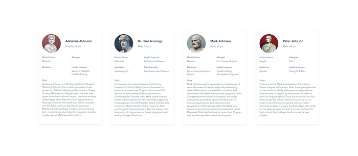
Personas are a great marketing and UX design tool; they help you understand your users’ goals and needs and introduce you to your users as if they were real people you could talk to. In marketing terms, a persona is a profile of a fictional user.
While working on the design for eCuris, we created several personas for each user role in the app: doctor, nurse, patient, caregiver, and family member. This is when it was particularly beneficial to have our clients, Paul and Mark, with us at our office and actively participating in the planning stage. Paul and Mark have extensive backgrounds in the healthcare industry and were able to provide details for our personas that made them more realistic. And of course, when it comes to creating personas, we decided to give them names rather than call them “Nurse 1” and “Patient 3.”
Working with Paul and Mark on eCuris personas helped us efficiently define our use cases and make sure that the eCuris ehealth application would be equally useful for all users.
What core features did we focus on when creating the UX design for eCuris?
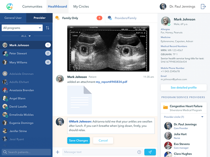
Healthboard
The most essential feature of eCuris is the Healthboard. This is the main screen in the app and the place where all communication happens between patients, their relatives, and their health professionals. All health-related information is also displayed on this screen.
Communication that happens on the Healthboard is structured around a particular patient (patient context) and a program which is usually related to a disease or chronic condition. When a doctor or caregiver picks the name of a patient on the Healthboard, all data related to this patient that they have access to is displayed.

Сommunities
Our clients wanted to create connections on the platform. Users are able to share their health experience and insights with others. That’s why we implemented Communities inspired by Facebook groups.
A community is a feed of posts which can be liked and commented by other members. Posts support any type of attachments so users can add photos, videos, GIFs, etc. To assure the quality of the content, communities are moderated by admins.
Moreover, in communities, users stay anonymous to be able to freely share their problems and solutions. The system generates a random nickname for each user which includes a user’s name and three numbers, e.g. jack483. However, a user can choose another nickname in profile settings or even show their real name. We also added a mark to doctors’ nicknames to verify their authority.
Communities are connected to organizations and programs. As of now, if a user is connected to a diabetes program, for example, they are automatically subscribed to an appropriate community connected to their organization.
For next versions, we are going to provide an opportunity to find and create communities, subscribe to them, and invite other users.

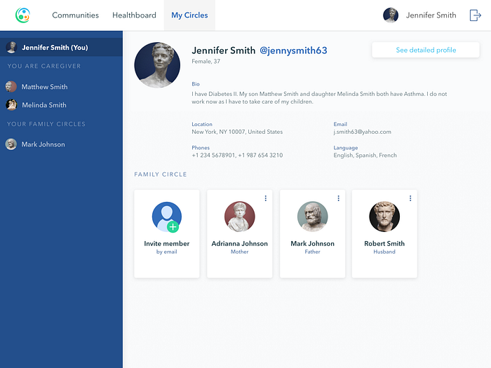
Circles
Circles show the people each patient is connected to. This feature was partially inspired by social networks like LinkedIn and the idea that users have many connections at different levels.
In eCuris, we created three types of Circles:
- Family Circle, which contains a patient and all their family members.
- Provider Circle, which contains a doctor — the main provider of healthcare services — and their team, including nurses and other specialists who can act on the doctor’s behalf and check in on the patient.
- Circle of Care, which contains all members of the provider and family circles including a patient, their family members, doctors, nurses, caregivers, and other specialists.
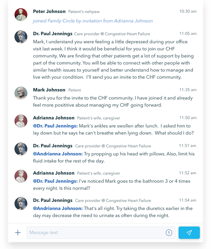
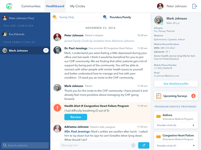
Chats
Another cue that eCuris took from social networks was using chat as the primary method of communication.
eCuris has two types of chats:
- Shared group chat for the Circle of Care, which includes all members of the circle including a patient’s relatives and healthcare providers.
- Group chats for the Family Circle and Provider Circle. These chats connect users based on their roles within the app: patients’ relatives are united in the Family Circle, while doctors, nurses, and other healthcare providers can communicate among themselves in the Provider Circle.
Side menu
When we were considering how information could be displayed in the app, we thought of a situation when one user plays more than one role. For example, Linda Jannings might be a patient while at the same time her husband is also a patient on the platform, so Linda might have one account that combines two separate roles with different levels of access to personal health information.
To account for people like Linda, we wanted users to be able to easily switch between Healthboards. To do that, we allocated some space on the left side of the screen and put a list of contexts there. A context in eCuris is similar to a group in a messenger app; contexts help organize data and make it easily accessible to doctors and patients.
The first item in this list is always the context for the current user, followed by a list of users for whom the current user is a caregiver, then followed by a list of the user’s family members. This might remind you of Slack channels.
For healthcare providers and their team members, the story is a bit different because each provider has only one long list of patients among whom they can select. To help doctors find patients, we added a search field and the ability to sort patients by a list of criteria.
For both patients and healthcare providers, a red dot appears by a user’s name if there’s an unread message. A user can have even three different roles in the app (as a patient, a family member, and a healthcare provider).
Programs, surveys, and triggers
eCuris might have some features in common with popular messengers, but its primary goal is to let health professionals remotely engage, educate and monitor their patients’ health conditions. Also reacting in real time to any clinically significant changes or service requests. Patients with chronic conditions need to regularly monitor their well-being according to a set of criteria such as weight, level of fatigue, pain levels or breathing difficulties.
To enable this monitoring and make sure that doctors receive regular updates about their patients’ conditions, we added a surveys feature.
A survey in eCuris is a customized questionnaire that patients are asked to take on a daily, weekly, or monthly basis. Each survey has a set of triggers — parameters that are most important for the particular patient. If any of these trigger parameters change, doctors receive a notification and can adjust treatment or recommend additional screenings accordingly. To implement surveys, we used a simple question and answer style in the form of checkboxes, buttons, dropdowns, and text inputs. Surveys can contain different types of questions: simple yes/no questions, open-ended questions, lists where patients choose symptoms, etc.
Programs are a higher-level functionality of the app. Within each program there’s a set of surveys, and patients are assigned to programs based on diagnoses.
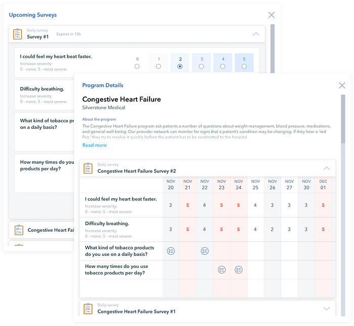
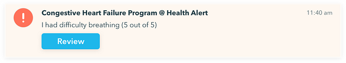
After a survey is submitted by a patient, it’s available for review by their healthcare provider and family members. If any of the patient’s triggers have been activated, all users who are connected to the patient will receive a notification.
To avoid a situation when a patient forgets to input updated health data, surveys are scheduled and patients receive reminders by chat.
Right sidebar
To display patient details, we added a right sidebar that contains
- the user’s personal details with a button to show the complete patient profile;
- an upcoming surveys button if new surveys are available;
- a list of programs to which the patient is assigned, together with the provider’s Circles for each program;
- a list of the patient’s family members (Family Circle).
This sidebar helps guide patients in the app. The sidebar is always visible and makes it pretty simple for users to understand how the app works.
UI design
As soon as we and our clients were satisfied with the degree of detail in the wireframes, we started on the UI design. All we needed to do at this stage was pick the color palette and render our wireframes.
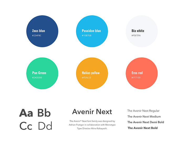
We created a couple of color concepts, and in the end we picked a palette of blue, light gray, and white hues with light purple accents. The decision was quite simple: many studies have shown that blue is the overall most-liked color and is the most neutral color on the internet. Red (or purple) offers the most contrast with blue. We used green and yellow to differentiate blocks and add secondary accents.
Final thoughts
Yalantis has always operated on the assumption that truly successful software solutions come out of close cooperation between the client and the development company, and the eCuris project has proven that we’re right.
We worked with our clients’ technical advisor, paid close attention to our clients’ business needs, studied the target audience thoroughly, and tried to envision how to best meet the end clients’ needs. This helped us prioritize the scope of features for the MVP version and make sure that all core functionality was implemented in the best possible way.
As a result, we were able to build a stable, HIPAA-compliant online medical software system that can easily be scaled to cover many more health users around the world — a platform that is highly responsive, can handle millions of users interacting on it at the same time, and is easy to navigate.
The MVP version of eCuris is ready and fully functional. We’re always working on improving existing solutions to keep up with industry best practices, which is why we’re now considering rewriting certain features of the platform using GO for heavy computations and Elasticsearch for data processing.
To check the full case study with engineering challenges and technology stack we implemented the app with, follow the link below:

