Email UX and Design Best Practices

User experience (UX) is important, and while there is sufficient content out there on the subject, there’s not much when it comes to email UX. Email UX is about keeping the email as simple as possible.
Based on studies, you have 50 milliseconds to capture a user’s attention in an email. You then have 11 seconds, at most, to communicate your message. Writing in a concise and coherent manner is difficult and especially in an email. I’m going to touch on a few areas to improve the UX of your content.
Content
According to the Nielsen Norman Group, reducing cognitive load maximizes usability.
When the amount of incoming information exceeds our ability to handle it, performance suffers. It takes longer to understand, you’ll miss important details, or get overwhelmed and abandon the task. It’s crucial to trim your content, create chunks, and use a content hierarchy (similar to a visual hierarchy which graphic designers use).
Hick’s Law
Hick’s Law states that the time required for a user to make a decision increases with the number and complexity of choice available. So basically, the more choices you have or the harder the choices are, the longer it takes for your user to make a decision.
This is why you should not include multiple primary CTAs in one email. There are a few exceptions for longer emails and newsletters.
Content Hierarchy

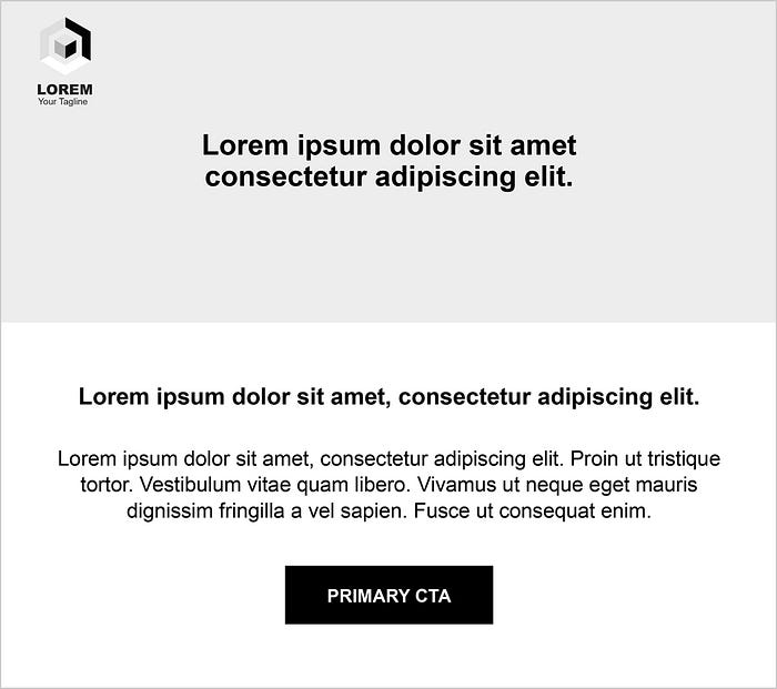
The headline should be the largest text and it’s ok to go bold. Subheadlines should be smaller than headlines.
The favourable line length for body copy is 50–80 characters. Don’t waste your reader’s time and get to the point. Use bold, italic and varying font weights and sizes to display hierarchy and contrast. Use readable fonts which are email client safe, such as Georgia, Arial, Times New Roman and Verdana.
Create contrast. Not having enough will make your email difficult to read.
CTA Design
Your CTA is a visual cue to the user, so make sure they’re easy to click on all devices. The button needs to stand out from the rest of the content. Use contrasting colors (which are on-brand) and use a filled-in button for primary CTAs. Ghost buttons or text links are fine for secondary CTAs. Through experience, they don’t perform as well as regular filled-in buttons.
Sections (Chunks)

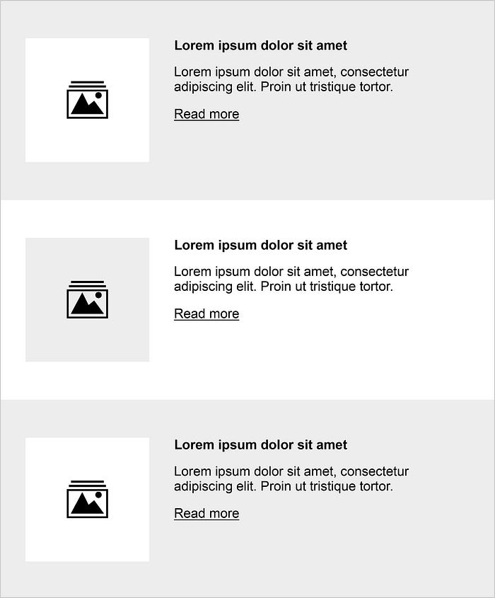
Break up your copy into sections (chunks): short paragraphs, bulleted lists and white space can really make a huge difference! Nobody wants to read a large block of text.
Creating Space
Don’t be afraid of white space. Use padding, especially between headlines, subheadlines and body text.

Typography
When possible, bullet lists. It’s easier for users to skim through content, but limit to three to five bullet points. Based on best practice, paragraphs should be around five lines or fewer. Paragraphs longer than three lines should be left-aligned, not centred.
Font size is important. Small text on desktop clients is very small on mobile. You’ll need to adjust your fonts for certain users. On desktop, the recommended minimum is 16px for body text, and a maximum of 21px.
If possible, always underline links and make them stand out as they can be difficult to click (especially on mobile devices).
Design
Remember, the standard width for emails is 550px — 600px. Any wider and you run the risk that your email will look strange. Mobile users are limited by screen size. As UX designers our job is to make the process of scrolling simple and attractive. This can be easily achieved with a good layout and distributing content properly. Use visual cues that will guide the reader to scroll through your email, such as dividers (diagonal lines) and screen-size sections (chunks). Do the “squint test” to figure out what elements stand out in your email.
What do you see when you squint at your email? Probably not much, but the elements that stand out the most are the notable pieces your users will see.
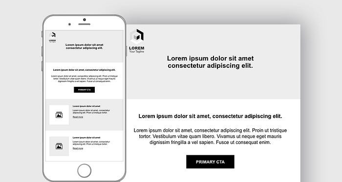
Below is an example of UX best practices in an email design:

Images
Avoid large files to prevent long load times. Email file sizes should be below 100KB. Image sizes should be less than 1MB. For retina devices, use images which are 2x the width while keeping their file sizes small. This will keep the images looking sharp.
Images have more engagement than words. Use images that complement the email’s message and don’t distract from the end goal.
Note many users will have images blocked by default, so including descriptive alt text for them and your visually-impaired users is essential to accessibility.
Background images can look great. However, due to email client compatibility they don’t always work.
Overall Email Experience
When possible, code all text as live text (not imagery) for best accessibility, readability and mobile responsiveness. Keeping the critical pieces of information as live text will prevent important information being blocked.
Always ensure email templates are designed with a mobile-first approach. Depending on industry, mobile devices can make up at least 50% of all opens. Emails that don’t render correctly may be deleted within three seconds.
Remember to test and optimise your email designs before pressing send.

