
Everything you need to know about number fonts
Everything you’ve ever wanted to know about number fonts including where to get your hands on free ones
When it comes to choosing the perfect typeface, there’s are a multitude of fonts available to designers.
Whether you’re aiming for complete legibility or simply want to add personality and flair to a design, it’s no easy task to find a font that ticks all your boxes.
But there’s another conundrum that UI designers have to grapple with: displaying numbers.
There are many reasons why you’d want to display numbers. From data visualizations and statistics to pricing and contact information, numbers play an important role in the way we understand data and the world around us.
With that in mind, which number fonts are great for displaying numbers and where can you get your hands on some free ones?
What’s a number font?
There’s no such thing as a number font, per se. Usually, a well-made and comprehensive font will include numbers and other symbols in its design.
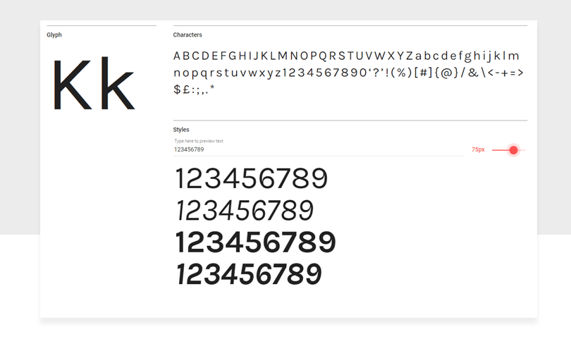
Take Karla, a font by Google Fonts. It’s a grotesque sans serif font whose numbers are in the same style as the whole font.
There are some fonts which are less extensive and have fewer languages supported — usually the free ones.
When it comes to getting your hands on a font, it’s worth checking how many symbols, letters and numbers it includes. We’ve seen instances of fonts with random characters missing.
There are some typefaces which only have the standard alphabet, for example. If you’re buying a font from an established foundry, such as Hoefler and Co, check the features section — it’ll give you all the information you need to know.
Designing with numbers
We mentioned in the intro that designers can have a tough time with numbers. Why? The reason is that numerals have different conventions than letters.
They have more curves and some numerals have ample white space to contend with.
Take the letter O. Depending on the font used, some people may have difficulty discerning the letter from the number zero.
To deal with this peculiarity, designers can change the stroke of the number to give emphasis or take away attention from the number.
When it comes to infographic design, headlines and lists, you’ll need to use numbers to convey the information in a clear and understandable way. That means choosing the right font and displaying the numbers in the right way.
How designers can display numerals
If you’ve ever spent much time looking at numbers or fonts, you’ll come to learn there are subtle differences in the way numbers can be displayed.
Lining numerals
First is lining numerals. Lining numerals is somewhat self-explanatory. It is when the numbers of a typeface sit on the baseline and are aligned with the cap height.
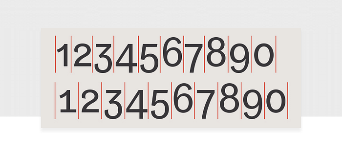
Text figures
This different from text figures, which is when the numbers are typeset with varying heights, as seen in the comparison below:

Text figures is useful when you have numbers in a large block of text. Their purpose is not to distract the reader and they help the visual rhythm of the text by blending instead of sticking out.
Proportional spacing
Then we come to proportional spacing, an alternative to tabular spacing. Proportional spacing is where the numbers are close together, helping reduce empty space in a document.
Just like letters, numbers are proportional. They vary in width according to their shape. A number 1 is much thinner than the number 0, for example.
Proportional spacing blends letters and numerals together more effectively. This variation wouldn’t work well when it comes to displaying numbers in a table because of the varying widths the result from proportional spacing.
Tabular figures
Tabular figures mean the characters or numbers in the font occupy the same amount of horizontal space, also known as monospaced.
Tabular figures are useful when you have to display:
- Sums
- Price lists
- Stock listings
- Code
Here we can clearly see the difference between proportional figures and tabular figures:
Typewriters commonly use monospaced fonts as well as text editors — monospaced fonts are used when writing code. With tabular figures, the numbers are built on a fixed width to ensure that columns of data align correctly.
Where to find the best free number fonts
Without a doubt, the first place to get your hands on decent, well-crafted fonts for free is Google Fonts.
What’s great is you can type some copy to get a feel for the typeface. Then when you’re settled on the fonts you like, you can use them in Justinmind thanks to our integration. So if you’re not sure how to present your data or which font to use — experiment with a couple of prototypes in Justinmind.
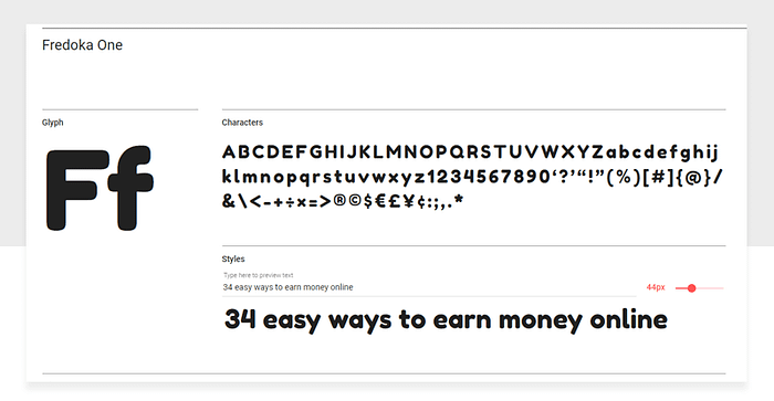
There’s a ton of fonts including the usual sans serif and serif typefaces. You’ll also find a vast array of display fonts, too. Take Fredoka One, a plump display font whose numbers would add fun and whimsy to any headline.
Take a look at this pricing page below. It uses the typeface Lato to display its numbers. It’s clear, crisp and legible. Exactly what you’d want in a font. And it works perfectly for this landing page.

While not 100% free (but pretty close…), you can pay what you want for some fonts on Lost Type. Take Klinic Slab, an underrated slab serif whose numbers are unique, whimsical yet solid.
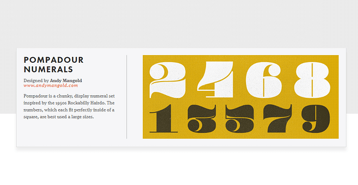
For extra pop, there are fonts like Pompadour whose numbers live up to its rather outlandish name.
If you’re creating marketing collateral for an ecommerce store, this font would grab people’s attention. It screams shiny, new price.
Font Fabric has a selection of fonts you can download at your leisure. Included in the selection is Bebas — a sturdy, reliable and free font. It’s even been dubbed the “Helvetica of free fonts”. If that doesn’t sell it, what will?
Everything you need to know about number fonts — the takeaway
Numbers are an essential part of any good font. Typographers who care about building strong fonts will undoubtedly design the numbers just as well as the letters.
Getting your hands on some free fonts means scouring the wilderness of the internet — there are a few here that will get you started. Use them wisely and, remember, always respect your type.

