Exert Dominance in Your Designs
How to make users focus on things that matter (the most).

When a particular element (or group) stands out in a certain way, drawing a significant amount of attention to itself, it is said to be ‘dominant’.
I’m sure you might have come across bing.com at least once in your lifetime. (It might even be possible you got redirected to it via Google.)
Just to refresh your memory, this is how their home page looks like.

What was the first thing you noticed in it?
Was it the large tree trunk at the center? The obtrusive pop-up at the top right? The search field, maybe? Or was it the bottom tray with five chevrons?
Since Bing is a notably popular website, and most of us already know that it’s primarily used to search for things — we invariably start looking for a search field amidst the clutter. But, if it were any other (lesser known) web page, we wouldn’t be so sure about where we’re supposed to look first — as every element on the page is competing with each other for attention.
This happens when there is a lack of dominance — or when everything is dominant.
The absence of an apparent entry point for users on any page/screen would entail that they’ll have to work their way into finding one — which increases cognition — and as humans, we despise the idea of working extra-hard for something that is easily achievable.
From a design standpoint, this would mean that users will probably move on to another design (screen, app, or website) where they can achieve the same thing with the least amount of effort.
Now, keeping the Bing’s home page in mind, take a quick look at Google’s. (Not that you already know how it looks like, but just for the sake of context.)

What was the first thing you noticed this time?
I’m sure it must be the distinct Google branding at the heart of the page.
Without having a second thought, we can say it is asserting the highest level of dominance — due to its contrasting colors and an ample amount of negative space surrounding it.
Some of you may argue: shouldn’t the search field be the most dominant element here?
That’s true, but as you may know, Google has kept its basic home screen layout consistent since the very beginning — which is why users invariably know that the search field will always be beneath the branding — making it equally dominant.
Dominance helps in paving a virtual path for users.
It initiates and directs flows
Dominant elements operate as starting (or entry) points on a particular page/screen, from where they can lead the users to other (secondary and tertiary) elements.
It promotes visual hierarchy
Assigning different levels of dominance (usually 3: dominant, sub-dominant, and subordinate) to elements based on their significance and (or) priority can create a visual hierarchy in your designs — which promotes easy scan-ability and decreases cognition.
For instance, consider this landing screen from Mailchimp’s iOS app.
Can you point out the dominant elements in it?
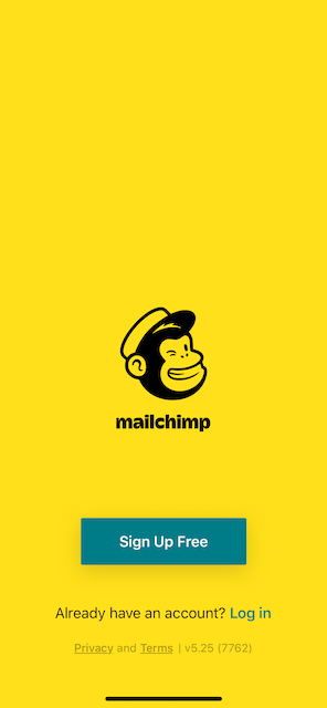
The striking yellow background and Freddie (the monkey) together are asserting the most dominance on the screen — and they should, as they endorse the brand identity of Mailchimp — yellow is their official brand color, and Freddie is their mascot.
These elements are dominant simply because they are an anomaly. Seldom we see screens that are this yellow and have a monkey winking right at us.
The next element you may have noticed must be the adequately large CTA (Call To Action) button in a contrasting green color that reads “Sign Up Free” — this is the sub-dominant element (2nd level of dominance) — simply because from Mailchimp’s, or any other company’s standpoint, sign-ups precede over logins — as they would want more and more potential users to join in and use their services — and by providing a clear entry point, they can speed up this process.
For the same reason, the one-liner text, along with the link to log in, constitute the subordinate elements. (3rd level of dominance)
Privacy and Terms, being the least important of the lot, are subdued at the bottom.
Ways to employ dominance
The basic idea here is to make the element (or a group) that is supposed to exert dominance, stand out in a certain way, calling towards itself a significant amount of attention. In other words, it should be an anomaly.
Tip: Try having only one dominant element per screen/page, as:
Each additional dominant element is directly proportional to an increase in users’ cognition.
There can be more than a few ways to create dominance, but I have mentioned four prominent ones below. Note that each of these can be used in combination to exert an even higher level of dominance.
Contrast
Using contrast is one of the most effective ways to make an element stand out. It even trumps size. For instance, in the image below, even though the grey circle is much bigger, our eyes instantly cling to the smaller one — only because it is contrasting better with the white background.

This is why most CTAs (Call To Action) buttons have contrasting colors that make them stand out even when they are relatively smaller in size.
For times when we are not sure which color will contrast well against a particular background, Adobe Color comes in handy.
Size
You can change the weightage of an element by making it relatively large or small, depending upon its significance and (or) priority.
But, while designing for small screens, try not to use size variations as your primary mode of employing dominance — as we can only enlarge an element so much, given the limited amount of real estate. We want it to be the first thing users notice, not the only thing. The same goes for while reducing the size of an element; we cannot sacrifice visibility (or legibility) for it.
(If you want some more suggestions on small screen designing, do read: 4 Things to Keep in Mind While Designing for Small Screens.)
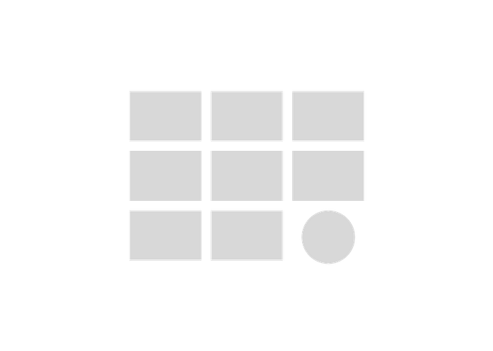
Shape
Using different (or unique) shapes also separates the dominant element from other monotonous elements. Throw in a circle on a page full of rectangles and it’ll instantly shift the focal point.
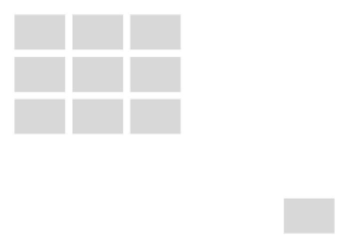
Negative space
If used effectively, negative space can enhance an interface in many ways. It not only helps in creating dominance, but also improves the overall scan-ability and clarity of the page/screen — which decreases cognition.
Set apart element that is supposed to exert dominance from the elements it’s meant to dominate.
Final thoughts:
Dominance can be a boon if used cautiously, and a bane if used abundantly — in which case, everything will be loud, yet nothing will be heard.


