People like listening to music. It’s an axiom and never a question. As Friedrich Nietzsche said: “Without music, life would be a mistake.” And who would argue? All of us listen to music daily. Some may prefer rock, others — classical compositions still no one misses a chance to enjoy their favorite tracks. Considering this fact, the need of having a twenty-four-hour access to music seems as a today’s must-have.
It’s hard to say how many music service products exist today but the industry constantly grows so designers have lots of work to do. We devote a new article to the peculiarities of UI design for music streaming services. Let’s see what screens are typical for this type of digital products and what elements their UI requires.
What do users expect from music streaming products?
Music streaming products aim at providing users with an access to the various musical tracks from all over the world. There are both free and paid services trending on the digital market and they are available for different devices including PCs and smartphones. Of course, all music streaming apps strive at uniqueness still they have a common base of tasks to accomplish. Let’s see what this kind of products usually offers to their users.
Online and offline music streaming. The majority of music players usually provide online streaming so that users could enjoy various tracks without downloading them on their devices. However, people can’t always have an access to the Internet so the feature enabling to download certain compositions and play them seems to be essential.
Playlists. Music streaming products contribute thousands of different tracks but even the biggest music lovers won’t listen to all of them. Playlists are a core part of music players. They allow users to choose and combine their favorite compositions for different mood and situations.
Music flow. Sometimes, people get bored of their playlists and want just some random tracks to play. Music flow is a list of tracks based on the users’ preferences which never repeats itself.
Radio channel. They say all new is well overlooked old. Even having a quick access to the favorite music, there are still many radio lovers. In-app radio channels are a nice alternative to the flow as well as an element of entertainment.
Music storage. Not all the tracks can be free to listen, which is why music players often give the possibility to buy paid tracks and add them to their playlists.
Equalizer. People perceive music differently so the need of sound settings is obvious. Equalizer helps to make music sound in the best way for a user by regulating music tones.

Screens for music service products
Based on the users’ needs designers have formed a standard set of screens (pages) which are typical for this kind of product. Let’s see what they are and which UI elements they usually include.
Home screen
Any digital product has a page or a screen where users start their journey within a product each time they launch it. A home screen is also known as the main page of a digital product. It received its name as it provides a starting point with many further directions for a user.
A home page of music streaming products often contains direct links to the most important areas of interaction with an application such as a personal profile, playlists, search field, and music store. Also, a home page provides an insight on music updates as well as the recommended music for a user.
Traditionally, UI of a home screen for a music app is made in minimalistic style. Recommendations and music novelties are presented via pictures of album covers or artists’ photos followed by captions saying the name. This way the search process becomes more intuitive and pleasant.
Profile screen
Profiles are a tool making interaction within a product more personalized. They allow operating with the information effectively and make user experience individual for everyone. As for music products, personal profiles assist developers to gather information about users’ tastes and preferences in music genres and artists. Based on the data, an app will provide listeners with recommended music as well as interesting fresh tracks.
In addition, a personal account is a good way to add features of a social app to a music streaming product. This way users can unite in a virtual community of a certain product and share the personal info with the others.
The principle of a profile page design remains similar for all types of products. First of all, a profile page should be clear in use. The amount of the information has to be limited otherwise a profile screen may look too complex. What’s more, it’s vital to make sure the navigation system is intuitive so that it wouldn’t have to take much effort to puzzle out the app.

Search screen
Hunting for new songs is a daily routine for true music lovers. Designers need to make sure it goes easily and leaves only pleasant impressions. UX for search screen should be well-thought and intuitive so that users could quickly find what they need. An essential part of a search screen are filters helping to sort the received results. There are some typical filters for a music app which include genre, artists, songs albums and a year of release.
Playlist screen
Music lovers like creating their own playlist for every occasion. Obviously, every music app is obligated to provide their users with such a feature. Playlist screen looks similar on different apps: it’s a list of tracks showing the name of the song, singer or band, and the length of the soundtrack. Also, designers can add a small image of the album this track belongs to. In case a song has no image there still should be an icon, for example, with a music note.
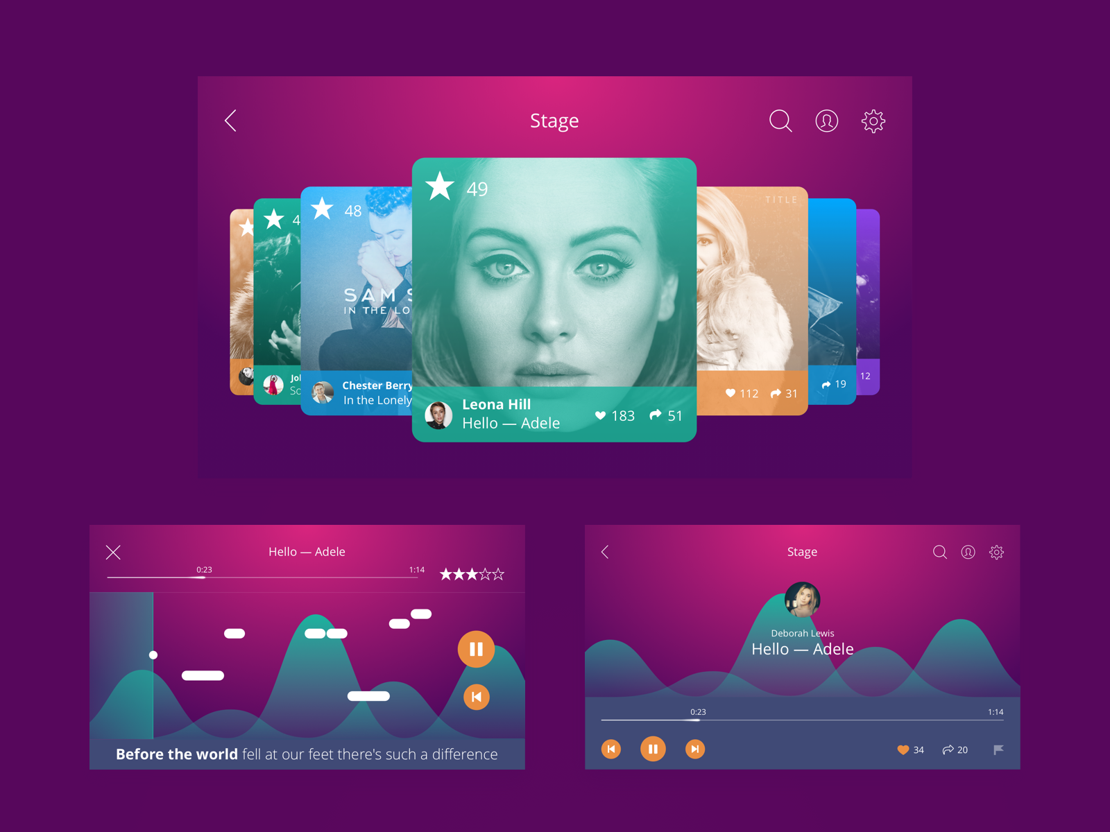
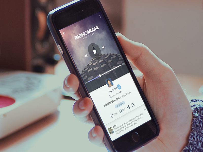
Player screen
The page which people visit most of the time using a music app is a player. People can control what they listen and how they listen to it via the player. The feature allows switching, stopping and starting a track with standard buttons which are easily recognized. This set is usually placed centrally on the bottom of the screen. The major part of the screen is typically taken by the image attached. Also, sometimes instead of a picture, many designers apply music visualizer as a central part of the screen. Visualizer is a good opportunity to reveal the imagination and creativity which is always inspiring for designers.

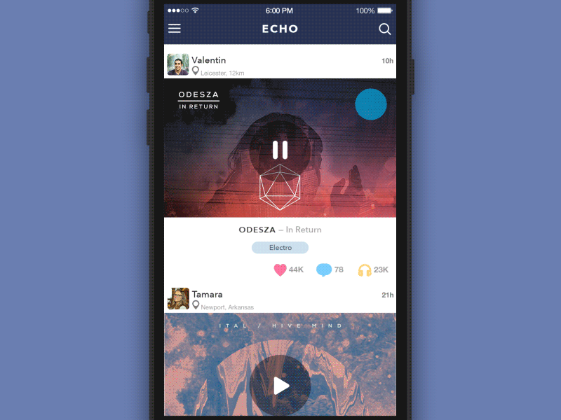
Music feed screen
If a music streaming service provides a possibility to add friends and follow other users, a music feed should also be considered. Feed is usually known as a constantly changing list of news and other data users choose to follow. Music feed includes the updates on the friends’ pages as well as news from the pages of particular artists they follow.
Designers make a simple clear UI for music feed which isn’t overloaded with visual details. It allows people to scan quickly through the feed not getting overwhelmed with tons of information.
Settings (equalizer screen)
Each app needs to have settings screen but a music app requires one specialized option. Besides other standard settings, they provide a possibility to tune the sound of the music. Depending on the music genre experienced listeners adjust the loudness of specific frequencies via an equalizer. Equalizers often look similar to vertical graphics responsible for certain frequencies which users can regulate with sliders. The designers often do experiments with equalizer UI to be certain it’s not boring to use.
Music store
As we said above, not all the music can be free so a music store comes in handy. UI design for music store usually borrows some principles of e-commerce design. First of all, paid music is presented in a catalog with relevant filters for the search. Clear visual elements support the product not overshadowing it.
Music has always been a source of inspiration for people around the world. Trends may constantly change but music will never step aside as well as products providing us with our favorite tracks. So, possibly, sooner or later each designer will create their own new music product.
Recommended reading
Mobile UI Design: 15 Basic Types of Screens
Case Study: Echo. Designing User Experience and User Interface
Originally written for tubikstudio.com
Welcome to see the designs by Tubik Studio on Dribbble and Behance