Member-only story
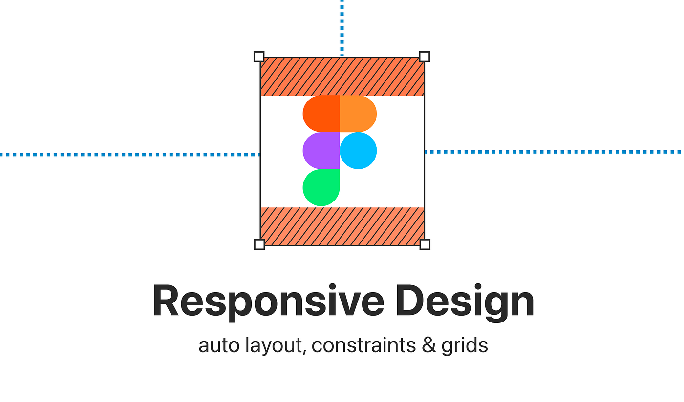
Figma: Setting up responsive design with auto layout, constraints & grids
Full guide on how and when to use what — the right way
Figma gives us impressive features when it comes to setting up responsive design. But let’s face it, responsive design can also be a recipe for disaster if you don't know what you are doing. So let's untangle our auto layout pages, and let's understand why constraints and auto layout actually go hand in hand.
This article is a free excerpt from my full responsive design course with Figma on moonlearning.io
The currently available tools for responsive design in Figma are:
1. Auto Layout
2. Constraints
3. Grids
We can use just one or combine them to a certain extent. There is no right or wrong. It is really about the behavior and setup you are trying to achieve. Thus it's key to understand how each of them works with its possibilities and limitations. Let’s learn about them:
1. Auto layout
Let’s start with the almighty and obvious: Auto layout! Your experience with auto layout probably looks a bit like this.

But stick with it, it's definitely worth it, and you will love it dearly.
A quick guide to auto layout in Figma:
Apply auto layout
Select a frame and hit the plus next to auto layout in the right-hand side properties panel. You can also use the shortcut shift + A.
Note how you can also nest auto layout frames. Now, when adjusting content in size or length, all settings remain.

✏️ Note: You can also apply auto layout to components. You can then nest instances of other auto layout components.
Menu: Spacing, padding, and aligning
Via the auto layout menu, we can adjust the direction and space between items, as well as horizontal and vertical…

