Five Lessons from Architecture School that Will Improve Your UX Work
“The doctor can bury his mistakes. An architect can only advise his clients to plant vines.” — Frank Lloyd Wright
As digital design people, we like to think we’re all fancy. We’re much more advanced than print designers. Our work looks great on desktop and mobile. We wear scarves, un-ironically, indoors.
But it’s good to recall, scarves aside, that we’re the new kids on the design block. Architecture, for example, has been around for quite some time. I thought I wanted to be an architect when i grew up, and took some classes in school. Instead I became an information architect, which, as it turns out, sounds decidedly less impressive when introducing oneself. But where was I.
Because architects have been designing human-spatial interactions for like, ever, there are a number of helpful principles they take for granted that can be useful for UX (User Experience) people in those moments when you’re grasping for a design compass. Here are just a few from architect and author Matthew Frederick.
1. “The more specific a design idea is, the greater its appeal is likely to be.”

This will immediately resonate with anyone who’s ever had a design direction watered down in the interest (however well-intended) of “making the product appeal to more users.” This is honestly one of the most difficult balances to achieve in client work: wanting to be receptive to input, but also making sure the work accomplishes what it’s supposed to do in the first place. Matthew Frederick, AIA:
“Being nonspecific in an effort to appeal to everyone usually results in reaching no one. But drawing upon a specific observation, poignant statement, ironic point, witty reflection, intellectual connection, political argument, or idiosyncratic belief in a creative work can help you create environments others will identify with in their own way.”
It’s an interesting concept because it’s counter-intuitive. Why not add a specific link for all of our audiences? Why not include all of our business units on the homepage — won’t they feel left out? Well, you may be doing more harm than good. I really like the concept of design inviting the user to interact in his or her own way. It gets at the heart of what UX is about: not creating experiences per se, but creating an environment for experiences to take place. The user will always meet your work on his or her own terms.
2. “Any design decision should be justified in at least two ways.”

I love this because it discourages lazy design thinking. Not to burst anyone’s bubble, but it’s not all that hard to build a website these days. Anyone with a bottle of wine and a Wix account can do it. But UX people make their money in taking highly complex information and making it appear dead-simple. That means you really have to get the most out of every design element. In architecture terms, this means thinking about both the form and the function of space:
“A stair’s primary purpose is to permit passage from floor to floor, but if well designed it can also serve as a congregation space, a sculptural element, and an orienting device in the building interior. A window can frame a view, bathe a wall with light, orient a building user to the exterior landscape, express the thickness of the wall, describe the structural system of the building, and acknowledge an axial relationship with another architectural element.”
In digital terms, if you’re struggling with the layout of a particular page, you might consider how you want the user to feel in addition to what you’d like him or her to do. If you’re not using techniques like CSS Shapes yet, this can be a great way to get your content to work harder by putting in something other than boxes. CSS3 animation in general offers a huge range of possibilities to have page elements work double-time: check out the subtle movements on French creative site waaark, for example, or the appropriately-unsettling site for feminist communal living experiment one shared house, where eyes literally follow you around the room.
Likewise, you can use this rule to weed out the interactions that are purely self-serving. For example, what about that auto-advancing hero carousel to ensure all 26 of our business priorities are displayed on the homepage? Do we really need that? (Spoiler: No).
3. “A parti is the central idea or concept of a building.”
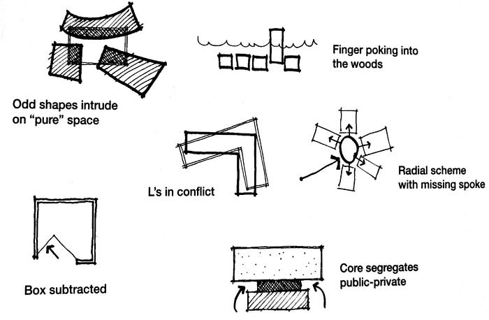
“A parti [par-TEE] can be expressed several ways but is most often expressed by a diagram depicting the general floor plan organization of a building and, by implication, it’s experiential and aesthetic sensibility. A parti diagram can describe massing, entrance, spatial hierarchy, site relationship, core location, interior circulation, public/ private zoning, solidity/transparency, and many other concerns. The proportion of attention given to each factor varies from project to project.”
For UX people, the idea of a unifying design concept is nothing new. Those I’ve worked with know I’m a big fan of the diagramed core content strategy statement, for example. I don’t burn a ton of time on it, but it is a great way to get the team aligned on the brand mission. Likewise, we’ve been using a lot of UX mood boards lately, or even simpler approaches like the 4x4 Mini-Design Brief.
But a parti can help you hone in on your desired experience even more. Architect-cum-experience-designer Steven Hien sums it up well with this example in his excellent piece How to Use Architectural Parti in Digital Design:
- Parti in Architecture: “Experience a building like a diamond.”
- Parti in Digital Design: “Experience a website like the California coast.”
What does a “website like the California coast” feel like? What does it sound like, or smell like? Now that’s a design challenge!
Of course apps and websites, unlike buildings, change rapidly overtime. The parti can provide the uniting force behind those changes (until you decide to bulldoze the whole creaky thing and start over, that is). Take Uber’s app redesign, for example, which evolved around the parti of “Where to?” leading to specific UI updates like re-working the product selection slider.
As a side note, we should point out that one shouldn’t take any of these concepts too far. I probably wouldn’t go up to my developer, for example, and complain that the latest code release “doesn’t align to the design parti.” (Unless you want to get punched directly in your parti).
4. “Any aesthetic quality is usually enhanced by the presence of a counterpoint.”

Building on the previous idea, just because you have a unifying concept does not mean all of your design elements need to be uniform. By contrast, adding a stylistic counterpoint to your design will emphasize, rather than detract from, the central idea.
“If you want a room to feel tall and bright, try designing an approach through a low, dark space. If you want an atrium to feel like a geometrically pure, highly organized center of a building, surround it with spaces that are more organically or randomly organized.”
In digital design, this can be something as simple as alternating light and dark layers as a user scrolls down a page, or something even more jarring like this example from Vanguard Prague. I’m not sure I love it personally, but the “static buzz” does create an interesting counterpoint to the otherwise minimalist design to emphasize the unconventional feeling of the living space.
What’s more, counterpoints in digital spaces needn’t be visual. With the advance of artificial intelligence (AI), interfaces like chat-bots can now respond to humans in real time, and are beginning to take on their own personalities. How might the inherently probing nature of a bot prove a useful counterpoint to the aesthetic quality of your site? It’s an interesting question, whether you’re creating AI to help with taxes, take out a new insurance policy, or simply text back your mum.
5. “A good building reveals different things about itself when viewed from different distances.”
Finally, this is a good one to recall in terms of designing for the first-time user as well as the returning user. In any new project, it’s easy to design with only new visitors in mind — where will they look first? Will they be overwhelmed with choices and flee? Will they hate us and trash us on Twitter? These are reasonable questions, but in reality, anyone can only be a new visitor once. Just as a well-designed building reveals new information to the inhabitant, your interface should provide sufficient detail and refinement to support the user who is up-close and personal, day after day. I’ve talked before about content density, longitudinal studies and other techniques for keeping this person in mind.
But this principle is also interesting in light of recent backlash against superficial, template-driven sites that skimp on actual content and value. UX designer Kate Meyer draws some clever architectural parallels in her article linking this backlash to recent trends toward brutalism and anti-design:
- Brutalism intentionally attempts to look raw, haphazard, or unadorned. A reaction to cookie-cutter, pre-made template sites that dominate the web today.
- Anti-design is brutalism without the rigor. Intentionally creating ugly, disorienting, or complex interfaces, often with a complete lack of visual hierarchy.
Of course, anti-design can get you noticed and talked about, but it makes longevity difficult to achieve. Clinging to an intentionally unintuitive interface, for example, is now blamed, among other factors, for where Snapchat went wrong.
It’s important to remember that the principles of these reactionary movements are founded in legitimate concerns about the sameness of today’s digital world. Reacting on that ground alone, however, can lead to a lot of equally terrible designs (and even some great counter-reactions like the site Brutalist UX Deliverables, which includes such awesome user stories like: “As a User I want to Visit the website so that I can See it.”) So it’s simply a question of how far you take it.
Or, to put it in terms of the age-old architectural question: Less is more? Or less is a bore?
Colin A. Eagan, M.S., is Principal for User Experience at ICF in Washington D.C., where he directs content strategy and information design projects for Fortune 500 companies, nonprofits, and government clients. He is a frequent contributor to UX conferences and publications, including Confab, Convey UX, IA Summit, and The UX Booth. He credits any career success thus far to not going to law school. You can follow him @colineags
Citations
- Frederick, Matthew. “101 Things I Learned in Architecture School.” MIT Press. August, 2007. FISBN: 9780262330541
- McKinney, Steve. “Get Up to Speed with CSS Shapes.” February 23, 2016.
- Kitney, Aaron. “10 Impressive Examples of CSS3 Animation.” Creative Bloq. August 23, 2017.
- Smith, Jared. “Accessibility Experts Warn: Stop Using Carousels.” Creative Bloq. July 10, 2013.
- Casey, Meghan. “Create a Content Compass.” A List Apart. June 30, 2015
- Polgar, Peter. “The 4x4 Mini-Design Brief.” Medium; The UX Blog. November 29, 2016
- Hien, Steven. “How to Use Architectural Parti in Digital Design.” Hero Digital. September 19, 2017.
- Hilhorst, Didier. “Designing the New Uber App: How Everything Started with a Simple Twist.” Medium; Uber Design. November 16, 2016.
- Milburn, Scott. “Creating a Chatbot: A UX Designer’s Firsthand Experience.” UX Mag. November 7, 2017.
- Nielsen, Jakob. “Is UX Getting Better or Worse?” Nielsen Norman Group. September 22, 2017.
- Meyer, Kate. “Recent Trends Toward Brutalism and Antidesign.” Nielsen Norman Group. November 5, 2017.
- Fiegerman, Seth. “Where Snapchat Went Wrong.” CNN Money. November 8, 2017.

