
Floating Action Button in UX Design
by Nick Babich
Floating Action Button (FAB) is a very common UI control for Android apps. Shaped like a circled icon floating above the UI, it’s a tool that allows users to call out the key parts of your app. FAB is quite simple and easy to implement UI element, despite that designers often incorrectly incorporate it into layouts.
In this article you’ll find answers on following questions:
- When to use FAB?
- What are best practices for FAB?
- How FAB and animation can work together to improve UX?
When to Use FAB?
For hallmark actions
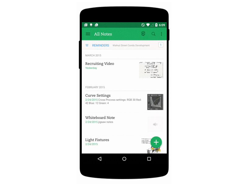
FAB highlights the most relevant or frequently used actions. It should be used for the actions that are strongly characteristics of your app. Ideally, the FAB should represent the core function of your entire app just like in the example below.

As way-finding tool
FAB is a natural cue for telling users what to do next. Research by Google shows that, when faced with unfamiliar screen many user rely on FAB to navigate. Thus, FAB is very useful as a signpost of what’s important.

Not every screen needs a FAB
It’s very difficult not to spot FABs because they are designed to stand out. But not every screen needs FAB simply because not every screen has an action of this level of importance. One good example is Google Photos app for Android. The app opens in a gallery view, which has a floating action button for search. Search is an extra action for the majority of users because most users will want to scroll the grid, not type a search query.

Best Practices for FAB
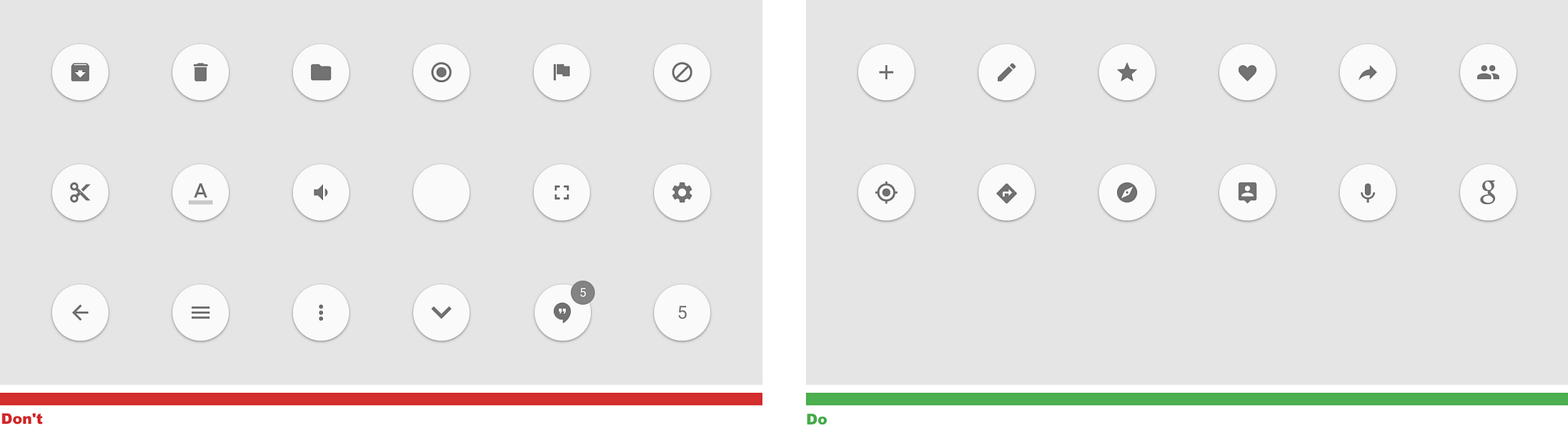
Avoid using unclear icons
The major problem with FAB is that it’s icon-only button and many icons are really hard to understand . As NNG points out, universally recognised icons are rare. And when users need to guess about the meaning of your icons, they have bad user experience.
It’s acceptable to use icons-only buttons but only if you make sure they are context-relevant and clear for your users. For example, if you have a note taking application it’s quite clear that the main purpose of the app is to take — and view — notes. And a ‘Pen’ icon would be great in this context.
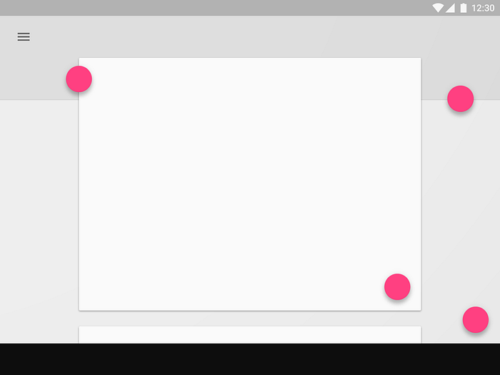
Use only one FAB per screen
Because FABs are so prominent/intrusive, FAB’s should be used once on a page or not at all.
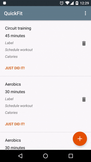
Use FAB only for positive actions
Because the FAB is characteful, it’s generally a positive action, like create, share, explore, and so on. FAB shouldn’t be destructive action, like delete or archive.
FAB and Animation
Floating action buttons are part of Material language and they are designed to be flexible. FAB can expand, morph, and react.
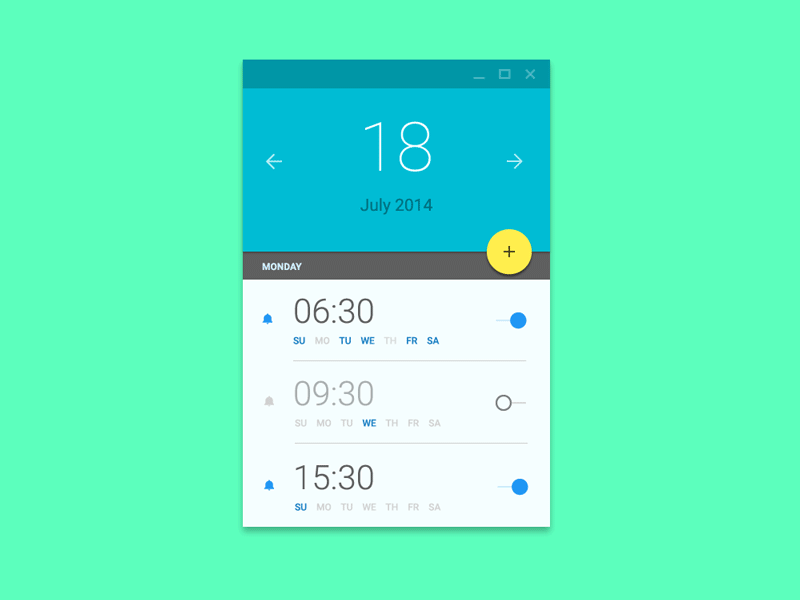
Expand into a set of actions
In some cases, it is appropriate for the button to expose a few other options on interaction (as seen in the Evernote example below). When the FAB replaces itself with a sequence of more specific actions you should design them to be contextual to your users. Keep in mind that:
- These actions must be related to the primary action the FAB itself expresses.
- As a general rule, have at least three options upon press but not more than six, including the original floating action button target.
FAB can morph into the new surface
FAB can help ease your users from screen to screen. FAB can transform into views that are part of the app structure.
FAB can improve transitions between screens
When morphing the floating action button, transition between starting and ending positions in a logical way. For examle, the animation in example below maintains the user’s sense of orientation and helps the user comprehend the change that has just happened in the view’s layout.
You can hide FAB on scroll
FAB can be hidden when scrolling down if it gets in the way (prevents user from reading the content). In example below, the FAB needs to be able to move out of the way, so that all parts of all list items are actually reachable.
Medium app for Android is a good example of using this technique. The Heart button disappears on scroll and reappears when the end of the article is reached — just when readers who liked the article would have wanted to use the button.

