Functional Animation In UX Design: What Makes a Good Transition?
by Nick Babich
Functional animation is subtle animation that has a clear, logical purpose. It reduces cognitive load, prevents change blindness and establish a better recall in spatial relationships. But there is one more thing.
Animation brings user interface to life.
Motion can make surfaces feel alive. Designers should use functional animation to smoothly transport users between states, explain changes in the arrangement of elements on a screen, and reinforce visual hierarchy.
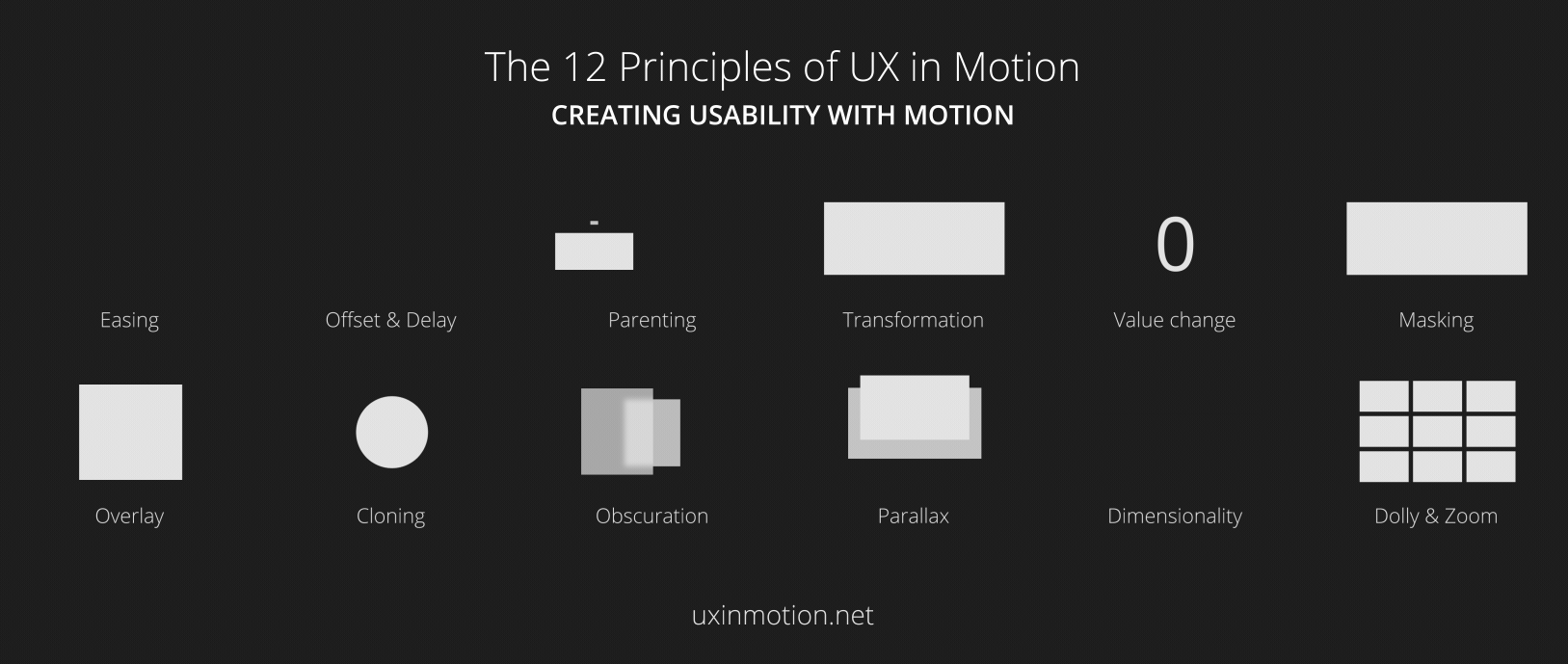
Successful motion design possesses the following six characteristics:
1. Responsive
Visual feedback is extremely important part of interaction design. Users want to see visual response to their actions because it appeal to the user’s natural desire for acknowledgement. In real life, buttons and other controls respond to our interaction, and this is how we expect things to work.

When we interact with a digital object, it should respond to user input with appropriate visual feedback. By doing that we reinfoce the sense of direct manipulation.

2. Associative
When users click on a particular element, and it responds with a new surface, we need to associate newly created surfaces to the element or action that generates them. The logic behind the associative connection is to help the user comprehend the change that has just happened and what has triggered the change.
Without associative connection you make your users wonder how two states connected. Don’t make users think!
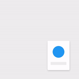
Below you can see two examples of menu transition. In first example menu appears far away from the touch point that triggered it, which breaks its relationship with the originator.

In second example menu appears right from the touch point.

Another example is an action button whose functionality changes under certain conditions. “Play” and ”Stop” buttons are probably the most common example of switchable buttons. Transforming the play button to a pause button signifies that the two actions are connected, and that pressing one makes the other one visible.
Strive to create smooth animated transition between states because it will make your UI look well-crafted.
3. Natural
Every movement in digital interfaces should be inspired by forces in the real world. In the real world, an object’s ability to speed up or slow down quickly is affected by weight and surface friction. In a similar way, starts and stops do not occur instantaneously.
Below you can see a good example where the user selects an item in a list to zoom into its detailed view. During expansion, the small card moves in an arc towards its destination as it expands into a larger card.

4. Intentional
Motion, by its nature, has the highest level of prominence in a user interface. Neither text paragraphs nor static images can compete with moving objects. Animated objects attract a lot of user attention and digital designers can use this property to create good transitions—transitions that helps guide the user to the next step of an interaction and help the understand how things work in the interface.
Here are a few great examples of intentional motion language:
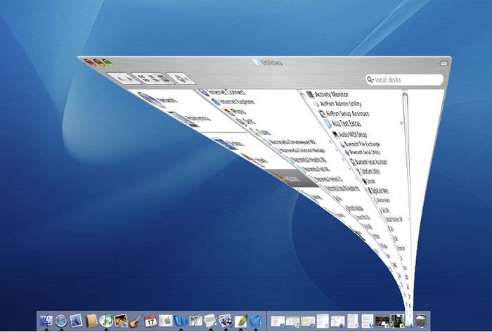
Mac OS uses a functional animation when minimizing a window. This animation connects the first state with the second state.
Another good example is a parent-to-child transition where user selects an item in a list item or card element and zoom into its detailed view. This interaction allows the user to maintain context.

5. Quick
When elements move between states, the movement should be fast enough so users don’t have to wait, yet slow enough so users can understand the transition.
Good timing is everything.
Slow animation can creates unnecessary lag and make interface look laggy.

Try to animate quickly so that the user doesn’t have to wait for the animation to finish yet be able to understand how things work.
Keep transitions short as users will see them frequently.
Keep animation duration at or under 300ms.

6. Clear
Too many moving objects in a same moment of time can cause confusion. This is especially true when multiple items move in different directions or cross paths.

Transitions should be simple and coherent
Remember, less is more with regard to all elements of UI, especially animation. So we should focus only on practical things the animation does for the user.

Conclusion
No matter whether your app is fun and playful or serious and straight forward, solid motion language can help you provide a clear and quick cohesive experience.
Thank you!
Follow UX Planet: Twitter | Facebook
Learn how to design better products
Interactions between computers and humans should be as intuitive as conversations between two humans. Interaction Design Foundation will help you to learn how to design for efficiency and persuasion.