Fundamentals of drafting good push notifications

Push notifications, love them or hate them, are now one of the most widely marketing communication modes. They’re all out there vying for our attention.
But this article isn’t about how to entice and get users to act.
This article takes a look at the technical aspects of how good notifications are structured, a fundamental that often can get overlooked.
Having only sent and used Android notifications so far, the article solely focuses on the same.
According to Material Design, the structure consists of:
- Header area
- Content area
- Action area
Header area:

The header area consists of:
- App icon: The brand logo
- App name: The brand name
- Header text (optional): Usually when an app sends notifications from multiple sources. E.g: Different email addresses
- Timestamp (optional): When the notification was received on the phone
- Expand indicator: To view media or more information.
*Sometimes, the structure might slightly differ depending on the app code used to send the notification.
Content area:
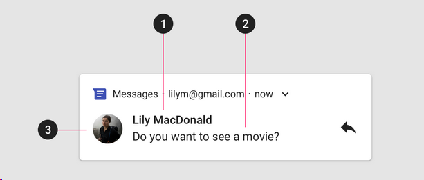
The content area is comprised of:
- Content title: This gives a brief headline or a gist of the main message
- Content text: This gives supporting information
- Large icon (optional): An image to reinforce the message. This is primarily used on messaging platforms. Eg: Sender’s profile photo.
Lastly, an image can also be added to the content area. The image is usually viewable only when the notification is expanded. (On a few older devices, the content area can get hidden when an image is expanded.)
Action Area:

The last part of a notification is the action area. Basically, the action you want a user to take after reading the notification.
*Sometimes when an image is added to the content area, this can be skipped.
Now, here’s what you must not do when drafting notifications:
- On the content title:
- Don’t repeat the app’s name — it’s redundant.
- Be under 30 characters. Preferably keep it shorter, because depending on the device content may get truncated further
- Give a brief about the notification, make sure this area contains the most important information
2. On the content area:
- Avoid exceeding 40 characters, if it’s plain text.
- If adding an image then keep it under 30. The text will otherwise go to the next line and not be viewable.
- Don’t repeat what’s in the title. (Things are best spoken with fewer words)
3. Don’t use the large icons for branding. Don’t add the logo again there. Use this space only if it adds value.
4. Don’t make the text action button’s content duplicate the behavior of tapping on the notification body. Basically, don’t repeat what’s on the content area on the CTA again.
These sound simple to follow, right? But surprisingly, it’s quite easy to find notifications that miss these fundamentals.
Few examples:


- Paytm, NY Times, and BBC use the content title to repeat the brand name. This is redundant and also not good utilization of real estate given that notifications already have limited space.
- Paytm and Amazon Music have used the Large icon to showcase their brand/logo. This adds no value to the notification.

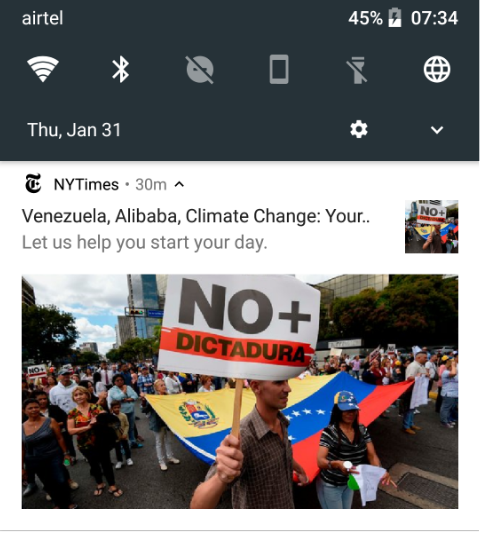
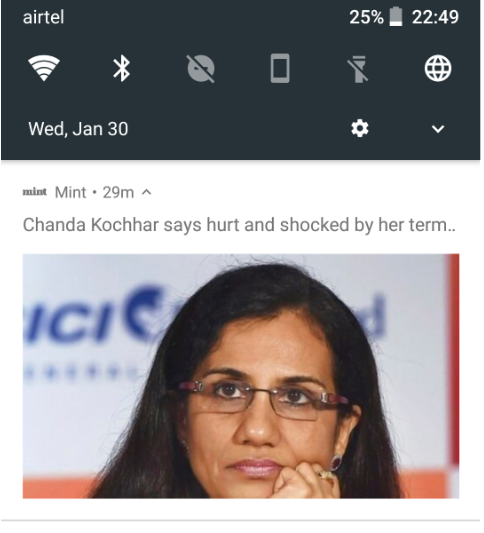
- The notifications here exceed the character limits on the Content title.
2. Mint isn’t following any notification structure. It’s missing a content title and the content area text, both of which exceed the character limit.
3. NY Times has repeated the image on the Large icon area.
Quick suggestion: The 1st notification is part of a “Monday morning briefing.” What The NY Times can do is to make a unique icon to identify the series to use on the Large icon area. It can so also avoid it being part of the Content Title.
What can be done to avoid these errors?
A quick way around to avoid these is to do a simple test with different devices (preferably on different Android versions) when drafting the notifications. It’ll help eliminate most, if not all errors.
To end, let’s look at a few apps that seem to be getting push notifications right:
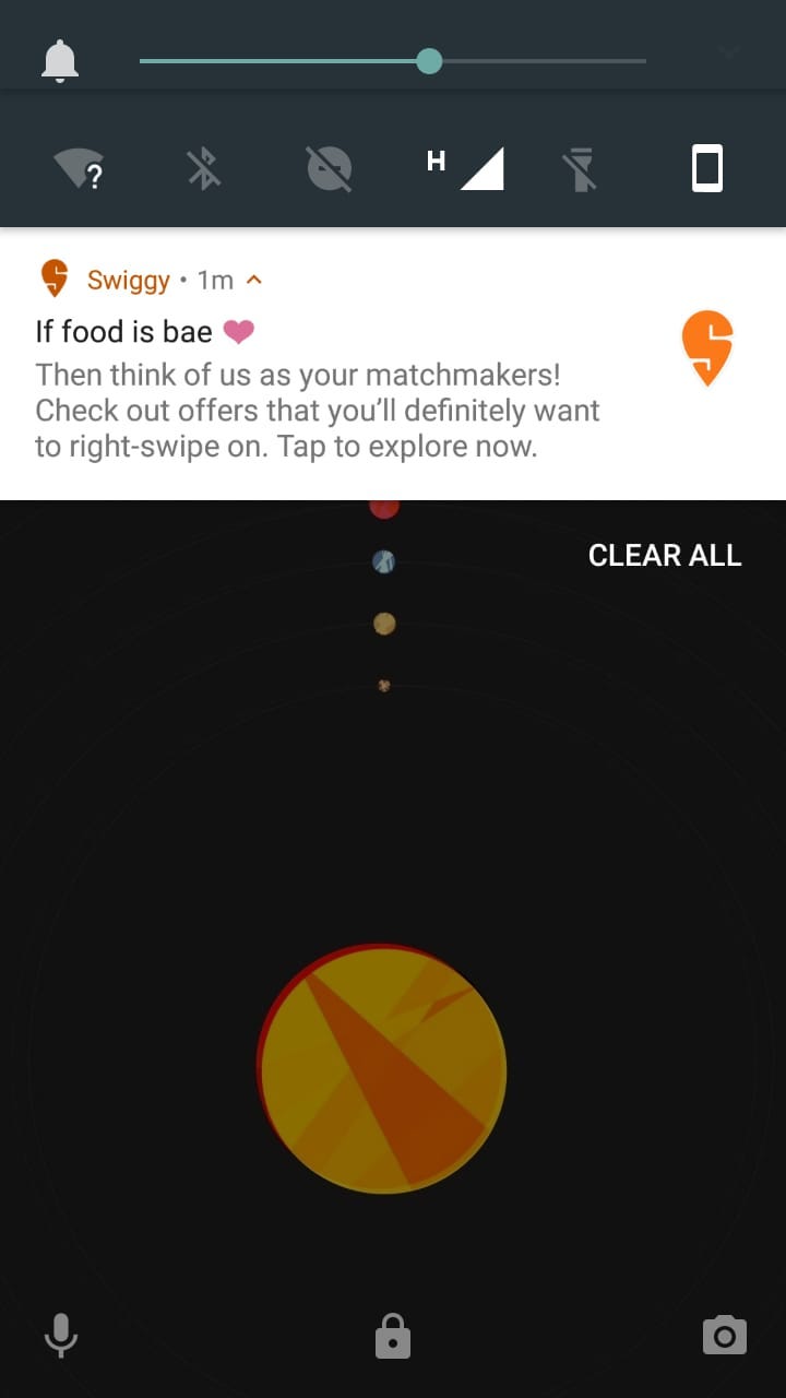
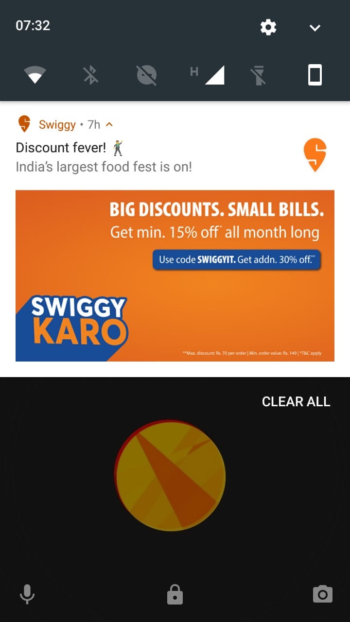

Notice the difference between the ones above and the earlier ones?
Now whether all these notifications are useful, relevant and personalized is for another article. And a look into iOS notifications is for another day (maybe when I own an Apple device). This is all for now though.
In case you have any other examples or thoughts about this, feel free to share them.
Source: Google Material Design guidelines


