
Gamified approach to sustainable lifestyle choices — a UX case study
An app for the British Columbia Sustainable Energy Association (BCSEA)’s Cool It Program
Project timeline: 3-weeks
Deliverable: Hi-fidelity prototype
Tools: Sketch, InVision
The Opportunity
Vancouver aims to become the greenest city in the world by 2020. The British Columbia Sustainable Energy Association (BCSEA) is a non-profit who supports this initiative by educating youth and creating public awareness about climate change.
The BCSEA runs the Cool It! Climate Leadership Training Challenge, where they hold workshops at elementary schools and provide a booklet for students to take home and track their climate-saving actions for four weeks. However, the current process is quite time-consuming as it relies on BCSEA to run workshops to introduce it, return to the schools to collect the booklets, then manually enter the data into Excel to calculate the students’ greenhouse gas (GHG) savings. Because of the effort required, the challenge can only be held at workshops that are funded by the municipalities. If it were an app, it could potentially have a wider reach.
BCSEA recently obtained new funding to expand the program for high school students. With this new opportunity, they approached Red Academy’s UX and UI design students with a community partnership project to build the Cool It app.
The project was executed by our team of five:

On Tuesday of the first week, we had a kick-off meeting with the client and identified:
Business Goals
BCSEA aims to expand the Cool It program beyond elementary schools, and encourage people to take action for climate change.
User Goals
Enable users to make changes in their lifestyle and see their impact in real-time (rather than waiting until the end of the 4-week challenge).
Project Goals
Create an engaging, user-friendly app that is accessible for the masses to track sustainable lifestyle activities.
Design Process
With this in mind, we dived into the design process: Research → Planning → Design → Prototyping → Testing.
Since I was the UX designer for this project, this case study will focus on the UX perspective.
Research
To start off, we created a hypothesis and looked at other initiatives in this space.
Hypothesis
We hypothesize that individuals believe they have an impact on the environment but are not motivated to significantly change their lifestyle.
Domain Research
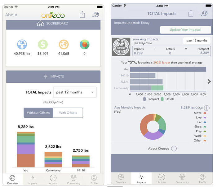
Oroeco is a similar app that allows users to track sustainable activities, compare to their local average and to their friends. However, the impact is not calculated per usage.
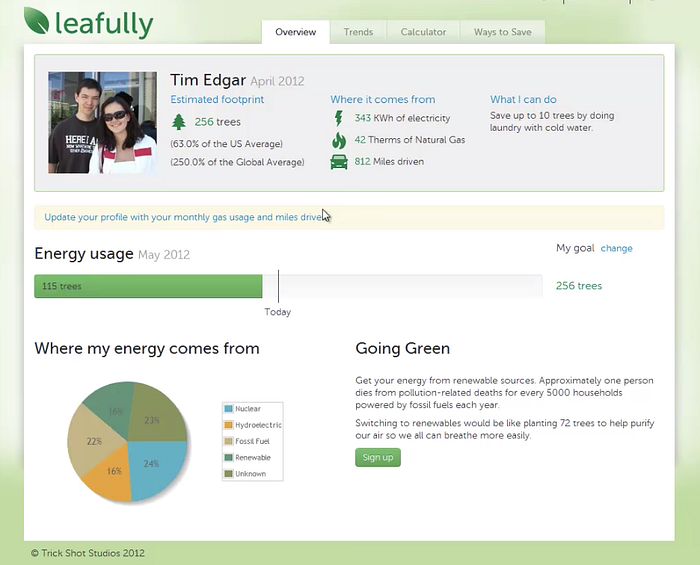
Leafully helps people understand their energy usage by getting data from their energy provider and translating it into a tangible measure — the number of trees needed to offset the pollution.

Give O2 tracks users’ daily transport and calculates emissions based on the duration and distance of the trip.
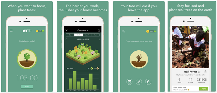
Forest is a productivity app that we took inspiration from. The Pomodoro timer is coupled with a visual representation of a tree being planted. If the user leaves the app during their focused time, the tree will die. Grown trees are added to their collection, which can then be added to their forest (second screen pictured). As they accumulate points, they could plant trees in the real world.
User survey
For our survey, we were curious whether users would be interested in a gamified or habit tracking approach to the app, so we included questions on these topics.
The survey was deployed to the contact list provided by our client, environmental subreddits, and our personal social media channels. We received 50 responses in 5 days. A quarter of respondents were between the age of 13 to 24, which is within our target demographic.
Key findings
- 98% of respondents were interested in environmental issues
- 90% of respondents were interested to find out about the environmental results of their lifestyle choices
- 57% of respondents have games on their electronic devices
- 56% of respondents (who used habit tracking apps before) found them helpful
Interviews
Due to the time constraint of the research phase (3.5 days), we interviewed people over the phone and sent out questionnaires when our availability didn't match. We gathered insight from:

A few responses particularly stood out:
“I found it’s easier to suggest my family to change a lifestyle than changing my friends’ behaviours.”
— Vivian, Grade 11 student
“For many of the youth that I know, the problem isn’t that they aren’t engaged — it’s that they don’t know how they can help.”
— Karina, Grade 12 student
“A lot of times it is the kids that introduce new, environmentally proactive ideas into our lifestyle. I think that the youth are already properly engaged in this topic. These ideas have been repeatedly stressed to them throughout their elementary school careers. It does, however, seem to slow down after they get to high school. There might perhaps be a benefit to enforcing these ideas to high school students.”
— Parent of Grade 5 and Grade 10 student
Contextual inquiry
We had the opportunity to attend a workshop held at Osler Elementary School’s Grade 4 and 5 class.
It was exciting to see the energy in the classroom — the happy dance from the little guy who answered questions correctly, the confidence from the lad who spoke about his expertise on environmental issues, the bossiness of apparent team leaders, and silly giggles of the general group.
We took these feelings of achievement and inquisitiveness with us as we moved on to the planning stage of the design process.
Planning
Affinity diagram
To analyze and find patterns within our research data, we summarized the common responses from our survey and interviews on Post-It’s and organized them into categories:

We discovered that:
- Many people would like to understand their individual impact and learn how to help.
- They would like:
→ to have concrete, actionable ideas
→ to learn from like-minded people and share their progress
→ a reward system to keep their bad habits in check. - In terms of usability, they would like an app that is intuitive and easy to use. The time it takes to log actions must be quick and as simple as pressing a button.
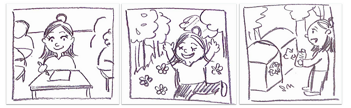
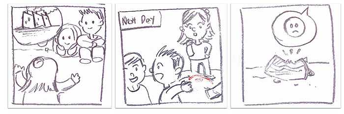
Storyboard & Scenario
We created a storyboard for our user, Amber.
User Persona
We created a user persona for Amber to highlight her motivations, goals, and frustrations.

Feature list
Shortly before the kick-off meeting, our client shared a list of 12 requirements and 13 possible ideas for the app. While they were all great ideas, we communicated the time constraint of the design sprint (3 weeks).
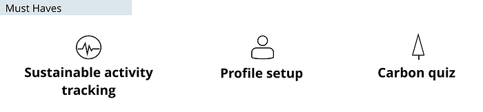
By the end of the kick-off meeting, we agreed to prioritize 3 features for the minimum viable product (MVP):
- Sustainable activity tracking — Targeting 1 general age group (high school students and the general public), including all content in the current challenge, and showing the GHG savings in real-time.
- Profile setup — For users who are part of the Cool It program, setting up personal profiles allows BCSEA to see which school and class they’re from.
- Carbon quiz — This is a series of 25 questions given to students before the workshop. Integrating it in the app allows the users to reference back to their benchmark.
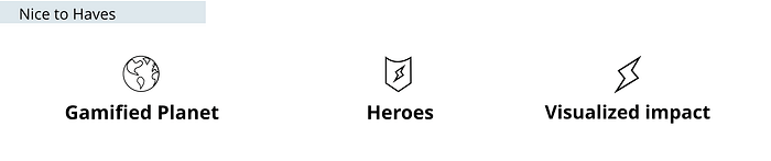
Building on the MVP, we pursued three additional features that make the app more fun:
- Gamified Planet— Points are accumulated when the user logs sustainable activities, which unlock awards. Awards can be placed on the user’s “planet page”. As they progress and collect more awards, the image of their planet grows.
- Heroes — If they are part of the Cool It program, they can see how people from their class are doing on the leaderboard.
- Visualized impact — See their average greenhouse gas savings, total points, and carbon quiz score. Visualize their progress on a line graph, which has filters to view their progress by category and by time.
User flow
With the features in mind, we created the user flow for the app.

This is the final version of our user flow, which is the same as the hi-fi prototype shown later. There are two parts I wanted to highlight:
- the Onboarding process (left-third): the app is created for the Cool It program users and for the general public.
→ When users first open the app, the app asks whether they are part of the program.
→ If they are, the app prompts for their school, class, and a special code to validate they are part of the program. If not, this step is skipped.
→ In both cases, the user then creates their account credentials, and then they are taken to the carbon quiz, which becomes their benchmark going forward. - the Day-to-Day process (right-bottom corner): Each day, the user goes to the Activities screen to enter the sustainable actions they’ve taken.
→ The user selects a sustainable activity to add it.
→ The system shows the number of points they are accumulating to give instant feedback (i.e. the points go up by 50 or 100 after each activity added).
→ The user repeats this process for all their activities that day.
→ The user submits this by clicking the “Calculate my impact” button.
→ The app calculates the GHG savings and tells the user whether they have enough points to collect an award for their planet.
Design, Prototyping & Testing
I had a hard time grouping my content under these headings because we didn’t have distinct design, prototyping, and testing stages — all three pretty much happened simultaneously — so I will use subheadings instead. Welcoming feedback on this format!
We started by whiteboarding wireframes at our design studio where we worked on the same step in the flow and came up with a design in 2 minutes, debriefed for 1 minute, and then iterated for 2 minutes.
After narrowing down those ideas, we sketched low-fidelity paper prototypes, before digitizing those into mid-fidelity screens in Sketch. With each iteration, we tested specific steps and improved on specific parts.


Iterations
In this case study, I want to walk you through one of the iterations. Let’s take the Activity Tracking feature and the Travel Smart action as an example. This is where the user would log that they biked to school instead of getting a ride.
As illustrated below, we started with the paper-based booklet that the client provided and translated it into an app screen:

Once we digitized this, the content didn’t fit, so we split it into two screens. However, our testing informed us that it required too many inputs (date, location, and mode of transportation, before clicking Save). The user would have to repeat this for each activity.

We took a different direction and condensed all of the activities into one screen using a carousel layout. This way, the user will just have one page to click through each day. The date parameters at the top allow users to retrospectively add activities if they had forgotten.
We wanted to retain as much of the client-provided content as possible, so we introduced a second panel where they can learn more about the different activities.
But, the feedback we received is that the users might not know to toggle left and right, and the two screens appear isolated (the position of the activities on one doesn’t correspond with the other). The user could have trouble locating the information.

At the end, we co-designed our final iteration with the client. When users click on an activity, there would be a pop-up showing the description, and then the user tap “+” to add the activity.
This design would require one extra tap for each action, but then they won’t be navigating to different pages to view the content.

Testing
Throughout all the iterations, we asked people to test the app by:
- creating an account,
- doing the carbon quiz,
- logging activities: (1) travel smart, (2) refuse reduce reuse repair recycle, and (3) community action
- go to the planet: (1) view your awards, (2) add an award to the planet
In addition to the feedback captured above, we received other suggestions:
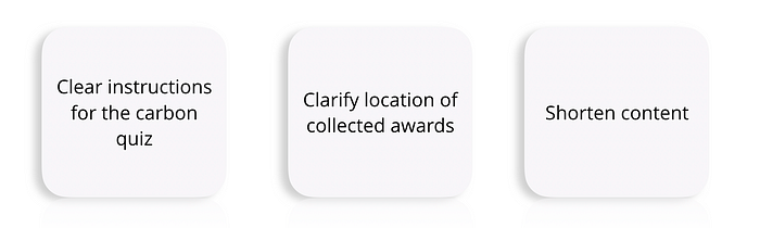
We resolved each by:
- Adding instructions on the top of carbon quiz rather than the page before
- Testing participants had trouble navigating to their collection of awards for the planet, so we added some copy to clarify
- They thought some pages were text-heavy, so we made the client-provided content a little more concise
Delightful Design
Beyond the feature list, we considered delightful design elements to keep the users coming back:
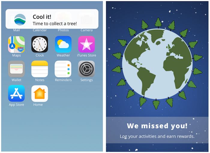
- If the user hasn’t logged on to the app for a while, a notification will remind them to collect a new reward.
- Once they click on the notification, the app would welcome them back and encourage them to log their sustainable activities.
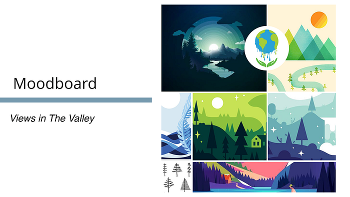
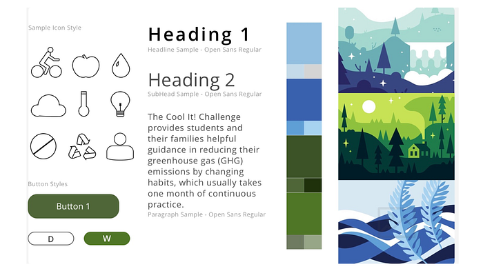
UI Design
While we were working on the UX, the UI team was busy creating the visuals for the Cool It app. Here’s a snapshot of their work:


Hi-fidelity prototype
Our final prototype was created using InVision:
Future Considerations
To expand on the current design and incorporate the client’s other ideas, here are some of the future considerations for the Cool It app:
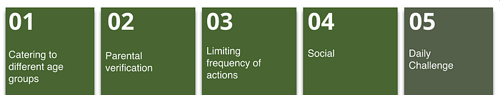
- Catering the content to different age groups to ensure users have specific, actionable content (i.e. what elementary school students can do independently versus adults)
- Including a parental verification step for younger students. The paper-based booklet requires parents to initial that the student has done the sustainable activity.
- Limiting the frequency that a user can complete the same activity, in order to discourage users from only repeating easy tasks, and encourage them to discover more ways to be sustainable.
- Adding more social aspects to the app — ex. adding people to your circle, creating contests with your friends, sharing photos of sustainable activities to share ideas.
- Daily challenges — ex. quizzes to get bonus points
Next steps
During the sprint, we presented our in-progress prototype to our neighbouring App Development class. The purpose is for them to understand the context and complexity of the app, in order to assess whether the app can/should be built in-house at Red Academy
— and it was selected!
At the end of the three weeks, we presented the final prototype to our client. She was very pleased with our work and was thrilled to hear that it was selected for development.
Reflection: Collaboration with Client, UI, Devs
Upon reflecting on this project, the successes, and the hiccups along the way, I realized that open communication was the glue that kept all parties together.
From day one, we were upfront with the client about what we can achieve in 3 weeks. When we took a different design direction, we scheduled a Zoom call to get her buy-in and make sure we’re on the same page.
Within the design team, we held daily scrums, openly shared our work in progress, and discussed the challenges we’re facing. We passed on draft mid-fi screens to the UI team so they can start playing around with different designs. We let them know asap if we needed a new icon and got their input on whether a new graphic is worth the effort.
With the Devs, we marched in a couple of times (at their convenience) to explain the inputs and outputs of the GHG calculator so they can tell us what it means when the app is connected to a database. This prevented us from going down a rabbit hole for a design that isn’t doable from a technical perspective.
There is definitely room for improvement in our prototype, and moving the app to the development stage is going to uncover some missing elements (ex. screens beyond our main flow, such as empty states, account settings screen, etc.) but I am excited to collab with the Devs and see the impact of the Cool It app in BC.
Thanks for reading! If you liked it, please clap or leave a comment. All feedback is appreciated!

