Member-only story
Getting started with grids in digital design
The 5 types of grids and how best to use them

You open your design program of choice and there it is staring back at you, a blank canvas. It can be a little intimidating. Where do you start? Where do you put the headline? A grid is just what you need to get started.
What is a grid?
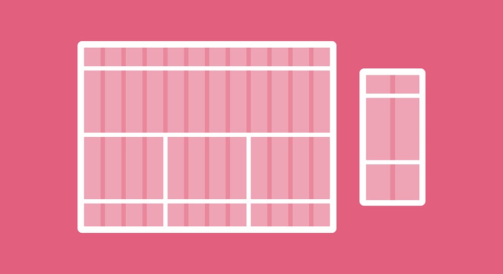
Grids are the skeleton of design, they create alignment, help you create order, and organize the content of your design. Whether you’re creating a layout for print like a magazine or combining images and text to design a landing page, you will use a grid to help you make design decisions and create a good experience for the user.
Using a grid eliminates random decision-making. Instead of placing elements in random places, by using a grid properly, you’ll know exactly where to place elements like a logo, menu items, a headline, body copy, images, and more. It will help speed up your design process.
Where do grids come from?
Before we get into how grids impact web design today, let’s dive into a quick history of where grids came from and how they were used. Grids are essential for organizing typography, they first used to organize type in manuscript layouts. Take a look at how well-organized this spread is from an early manuscript page.

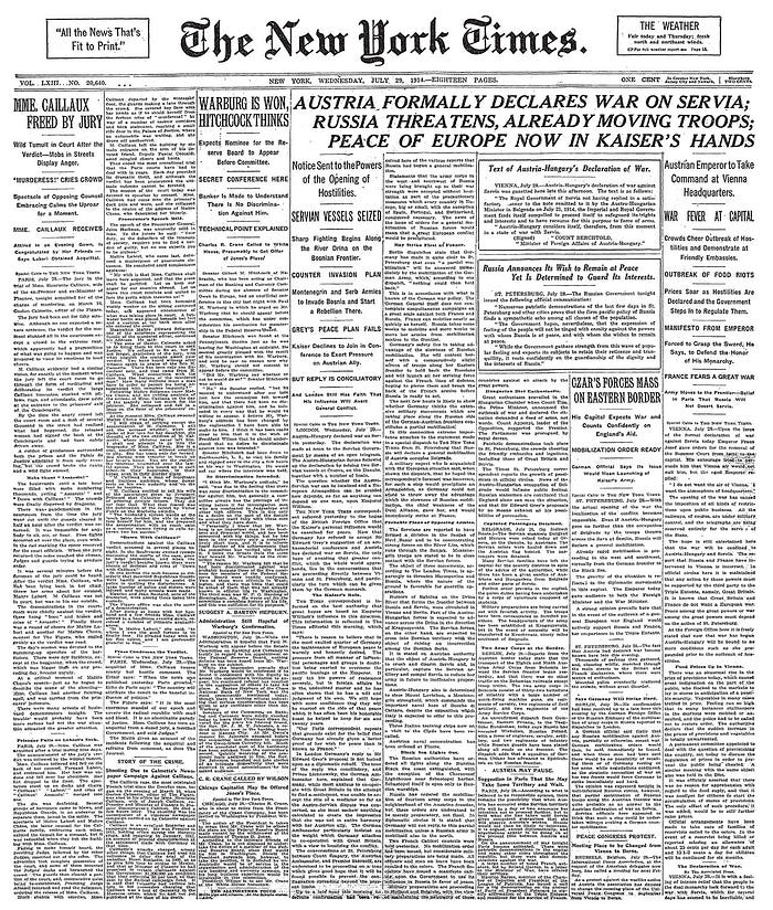
Fast forward to the Industrial Revolution and the introduction of mass production, newspapers, posters, advertisements, and other printed materials were printed in abundance.

In the 20th century, designers like Jan Tschichold and Josef Müller-Brockmann developed new grid systems that became what we know today as The Swiss-Style or The International Typographic Style. They introduced a modular approach with plenty of whitespace.


