Getting Started With Hackathons And Design Competitions.
Hackathons and design competitions are a great way for students and junior designers to get a feel for industry-ready design while also gaining credibility for their portfolios if they win awards. However, I found that many design competitions and other hackathons always advertised themselves as “beginner-friendly” yet it was unlikely that these beginners would make it all the way to the finalists with the limited guidance provided by the competition. In this article, I will share some tips based on my competition experience. With this event, I hope to make design competitions more accessible and actually beginner-friendly.
A bit about me
I am Nicolas, a UX designer. I have competed in multiple design competitions and hackathons throughout the years. I have also played multiple roles such as designer, researcher, web developer, and presenter. If any of this interests you, feel free to connect with me and I’ll be happy to chat.
An introduction to competitions
There are a wide array of competitions currently being offered, with the advent of the pandemic, many of these competitions are now being held online, presenting many participants with a more accessible option to join. Generally, a competition provides participants with a prompt for a design that they would have to create. This prompt can sometimes be really specific or super vague, depending on the competition. For example, a recent design competition that ended just before the holidays last year was a competition hosted by Adobe and Patagonia. As you all know, Patagonia is a large retail company that also has a global initiative called Fair Trade where they try to reduce fast fashion internationally. During the opening event, designers talked about their jobs as designers at Patagonia and also about their contributions towards the Fair Trade initiative. Then as participants at this competition, we were given the prompt of designing an app that incentivized people to help reduce fast fashion practices.
Approaching the prompt
Now let’s say that you have been given your prompt and are prepared to start your design. Well, the first thing is starting with a great idea that solves the prompt but has original and creative elements.

So the first thing that you should do is analyze the problem and first determine who you are trying to target with the app or interface.
When you have determined your target audience, it is now easier to shape your interface towards this more specific audience. You can then start ideating and exploring certain features that you might hope to see during this final product. Keep in mind that jumping straight into prototyping for your final product is inadvisable at this stage. You might run into an issue later on and your commitment to the final product may be a bit too inflexible to make changes. So this ideation step is just exploring certain aspects that might work and could solve the prompt.
Now it’s time for you to start testing. Steps 4–7 are all about testing the specific features that you have explored during the ideation phase. UX is all about telling a story so you want the users of your interface to feel as though they are being transported seamlessly from one feature to another. This is why testing your features is so important. Through testing, I have uncovered many issues in all of my designs that seemed trivial at first but after doing the tests myself, I was actually horrified that something so simple was actually overlooked. So to help everyone visualize what this process looks like, I’ll provide an example from another recent competition.
Exemplifying this process
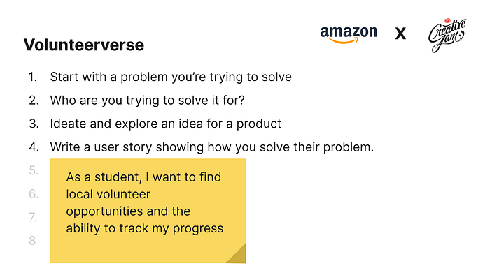
There was a competition last year hosted by Adobe and Amazon and the prompt was to design an app for users that helped improve their volunteer experience. An app like this doesn’t currently exist and could really streamline the process of volunteering, it could also help incentivize more people to volunteer with a simple and intuitive interface. Their prompt also put a focus on inclusivity and accessibility for volunteers and to ensure that experience of everyone was the same regardless of their circumstance.

So my teammate and I first framed the problem. We knew that we had to place an emphasis on inclusivity and accessibility for people interested in volunteering so we kept that in mind throughout the competition.
We then looked more specifically at the target demographic. We extended our scope to students specifically and according to stats Canada, we found that students were the largest demographic volunteering with over 58% of people aged 15–24 years old were actively volunteering.
Now with our target demographic and inclusivity and accessibility in mind, we then started exploring features that the app could potentially showcase. Since we were trying to cater to a relatively younger audience, we wanted a unique UI that seemed modern and had a trendier feel to it. We also wanted chat functionality since networking and communicating with peers was something that starts to gain prevalence in this age demographic. Finally, we wanted to add some sort of a gamification concept that should incentivize users of this interface to keep on volunteering. From these 3 points, we refined it into 3 more specific features that should appear in our final product.
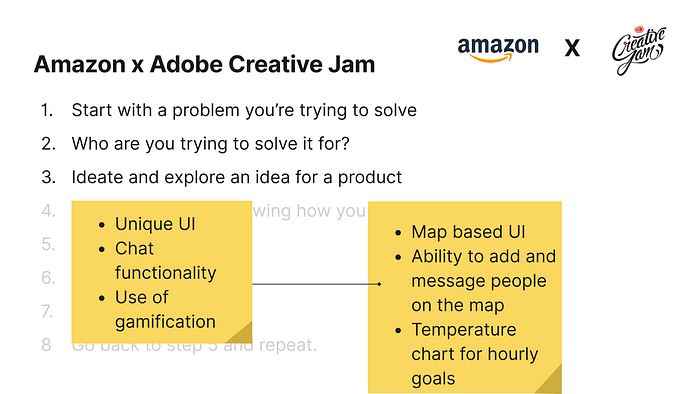
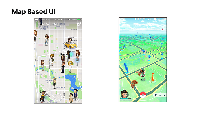
For our main screen, we wanted to use a map-based UI, and we drew metaphors with Snapmaps from the Snapchat app and the main interface on Pokemon go. This was interactive enough and all useful icons would be located around this central map.
Now the next step was to empathize with a user and determine a typical user flow that might occur when using your interface. Here, we took a look at a student that wants a quick and easy way to look for local opportunities nearby and another method to track their volunteering progress. This seemed like what the majority of students were looking for, so this confirmed our initial hypothesis and we could then proceed with the map UI.
Ideally, for the remaining steps, you should be testing the specific features that you have implemented and eliminating unnecessary elements in your design. Now, I won’t go into the testing aspect since this was just testing which fonts, sizes, and locations of buttons were the most effective but nevertheless, this is still a crucial step that you should not skip.
So the last step is doing the same process for all of your other features. When all of your features are done, now do the same testing for the final application with all possible user flows. Again, I want to emphasize that UX is all about storytelling so you need to make sure that the transitions from one screen to the next are as seamless as possible as if the user is going through a story flow of their own.
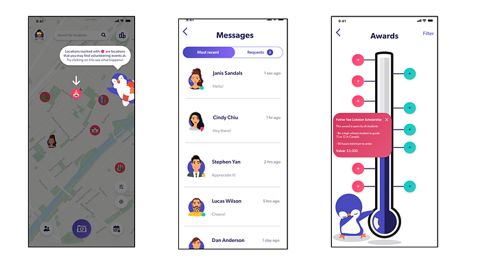
Here are our final screens for the 3 features that we discussed earlier. The map UI with some tooltips for easy onboarding for the user is this one on the right. We referenced a similar UI that was pretty popular for this age demographic. You can see how all the buttons are integrated seamlessly with the main map screen and each sub-screen can be quickly accessed from this screen. This ties back with constant testing which resulted in an optimal placement and size for these buttons. The middle screen is the chat UI that we developed. Here we tried to maintain the same color scheme and UI with the other screens, again maintaining the story that we are trying to take the user through. Finally, the awards screen where users can view their progress is the gamification aspect that I was describing earlier. It shows the progress of how far the user is to their next goal, thus incentivizing them so that they can reach it.
Now during this competition, there were 4 separate rubrics that the judges graded us on. Most of them were typical to most design competitions like the design of the interface and the user experience. However, something that is also very common in many design competitions is the innovation part of the grading scheme. During this competition, we received the highest grade for innovation. Now innovation starts with the user. It is important to empathize with the user and their flow throughout the usage of your app. You must first understand what they are specifically looking for in your interface. In our case, the user wanted to find nearby locations where they could volunteer and also be able to track their progress. This is how we settled on a different idea that nobody else in the finalists applied which was a map-based landing page.
Another tip that I attribute to success in design competitions is using metaphors. This ties in with understanding the user. After understanding the user’s needs, it is also important to understand what they interact with on a day-to-day basis. Here we made a parallel with Snapchat and Pokemon Go, two UI trends that had a significant impact on this specific target demographic. Although the hype around Pokemon Go has tapered off, Snapchat is still widely in use today and the map-based UI of both apps are what we referenced to create this successful product.