Member-only story
Getting started with visual hierarchy in design
3 ways to easily create hierarchy
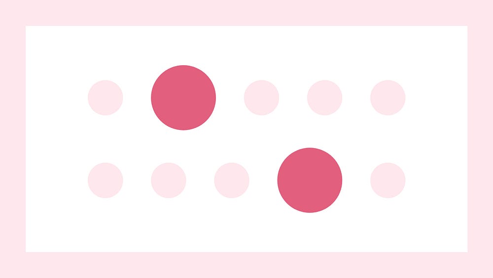
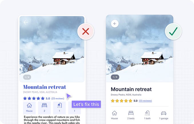
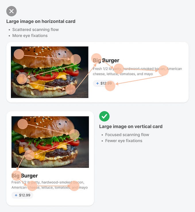
Hierarchy ranks the importance of design elements on a page. What do you want someone to see first? Should it be the title on a webpage that creates a strong call to action or maybe a photo or illustration that gives more context? Let’s dive into these design examples and learn how to create better hierarchy.
What is visual hierarchy?
There are multiple definitions of hierarchy, most refer to a system of organized rankings or order or power structure to help everyone know who is on top and most important in a chain of command. But when it comes to design, visual hierarchy is related to all the elements you see in a design and how they are perceived in order of importance.
The best examples of hierarchy in design come from poster design. Similar to a billboard, posters are usually displayed large outside of a building or somewhere there is high foot traffic. But you have only a few seconds to catch someone’s attention before they walk past. One way to do this is to design the poster in a way that something stands out in importance.
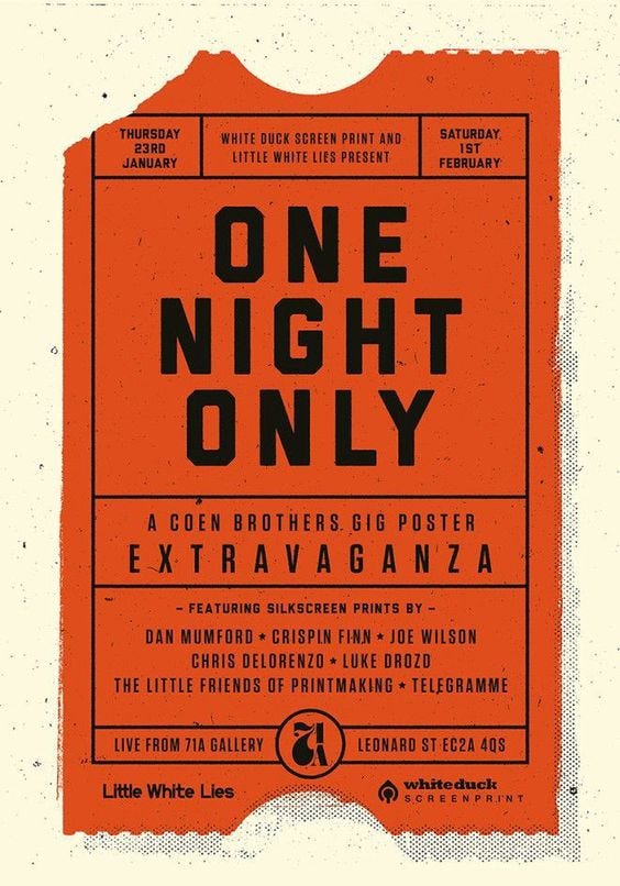
Take a look at this poster, notice how the design is simple, it uses a limited color palette and mostly typography and lines to create this striking design. But even though the design is mostly made up of type, there is still a level of hierarchy, you notice the large headline “One night only” first because it’s larger in size, it’s set to all caps, and it uses a bold typeface.
Why is visual hierarchy important in design?
If every part of your design is of equal importance, then nothing will stand out. When it comes to web or app design, this is crucial to avoid. Using hierarchy will help you guide the user along the correct path. Is this the first time they are using this app? A good onboarding experience will help introduce them to the key functions of the app. Likewise, the first impression someone has of a website is vital for them to return.


