
**Update**
A week after this case study was published, I was invited down to the main office and met with Amir Mostofi (Head of Design) and Ben Bostock (Product Designer) to get some feedback and gain insights into the future of design at GoCardless. Incredible experience!
Project
Design the GoCardless mobile application for customers (e.g. small business owners) to control cash flow even more efficient and hassle-free.
This is an unsolicited concept — not an official GoCardless project.
My role:
- Product strategy
- Research & Analysis
- MVP solution
- Information Architecture
- Wireframes
- Visual Design & Prototype
GoCardless
The company is creating a new international payments network to rival credit and debit cards. Their ambition is to break down barriers so businesses can quickly and easily take payments from anyone, anywhere in the world.
We’re bringing Direct Debit into the digital age, building the best system for taking recurring payments.
I’ve been a massive fan since I joined back in March 2016 to collect client payments for my personal training business (www.flexiblestrength.co.uk) in London, UK.

Before using GoCardless, a huge chunk of admin would consist of keeping track of client sessions and notify them when they’re due for another block of PT sessions.
The problems is that the message would often get lost in the plethora of emails; clients can forget to transfer the payment before the new block; it was generally a nuisance to access online banking — although it was only 3 years ago, online banking required multiple steps to log into the main portal (i.e. physical secure key).

GoCardless has helped me evolve and simplify the business admin. Instead of charging blocks of sessions, I now set up Direct Debit payments for new and existing clients.
Every 3 months, I’ll review their overall progress, and if we continue working together, I’ll just put them on a new payment plan.
Everyone’s happy.

So why an app?
As a freelancer, I found myself spending more time on my iPhone than the computer during work and out of hours (commuting, coffee breaks). And because the dashboard is not particularly mobile-friendly, I’ll usually wait until admin time on the MacBook — setting up payment plans, check payment statuses, invite new customers.
This sparked the GoCardless app idea…

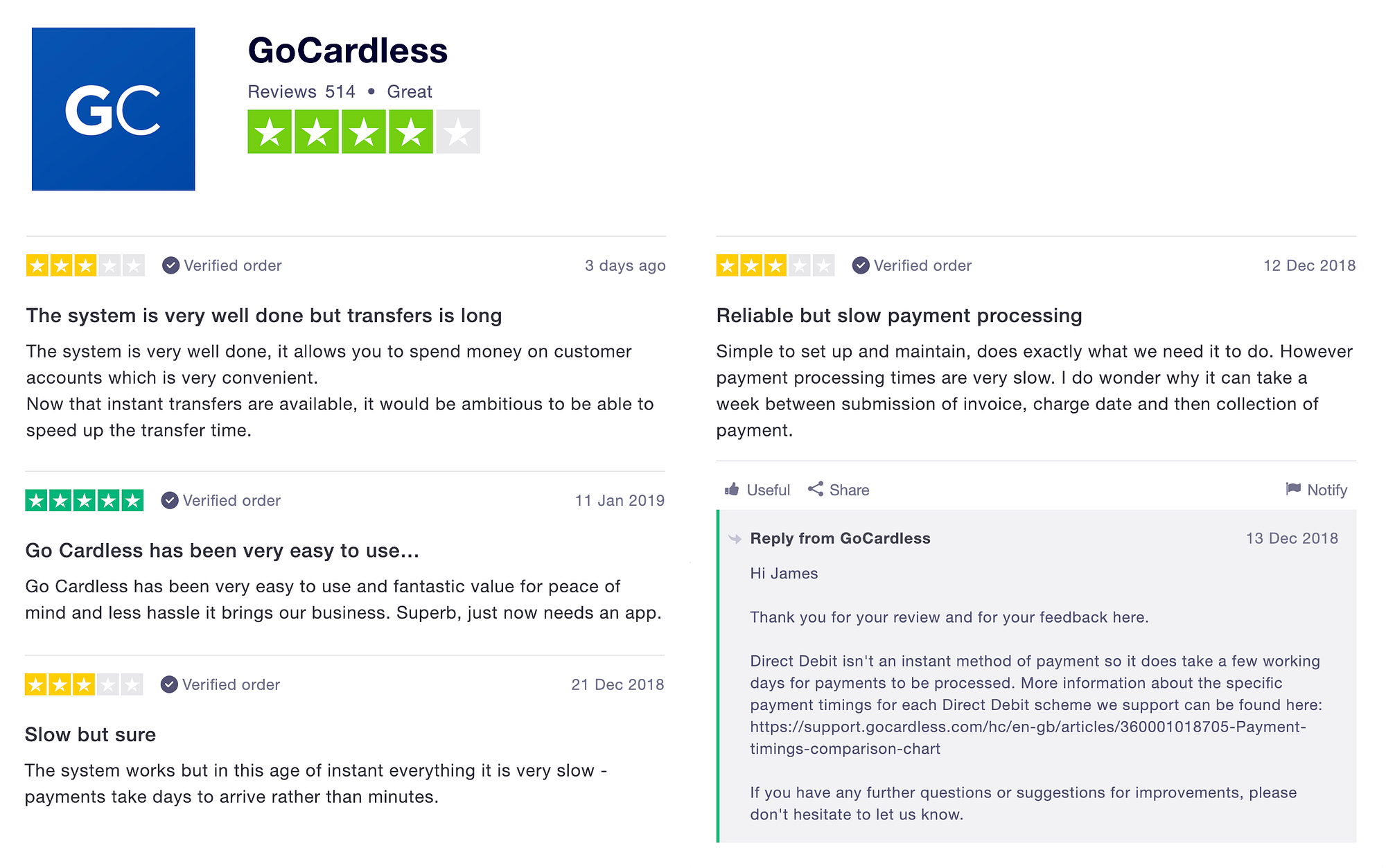
But before I got too carried away with my hypothesis, I asked other businesses to share their experiences using GoCardless. I also checked out Trustpilot reviews and got a general feel of the problems users had. This led me down the rabbit h🕳️le…
Problems
- The end-user dashboard displays the desktop version on mobile — as statistics show, internet usage on mobile has massively increased in the last 5 years, overtaking desktop computer in 2014 so it’s important to consider mobile first design. Users are also required to manually log in every time with their email address and password.

- Debit and credit card transactions — will always be faster than Direct Debit (2–4 working days) compared to instant card authorisation.
But what if there was an accessible way to monitor cash flow and receive notification updates from their mobile phone? It won’t improve the transaction speed, but users may find this more helpful along with numerous advantages for using Direct Debit.

- Missed notifications — Users receive one email notification per transaction update (e.g. paid out, cancelled, failed). Given the volume of online information we get daily, we can easily miss the email. (Check out: ‘Don’t let email become your ball and chain’ by RealBusiness).

MVP app solution
The design approach was to improve the mobile experience while respecting the product’s existing branding (as close as possible) and focus on usability issues.
- Provide a seamless and straightforward way to monitor cash flow, invite new customers and set up new payments on mobile (iOS)
- Responsive design for a pleasant (on-the-go) mobile experience similar to applications like PayPal
- Provide users with quick and secure access to their account (Face ID/Touch ID/pin code)
- Push notifications for the latest updates
- The mobile application should go hand-in-hand with the main dashboard — certain functions will remain accessible only through the site (e.g. ‘Events’ and ‘Developers’ tabs)
Important point:
The GoCardless team are smart people. Plans may already be in place to release an app down the line. If not, they’ll have valid reasons to scrap (or delay) the idea due to business requirements, resource constraints or technical limitations.
I’m simply offering an additional solution based on personal experience, feedback from other GoCardless users and online reviews. This has given me the opportunity to flex my design thinking skills 💪
User Research
Key takeaways from local business owners:
“I love GoCardless. But I do find myself constantly checking my inbox because it’s more convenient than logging on the dashboard.”
“Back in the days the Direct Debit process was long and complicated. Thanks GoCardless for making it easy for us small business owners!”
“I’ve reduced my admin time but I still spend time figuring out when customers has approved payments and roughly when it’ll be paid out to me.”
“I want to check payment statuses on my phone but chunks of information can cut off from the screen, even when I try swiping across.”
“Our ambition is to break down barriers so businesses can quickly and easily take payments from anyone…”
Over 30,000 companies of all sizes trust GoCardless so they’re doing something right. I want to think if they’re going to rival with card transactions, it’s better to focus on improving/introducing products that will continue to help businesses monitor cash flow and take (recurring) payments with ease.

According to research, the average small business is owed over 63k in outstanding payments. This has a huge impact on cash flow, and means having to spend extra time, money and resource chasing payments, which takes away from higher value work and any plans for growth. — https://gocardless.com/guides/posts/five-things-direct-debit-can-do-for-your-business/
Information Architecture
To design a user-friendly product with a clear navigation system, I had to organise the content and form a skeleton of the layout — with the help of going through the current dashboard user experience.

Low & mid fidelity
In my mind, I had a clear idea of the look and feel. However, when it came to sketching on paper, I was stuck with the ‘perfectionist’ problem. I wanted to get every detail spot on and procrastinated numerous times while staring at the blank pages.

This project has taught me to expect the ugly first draft and overcome the ‘resistance’. (Credit to Steven Pressfield)

Visual designs & Prototyping
The idea from the start was to follow the brand guidelines because it’s important for existing customers to be familiar with the new application right from the get-go.
I relied on screenshots and the eyedropper tool to pick out the colours. After the first version, I stumbled across https://brand.gocardless.com and ended up changing the colour palette — a rookie mistake on my part.


With that said, I attempted to download other resources (typography, icons, UI components) but the files required the owner’s permission to gain access. I then emailed the design team and received a delightful response within minutes…

Although I had to improvise using another typeface and a set of different icons, the primary purpose was to create something useful and enhance the overall GoCardless experience.
It was essential to keep in mind the mission and focus on “impact over beauty” (one of the GoCardless design principles).

Check out the prototype: https://marvelapp.com/58j3i28
(To any GoCardless users reading this, I would love to hear from your feedback)
Screens

Potential ideas (after MVP release)
- Introduce holistic ways to promote plan upgrades within the app — when businesses grow, the needs evolve so the ‘Plus’ or ‘Pro’ plan may bring more value. The ads should never come across as spam or hard-selling.

- Live chat feature — GoCardless take feedback seriously. And they’re known for their customer service so depending on logistics and technology, allowing users to contact the support team via the app can add to the overall experience.

Conclusion
Design is a continuous process. By acknowledging this from the beginning, I was able to focus on the process and avoid finding the perfect way of doing things. Not only did I enjoy the problem-solving aspect of it, I saw plenty of similarities between product design and my approach to personal training.
I’m aware of every decision I’ve made for this project may not be the best for the company. I would love to get insights from the GoCardless design team and welcome feedback.

