Good or Bad Design?
Designs of Physical and Digital Products around us - A Raw Perception!
Is this another blog comparing good design and bad design of products? No! I’m just a common man trying to learn UX Design and you know, one should never underestimate the power of a common man :)
Well, I’ve just started my design journey with this blog as my very first project which is about a raw observation of everyday products we use, an observation without any preconceived notions and conceptual backing. I haven’t read any books, research papers, or case studies, before writing this blog on purpose, the purpose to deliver an authentic “Raw Perception” to my readers, I just learnt to look at things differently! but after updating the second part of this blog which will be a raw observation of Digital Products coming this Sunday, I’m sure reading this awesome one “The Design of Everyday Things” by Don Norman.
So, while I’m writing this blog what is Good and Bad Design for me in inverted commas? Well, “Good Design for me is any product be it physical or digital that delivers the desired or expected outcome easily, efficiently and pleasantly and a Bad Design is just the opposite!”
Okay, so let’s get started, showcased below are the pairs of five types of physical products I found at my old place, I’ll try and describe their usability in short, but I won’t categorize them as good or bad designs, as our ancestors rightly say “One man’s food can be another man’s poison” so I’ll leave the categorization part for you, Here we go!
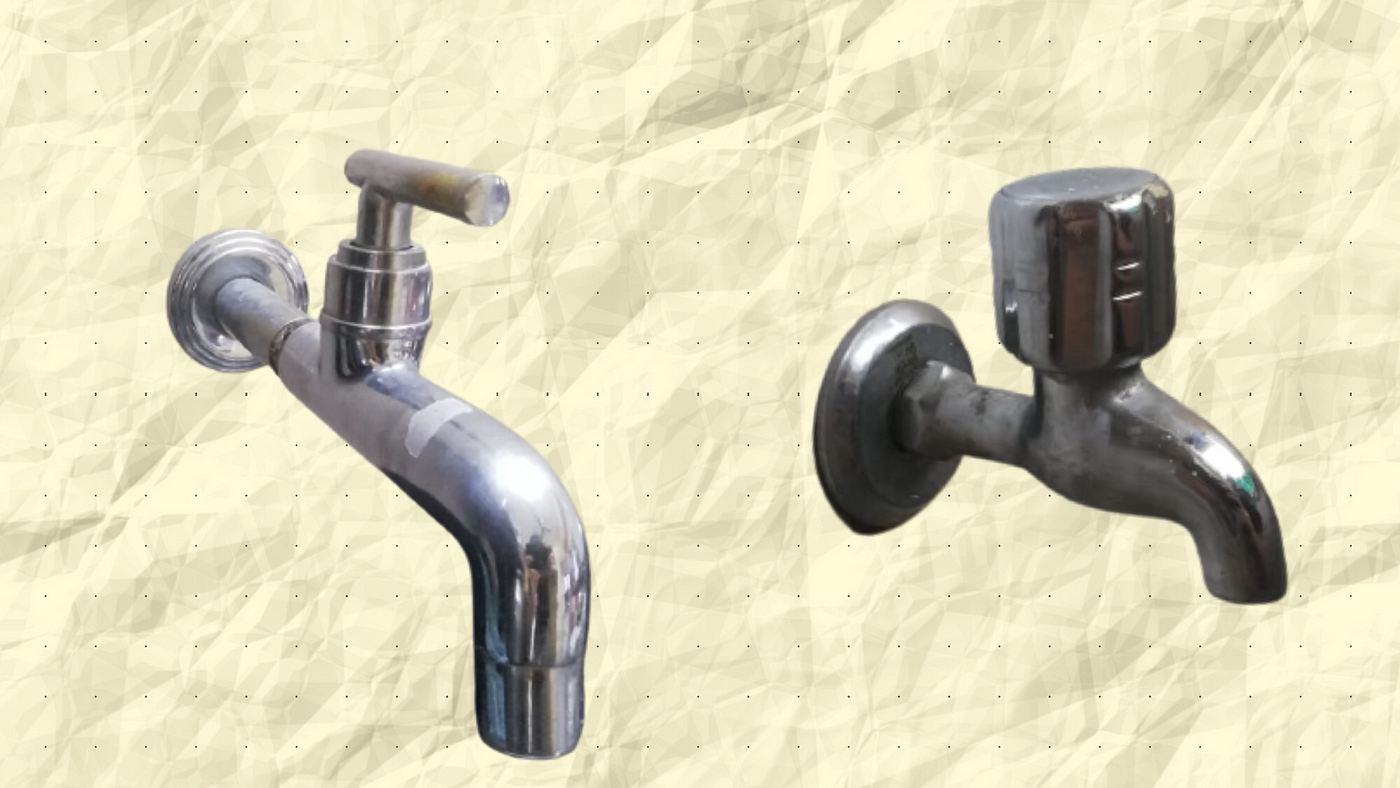
So our first pair of physical products are these taps, let me describe how these taps function, I mean, I know you all are smart enough, but that’s something I have promised, a short description of all the products :)
On your left is the tap with a thin, short, cylindrical knob, by just rotating it to 90 degrees in a set direction you can adjust the overall flow of water according to your need or requirement smoothly, quickly, and without any hassle.
On your right is the tap with a thick, typical knob with some grooves on it that are meant for resting our fingers while using the tap, to control this you need to rotate the knob multiple times to adjust the flow, at times when your hands are wet or slippery this process becomes a little difficult as you do not get a proper grip of that knob. Don’t you feel the same?

Next on the list are these electric extension boards, one of our most important assets during the lockdown, we could manage our devices efficiently whilst working from home.
So on the left, we see a smaller board with three bigger plug points and multiple USB ports, this one is quite compact, handy, and most importantly eliminates the stress of using mobile charger adapters.
On our right, we have a larger electric board it carries one big plug point and two smaller ones, plus it has the feature to coil its wire inside it. Which one would you prefer?

Here we have a pair of switches both look pretty similar, No?
Well, on our left we have a switch with a big universal plug and little red light on its switch, that lights up and glows red when you turn on the switch.
On our right is a normal set of a plug and switch with a smaller plug and a switch similar to our left but without any red light indication on it. Which one’s better?

A pair of water bottles made with the same material and having a similar storage capacity.
On our left, we have a metal water bottle which can carry around 1 liter of water and has the capability to keep it cool for a longer time or warm if we wish to store some warm water, its shape, where it goes a bit slimmer in middle also adds a good grip, even when the bottle is full and your hands are slippery.
At the right is a similar bottle with a bit different design, it carries the same features as the one in the right, at times when the bottle is full or your hands are slippery you might need to use both your hands to hold it to use properly. Did you notice the usability difference at the first glance?
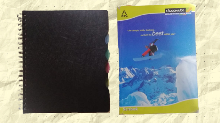
Last in our list is a pair of books, one of our old school companions, which we still love using and scribbling our ideas upon, with changing times their forms and looks changed, they were further digitized, but we still have at least one, don’t we?
The black one to our left is a 300 pages book, looks quite smart and flexible with the spiral bound and multi-colour book dividers inside make it a nice multi-purpose book, pages inside give enough area to scribble and express.
To the right is another 300 pages book bound with staple pins and a softcover, ideally good for a single subject, but you get a bit less area to scribble upon. Which one would you love to use?
So these were the products which I was able to showcase here, in fact, I had fifteen such physical products which I observed and had different thoughts regarding their design and usability, but I believe the above listed were the best ones to showcase.
However, I hope you had a good read and also hope this blog gave you some different and deep perspective towards things around you, coming Sunday that is 27th June 2021, I’ll be further updating this blog with its second part, which will give us a raw perception towards some digital products or interfaces around, Would you like to read the same? How do you find the digital products you use regularly?
Good or Bad Design?
Designs of Digital Products around us — A Raw Perception!
Hello Readers, I hope you enjoyed your short and sweet Friday read which was all about a raw observation of physical products around us, as promised, here is the continuation of the same blog which will be a raw observation of Digital Products or Interfaces we use or experience regularly.
Modern Times are all about digitization and its experiences, right from Alexa ordering our groceries and veggies to finding our first date on Bumble, it's all on our phone! In short, humans have created their own digital world through design and technology, a world without any boundaries and constitutions, a world that is designed and directed by human beings!
When we speak about our digital world, the applications or websites we use play a vital role in it, digital products were designed for the advancement of our digital world, they were meant to make our lives easy, productive, efficient, pleasant, and entertaining which has been a successful mission so far.
Unlike the early stages of digitization, now are the times where every digital product revolves around the human/user experience, if the users don’t love the product, you won’t survive in the market if your users are in love with your creation, Skies are the limit! So let's check out some of such real-world applications out there, do drop your thoughts about your experiences with the digital products. Here we go!
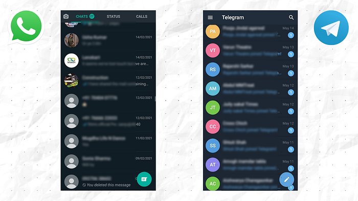
Our usual days start with checking our WhatsApp, not an ideal practice early morning, but, Can You resist?
On our left is our favorite online messaging application “The WhatsApp” which comes with a clean and soothing interface but stuffed with features, but do you ever feel like you are using an app with some most complex features with such ease and love, in spite of its naughty privacy policies! Let’s take a minute to Thank their UX / UI Designers!
Next to it is another famous messaging application Telegram, looks quite similar to WhatsApp and also claims to have clean privacy policies, a light, and simple messaging application, Have you joined Telegram yet?
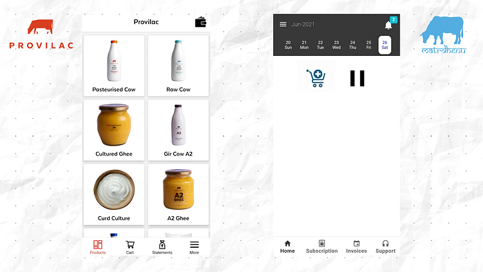
Milk and milk products are a staple of Indian Cuisine, dairy is believed to be one of the vital strength providing foods in the country.
On our left we have Provilac one of the fastest-growing milk distributors of Maharashtra, as soon as one enters the app you see the above-showcased screen a very crisp, detailed, and minimalistic piece of design, your delivery is just a few clicks away!
To our right, we have another upcoming milk distributor Matrdhenu and you see that screen as soon as you enter the app, the cart icon is to order the products and the pause icon is to make changes in your subscription plan. A simple app designed to facilitate online sales. Which brand would you choose to order your dairy from?
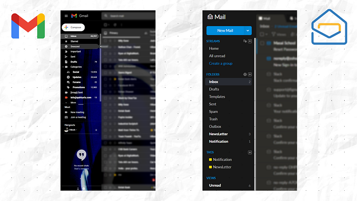
We have greatly advanced when it comes to connecting the world and communicating, but is all of that possible without having an email id?
Do I need to introduce the one on left? Gmail, one such digital product that we have grown old with and Gmail is still aging like wine, I never realized the value of Gmail and its quality to make emailing easy, the icons especially in the section towards the left, now make me realize their importance over other emailing products, also appreciate the visual differentiation of read and unread emails, can’t ignore its integration with other Google products and crystal clear showcasing of all its features on a single screen, Life is Easy!
Recently started using Zoho, I really respect the journey and values of this company, their emailing product also gave a smooth experience throughout, tiny tweaks in design might make the product more magical! Did you check the spam section? some important emails might just lie there!
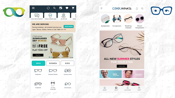
I just love to stylize my looks with lenses and frames, it's even lovelier when brands like these get you covered!
Lenskart, one of the mega players in the eyewear industry, I really appreciate their placement of carousel offers and beyond perfection blend of icons, images, and text, not to forget the spatial utilization of the overall user’s screen and least usage of the hamburger menu, Just Love the Transparency and features of this app!
Coolwinks another great player in the eyewear market, appreciate the cleanliness of this application, just wish they start using more icons than images, some images might not be required like for men's and women's eyewear. A simple, sweet, and hassle-free experience to buy eyewear, but some more emphasis on smart design and development might work wonders!
I just wonder how enhancements like AR / VR, AI, and other amazingly blooming technologies coupled with great design might bring a massive human-computer revolution! How do you think the future of Design and Technology might look like?
So, that was all from my side, I really hope I was able to serve you with a true layman’s perspective towards physical and digital products and towards life, I really feel all the products we look around or use have something great in them, at the same time something great is also always missing and we humans, the masters of logic, intellect and emotions can fill these voids and make things better not just for ourselves but also our environment!
Happy Reading :)