Green is Not Always Good
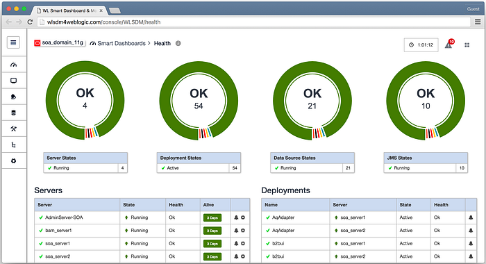
It’s as familiar a design pattern as can be found in the design community. When trying to convey status of an object or objects, most designers will go right for the Red / Yellow / Green (R/Y/G) color scheme. Anything that’s good is made green. Anything that is bad is colored red. Anything in between is coded yellow. It’s a simple design choice, and you will get almost no push back when you try to offer it as your solution. That doesn’t mean it’s the right solution, though.
Problem with the Pattern
There are several overarching reasons you shouldn’t want to use the R/Y/G approach in your designs.
The most well-known concern is with accessibility. Over 8% of the population of people of Northern European descent are red-green color blind. To be good stewards of accessibility, we should make sure that we account for these potential users in our designs. If some users can’t use color to differentiate between good and bad, then obviously there is a design deficiency.
But there are ways to skirt this so that you can still apply red and green to signify bad vs good. A typical recommendation would be to use another dimension to support the color coding (e.g., using different shapes or patterns). While this design choice may help with accessibility, it’s usually a poor choice to do double coding (using two different design variables to cover a single piece of information), since it wastes a dimension of the data that could otherwise carry more information. However, even if it does address the accessibility issues, there are several other problem that we face when using R/Y/G.
When we think of these these colors, we often consider the states of good/warning/bad as a reference to stop lights. They have a meaning to us which is valuable. At the same time, these colors were originally used in a particular context that may impact how we think about them.
In stop lights, all three colors are equally meaningful. Each light color represents a discrete state and indicate that a driver should take a particular action. Green means the driver should go, yellow means the driver should prepare to stop, and red means the driver should stop. As opponent colors, green and red serve as great choices for colors for opposite actions. Yellow is distinct from these two, and will stand out from both colors. Most importantly, identifying each state is equally valuable to the driver.

This schema doesn’t generally apply to how we use these colors in design. Usually, green means that things are all good and yellow means that things are in some (vague) state between bad and good, but in both of these cases often no action is necessary. People generally only take action when the state of the object moves into the red. In this usage, only one state — red — requires user action. This means that the stop light metaphor that we have been using is really a poor fit for we want to accomplish.
Also recall that the stop light represents three discrete states. Yet for many cases, we use R/Y/G for measures that use continuous data. Take a typical approach to a single metric (using a scale from 0–100). In these cases, anything between 70–100 might be declared good (green), values between 50–70 ok (yellow), and 50 and below as bad (red). The artificial, discrete boundaries cause complications in understanding the data.
For example, there is virtually no difference between a score of 50 and 49, and yet one might be coded as ok and the other coded as bad. The user will have to spend cognitive effort to make sense of this. On the other hand, there is a tremendous difference between 0 and 49 (or 50 and 69, 70 and 100). Yet, both values are coded in the same way. Again, users are going to have to spend cognitive effort to figure out the difference. This will always be a problem when using discrete states to capture continuous measurements.
Additionally, it’s also difficult to define what it means to be in the yellow, ‘ok’ state. It usually signifies something that may be worth paying attention to but not something that requires action right now. This is a very squishy boundary that can be manipulated as the designer sees fit. More often than not, the designer becomes overly-cautious, placing too many items in a yellow state. The classification becomes watered down and doesn’t provide the value that people want.
Even if you have a system that only has discrete states, like the stop light, there are still perceptual issues to consider. Our eyes have evolved over millions of years to work in a certain way. One peculiarity is that the human eye is most sensitive to a wavelength around 555 nm (which is bright green), since it activates two types of cones about equally.
The impact of this perceptual phenomenon is that the items that are green on the screen will draw more attention then those that are red. This is the exact opposite effect that we want when we use the R/Y/G pattern in design. We want to draw our users attention to things that are operating poorly. By using R/Y/G, you can actually be distracting your users from where they need to focus.
When we broadly apply the R/Y/G pattern, we can cause confusion and actually make things more difficult on our users.
Our goal in design is to reduce our users workload and help them understand their world more easily. When we broadly apply the R/Y/G pattern, we can cause confusion and actually make things more difficult on our users.
A better way
Fear not. There is a better way forward. We can take the best parts of R/Y/G pattern and not lose sight of the needs of our users.
First, the color red carries significant meaning with it as an alert condition. It would probably be wise to preserve this going forward. While our eye may be most sensitive to the color green, we may be asking too much of our users to completely shift the paradigm on them. Using red will significantly draw attention assuming that you control the salience of the rest of the display.
To get as much value from the color scheme as possible, we need to better define what it means for a system to be operating poorly. Better understanding goals can be a start in this process. This will help us identify what failure really means and also start to reveal how flimsy the definition of the ‘yellow’ state usually is. In reality, it’s often in place just because people want to use R/Y/G.
The next way to improve our designs is by limiting the use of green, possibly eliminating it all together. As mentioned earlier, when we use green in most of our systems, we usually intend this to mean that all is good, no action needed. If that’s the case, green is a poor choice. It stands out on the page and will draw attention to it. It will distract from the objects that you really want people to look at.

Instead, you would be better served staying within the grey scale to code this state (light grey or even white, when on a light background). When you do this, the red will draw all of your users’ attention, helping them quickly find the problems in their domain and go to them directly.
This is especially helpful if you want to use the some color scheme in data visualization where the majority of the system is in a positive state. Our pre-attentive system is good at identifying outliers in color and red and green make good opposites. Still, the green will dominate the visual field and will draw too much attention. The mass of green can overwhelm the perceptual system drawing attention to itself. A light grey, on the other hand, will more easily fade into the background, even in large numbers. That way the user can compare between two groups easily, but still be drawn on the smaller, aberrant issues (the reds) that need to be addressed.

Finally, if you have a measurement that uses continuous data, show the data in the continuum and help the user compare one object to the next. If there is a legitimate boundary condition or limit, you should represent that in the data presentation. You can even use green here (a dark green) as the color of items in a normal state, as a bright red would still jump off the display comparatively. But don’t break up the information space into discrete states just because you can.
Improving on the Past
The best argument for using the R/Y/G color scheme is that it’s familiar and that people are automatically going to know how to use it. But this is a terrible reason to continue to do something that’s bad for our users. There are a lot of design patterns that have been around for a long time that don’t really serve our users, from the pie chart to the folder structure. People like them not because they provide a great experience, but because they have learned to deal with them.
We need to put these patterns aside and understand not just what our users like but what’s best suited for them. There will still be a time and place for the R/Y/G color scheme, but the decision should be intentional and not a default choice. We need to be thoughtful about everything we add to, or remove from, a system.
We need to be thoughtful about everything we add to, or remove from, a system.
As designers, we can only control so much. We can’t control how our users perceive information, but we can control what they will perceive. We can’t control if our users will be successful in the tasks we are supporting, but we can put them in the best possible position to succeed. Doing so requires thinking through all our design choices and not just assuming that what’s been done before is the best option.
Thanks for reading. For more of my UX ramblings, you can follow me on Twitter: @bkenna1 or here on Medium.


