
Guiding principles to design for delight
“Design doesn’t need to be delightful for it to work, but that’s like saying food doesn’t need to be tasty to keep us alive” — Frank Chimero
Building things that go beyond utility and truly excite people is close to our hearts as designers. I hear that a lot when screening candidates for the design team at Blinkist — they often even mention it as their initial motivation for transitioning or starting their career in this field in the first place
If you ask around at your company, probably everyone will support your goal of delivering excitement or “delight” to people who use your product. Though when asking about how that might look like, answers might get fuzzy: make sure it fulfills the desired function and…hmmm…make it intuitive to use…and ah yes, we of course want to strive for simplicity!
That’s at least the situation we faced many times. Everyone’s fully on board that we want to make things delightful but found it really hard to articulate what’s meant by that.
To solve that, we set out to build a common understanding of what “designing for delight” means. Not as an all-encompassing, basic truth — but for us.
What does designing for delight actually mean?
When digging a bit into the literature you’ll find many ways others think about “delight” in design. The most commonly referenced framework (here by Jared M. Spool) is the Kano model: thinking about your features as performance payoffs, basic expectations, and excitement generators. And that’s already super useful, though more for building a product roadmap and less for guiding a designer’s day-to-day work.
Even when discussing “delight” within our team made it clear how widely different our perceptions of it were. Some see it as the final polish of UI, personally relatable copy and comms, or fun add-ons, e.g. hiding Easter eggs for users to discover.
To ensure we talk about the same thing and our perception of “delight” is something we all support, I ran a full-day design team offsite to build a clear definition and direction.
The result: Three principles
After piles of digital stickily notes, messy Miro boards, and Figma files, we came up with a simple set of principles we make that sums up how we think about designing for delight:
Design for delight by anticipating needs beyond the obvious so you can offer moments of joy.
Of course, “anticipating unmet needs” should always be part of anyone’s design process. This principle heavily relies on the “beyond the obvious” part — how can you make an experience extra smooth? An analogous example of this is how Safari on iOS allows you to not just “Paste”, but also “Paste and Go”.
Design for delight by offering a surprise in otherwise dull moments.
Any experience inevitably includes necessary steps but not always the most exciting, e.g. filling out input forms or, waiting for UI to finish loading. This principle makes us crucially aware of these moments and asks us to reconsider a simple solution for an exciting little surprise. Some examples: Wolt lets you play a little game while waiting for your delivery and Redbubble’s newsletter preference settings show “Jeff the Unicorn” change expressions based on your settings.
Design for delight by exceptionally tailoring the experience to intent and context of use.
This one focuses on initial intent — not just the what but why and when someone would want to perform a certain action in the first place — and then designs with that in mind. An example: Superhuman built an “unbreakable” date picker because they know that their users are crazy busy, want to get to inbox zero as fast as possible, and can’t bother with input rules. You can type dates in all imaginable formats and you will get a valid result — no input errors at any point.
To embed this set of principles in our process and make it actionable for every designer, we came up with one guiding question per choice.
- “How and where can we anticipate an unmet need beyond the obvious to offer a moment of joy?”
- “How and where can we turn an otherwise dull or tedious moment into an unexpected and delightful surprise?”
- “How and where can we tailor the experience even closer to our user’s intent and context of use?”
With this framework, we disconnect “delight” from the notion of just being the cherry on top but integrate it into our process. The guiding questions are not limited to “delighters” like the famous Mailchimp high five or Asana’s flying unicorns but help us to be an extra bit more thoughtful with our own design process — thinking one more time about the user’s context of use, intent and need to deliver a product that not only works but delights.
Here’s an example of a feature we shipped, in part guided by the guiding questions above.
“Tinder for books”
Our “Get Started” team came up with this fun and engaging way of probing users’ content interests during onboarding: using the familiar swipe left/right pattern for adding content to your library and letting us know what categories and other titles we might recommend to you.
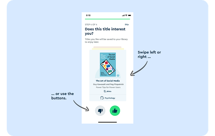
Turning otherwise dull moments, like going through an app onboarding, into a fun surprise, as well as tailoring the experience close to intent early on.
The principles in our day-to-day
Designers started to run pairing sessions with each other, product managers, and developers to come up with ideas together. They even came up with templates to get started and added them to our Helpers library in Figma for everyone to use.
Each time at our weekly team meeting, we have a short agenda slot to showcase “delightful” examples from recent releases or other products which we call our “Delight of the Week”. We show stuff that excited us and referred to our principles to keep our minds working in that direction.
Of course, we still have a long way to go. We still often battle the urge of seeing delight as the shiny little extra at the end, but rather as the overall goal for the experience. We don’t want this to become a gimmick but something that creates real value for people who use Blinkist.
Anyhow, this framework took us a good first step toward that goal. “Delight” and our principles have become an integral part of our way of working. And what really makes me most proud is if I hear other functions referencing them.
I hope that you too can find value in either the principles and guiding questions — or just the journey we took to get there. In any case, this is continuous work in progress for us so please reach out with any thoughts or feedback!


