Heuristics #5: Error Prevention-Simplified by the examples.
The Jakob Nielsen’s 10 heuristics will be served as a series or as episodes to you all. I will publish each heuristic a week- Every Thursday.
If you haven’t read or you want to know what is heuristics, why we need them & who made this? For that, you can check this article- Heuristics #1: Visibility of system status.
Sorry Note: Because of the extremely hectic schedule and few personal works I was not able to prepare this article on time which I have promised to you all. I’m sorry guys 😔

The entire world is dealing with a life-threatening virus named COVID-19. There are total cases of around 23 million and 799 thousand people have lost their lives and still counting. This pandemic forced us to follow a great, old & famous proverb- Prevention is better than cure. It comes from as early as the 17th century and there is a Latin translation from even earlier (13th century)
What does this proverb tell is that we must take sensible steps and measures to avoid the bad thing, illness, damage, or any health issues prior to the initial occurrence of any symptoms. That’s why we asked to take precautions like wear a mask, frequent hand wash and maintain the social distance in this pandemic.
Likewise in the digital world, we have a heuristic called error prevention which suggests that the prevention of the error is better than the well-designed error messages.
Prevention of the error is better than the well-designed error messages.
In simple terms, prevent the occurrence of the errors or any situation that leads the user to make a false or any unwanted decision.
While using any product if the user comes up with the error, it’s not at all the user’s fault. Instead, it’s the designer's duty to design a product or a system in a way that helps the user to avoid such cases or any occurrence of the error. Don Norman’s book- The Design of Everyday Things has much detail about the 2 types of error i.e., Slips & Mistakes
1. Slips:
This type of error occurs when a user is familiar with the goal or the action they are going to perform. But accidentally they made a mistake while performing. To avoid the slips we must guide the users by providing them the limited options to choose & to constrain the input types.
Slips are the kind of errors that are generally happened by the expert users.
Let's understand it more clearly by the set of examples:
Example 1, Microsoft Recycle Bin- WinOS
If the user deleted one of the important files in a hurry while deleting the unimportant files, Microsoft gives the ability to restore or to recover the deleted file from the recycle bin at ease. But it’s only possible if you have simply deleted and not the shift+delete(permanently deleted).

Example 2, Gmail- Website
In Gmail, if the user deleted an important email by mistake they can undo that action by simply clicking on the “Undo” action button from the snackbar from the lower-left corner.

Example 3, Bewakoof- Website
In Bewakoof's payment method screen, when the user inputs the card number which is a 16 digit number, it automatically adds spaces after input of every 4 digits and totally ignores the user input of the spaces or dashes.

Example 4, Microsoft Word- WindowsOS
While writing in the word program, the typo error or the spelling mistake which also considered under the slip error was underlined by the red color, so that the user can fix it.

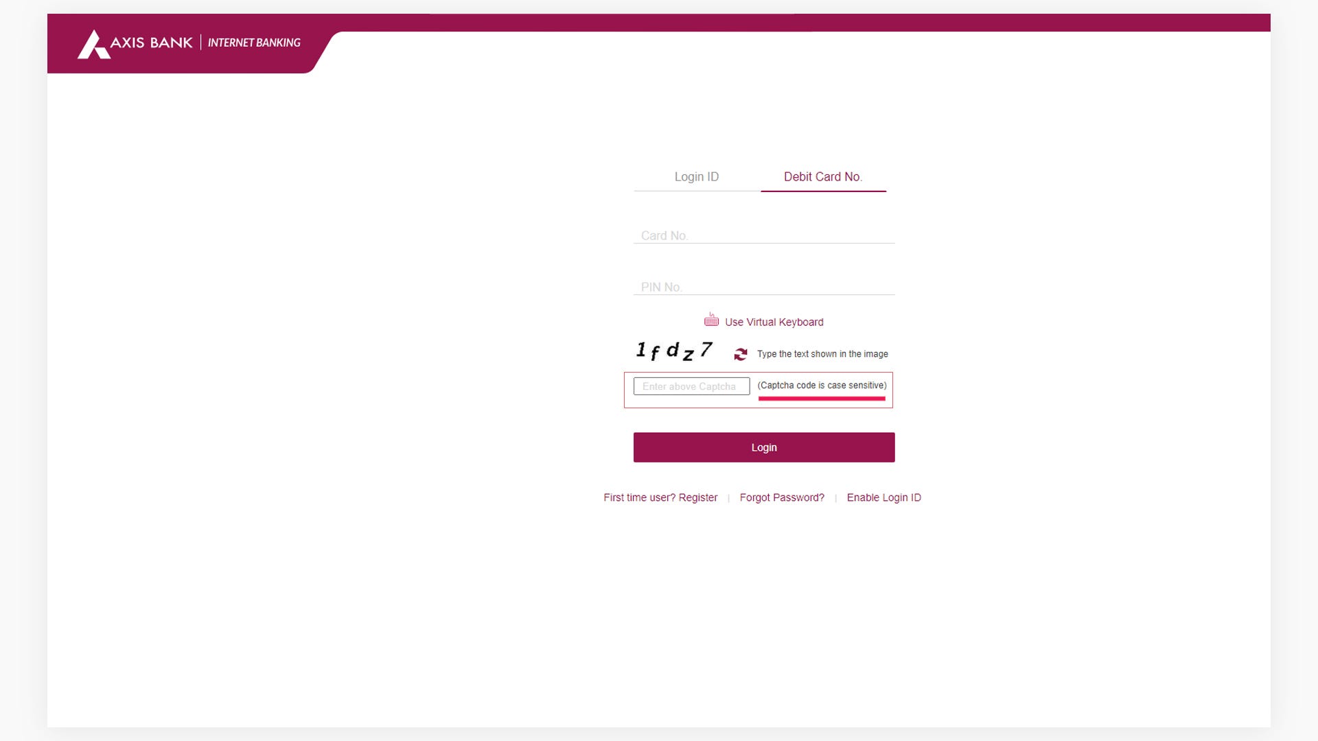
Example 5, Axis Bank- Website
While login to the axis internet banking they ask the user in the end to enter the captcha code. To prevent the users to make slip error they mentioned clearly that the “captcha code is case-sensitive” which suggests the users to check the “Caps Lock” before entering the code.
2. Mistakes:
This type of error occurs when a user is not familiar with the mental model of the system or occurs when the user is trying to perform an action that is not appropriate to the current system functionalities or the user will lack complete information related to the task or a system. To avoid the mistakes the designer needs to do user research about the user's mental models and the expectations. And also the designer must provide clear context & information of the task to the user.
Mistakes are the kind of errors that are generally happened by the users who has incomlpete information about the task or any event and the mismatch of the mental model.
Let’s understand it more clearly by the set of examples:
Example 1, Exito- Website
While making the password for the Exito e-commerce website during the signup stage, the system guides the user by indicating what should be the combination to make a strong password.

Example 2, Microsoft Recycle Bin- WinOS
Microsoft confirming the user about the destructive action of deleting the files permanently. The users should always ask to confirm for any destructive or important actions like delete, send payment, trade the stock, buy in quantity, etc.

Example 3, Zerodha- Website
This example is the badly designed login form which lacks suggestion or guidance related to the “User Id”. This actually happened with my mother who is not very familiar with dealing with the technology. She’s a nursery teacher by profession & a part-time stock trader. Once she tried to log in to her Kite account from my desktop and was trying to enter her email address as a User Id. But she was unable to write more than 6 characters and was very frustrated. She called me to help her. What I have noticed immediately is that the user’s input is validated only to 6 characters. Now I just need to find the 6 characters long user id. I checked her Gmail account for the email template that could be sent to her with her User Id. And yes I found that email and in that there Zerodha had mentioned the 6 characters long User Id.
What they should do to match with the mental models of users like my mother is to provide a clean and simple one-line description under the UserID input saying- Please enter your 6 characters long user id that we have sent to your email address. This simple message will definitely help hundred or thousands of users for sure!

Example 4, HDFC & Axis Bank- Website
See how in banking applications like HDFC & Axis, they confirm with the user before the money transfer to its payees. Products that deal with any kind of currencies will always ask its users to confirm before the action performed. Because to resolve the accidental payments, it requires more time & work.

Example 5, Paytm- Website
In Paytm, they have clearly specified the possible states of the seats that the user requires to make their decisions clearly. See how clearly they have mentioned with colors and information like- Green for Selected Seats, Pink for the seats booked by ladies, Gray for the occupied seats, and so on.

It’s not at all possible that users can’t make mistakes even after tons of research, analysis, or whatever. But we as designers should always try to filter it out and make the user's decisions and actions error-free.
I hope I delivered it to the point. I will post the sixth heuristic principle exactly after a week. Stay tuned!
Will appreciate your feedback, love & comments.
Wear your mask 😷, wash your hands 🧼 & maintain social distance 📏.
Namaste 🙏.
If you haven’t read or you want to know what is heuristics, why we need them & who made this? For that, you can check this article- Heuristics #1: Visibility of system status.
Reference to know more about Heuristics & UX: https://www.nngroup.com/articles/ten-usability-heuristics/