Heuristics
Usability of a product
Intro
Hello there, back for more design-related stuff. Well, I have something special for today. Heuristic and its principles to ensure better usability of a product. After reading this, you will get a good idea of how to pinpoint issues within a product, so that they could be resolved.
Let’s dive in.
So!
What are heuristics?
Following what I learned through my mentors and some research —
They are the thumb rules or you can say common sense, developed within people, due to past experiences and learnings, which enables them to understand anything new, and to take actions based on that.
For example, take this branch shown below, now imagine, it is in your path and you have to move it away. All of you will have a heuristic idea of where to hold and where to avoid contact because of your previous experiences and learnings.
So, we all came to an understanding that, we figure out new things based on our heuristics. It is also true with everyday products, we see around us, like a button is there to be pressed, a handle to pull, push or hold, a hook to probably hang something. We all have learned these interactions with time and now they are part of our thumb rules.
These rules dictate the usability of a product, may it be Physical or Digital. So, how can we ensure and evaluate any product’s usability?
There are many ways, one of which is the 10 Heuristic Principles by Nielsen and Norman group for better usability. These principles mainly focus on digital User Interface Design.
10 usability Heuristics for User Interface Design by Nielsen Norman Group
- Visibility of system status
- Match between system and the real world
- User control and freedom
- Consistency and standards
- Error prevention
- Recognition rather than recall
- Flexibility and efficiency of use
- Aesthetic and minimalist design
- Help users recognize, diagnose, and recover from errors
- Help and documentation
- Visibility of System Status
When you allow the user to know, what’s happening in the system, for every instant of the interaction.
For example — we all have seen the loading bar or the rotating wheel on our phones requesting us to wait for a while, loading is in progress. Imagine if it was not there, how on earth will someone know that he/she should wait. You will be in a dilemma if, the system is working or not.
2. Match between system and the real world
When you use language, symbols, and other interacting mediums in such a way, which are familiar to the user.
For example — You may have seen the Cart icon in various e-commerce websites like Amazon and Flipkart, where your purchasing items are kept. It is very easy to understand the function of this cart function because we all are familiar with it.
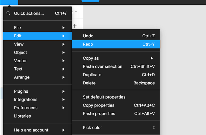
3. User control and freedom
We as people, continuously do things that we suddenly want to be undone or changed. We learn new things also by using methods like hit and trial, experiments, inspecting, etc. Now, if we get a clear and quick way out, of our current actions we feel a sense of control and freedom in performing them.
For example — Take the widely used shortcuts; Undo and Redo, they allow you so much freedom to experiment and give better control over the outcome. You can also take the backspace key, the cancellation option in our reservation ticket, the back option on web pages, and much more as examples.
4. Consistency and standards
It is easy on our brain when we face similarities, but it gets uncomfortable to see abrupt changes frequently. For that reason, products are made in such a way that similar things are kept together in one place and the same pattern is followed inside the product and also in its extensions, series, updates, and everything relatable.
This approach maintains consistency and standards within the product and also among other, similar products.
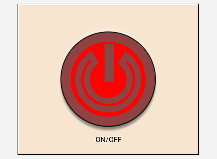
For example — We all are familiar with this power button, you will find it on many physical devices as well as on digital platforms also. This power button is one of the standard designs followed worldwide.
5. Error prevention
We perform two types of errors one which is unintentional (Slips) and another which is intentional (Mistakes). A good design uses constraints, guide maps, warnings, and other means to ensure the prevention of both, to as much extent as is reasonable and possible.
Example of Slip — When you put salt in your shake instead of sugar.
Example of Mistake — When you put extra salt in your dish because you thought it would be ok but it turns out to be, not ok.
Digital example — The warning popup you see before you take some action that could result in loss of data or another serious impact.
6. Recognition rather than recall
Recalling sometimes can be very frustrating, have you ever tried to remember the lyrics of the song you forgot but do remember the tune or feel of it? name of the movie, whose scene you are discussing with your friends, the meal you had yesterday, the pin or password of some website you forgot… I think you got the idea.
A good design replaces the necessity to recall with recognition.
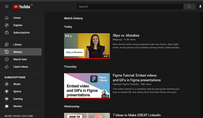
For example — The Youtube history option allows you to recognize the video that you saw a day before yesterday, rather than recalling it, which could have been very hard for you.
7. Flexibility and efficiency of use
In games, you have an option to choose the sensitivity for better control (customization). This principle focuses on increasing productivity and the ability to customize the product.
For example — Shortcuts, ya! they make our lives so easy. You have the flexibility to perform a task in multiple ways (good for both a novice and an expert) and at the same time, the efficiency of work increases exponentially.
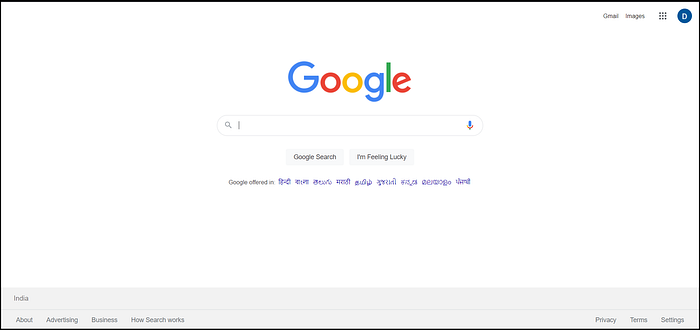
8. Aesthetic and minimalist design
There should be a limit to how much content is exposed to a user and in what manner. This principle focuses on providing information that is just sufficient, not more nor less, and also in a presentable way.
For example — The Google search page
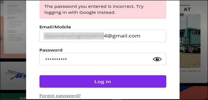
9. Help users recognize, diagnose, and recover from errors
Have you ever seen some machines start showing you an error with the name ‘some gibberish’ that you don't understand? such as an error 404. In such cases, users get confused and frustrated. Instead, products should convey the message in a way that users can understand.
A good design not only converses in a user-friendly way but also guides them to recover from errors.
For example — See the text in red highlight, in the image below, it tells you that you entered an incorrect password. It also provides you with two options first is to sign in with google instead and the second is to select forgot password at the bottom in case you want to recover it.
10. Help and documentation
Almost every product today comes with a manual, which is documentation of all important information, a user needs regarding the product. Have you seen apps and websites with a help section, where you find all the information related to them and FAQ? Also, some of the digital products provide an onboarding process where the user is made familiar with the interface and the way to initiate important actions. All of this comes under Help and Documentation.
Example — Below is the link to the medium help center you can check out. It is a good example of help and documentation
So, guys how was it? learned something new, awesome.
I’m also working on heuristic evaluation on a website. Here is the link.
Thank You, guys… till the next time.

