Heuristics #8: Aesthetic and Minimalist Design-Simplified by the examples.
The Jakob Nielsen’s 10 heuristics will be served as a series or as episodes to you all. I will publish each heuristic a week- Every Thursday.
If you haven’t read or you want to know what is heuristics, why we need them & who made this? For that, you can check this article- Heuristics #1: Visibility of system status.

Does anyone know on Medium how many numbers of topics are getting provided? Any rough guesses?
It’s 104 topics in total from which you can select your interested and relevant topic. There are topics like art, gaming, photography, visual design, food, language, and many others. What happens if our dear and lovable Medium will not ask to select our interested topics in the very first step after signing in???
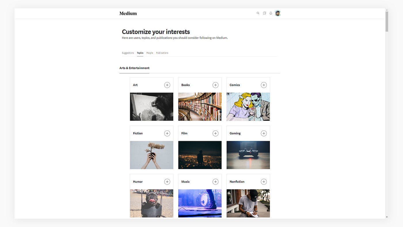
Exactly, our home screen will be flooded by unwanted & irrelevant content. Our brain will be bombarded with tons of articles that were not likable & relevant to us. Who loves the cluttered, littered, unwanted things in their way? I think… No One! Each and everybody needs relevant, clean, and clear things in front of their eyes, especially in digital platforms.
Platforms that have an enormous amount of data and information to show will always ask their user to select their interesting topics to make the customizable feed for that user. Platforms like Medium, Quora, LinkedIn, Facebook, Instagram will show you the most relevant feed to you according to the topics, people, groups, tags you have chosen, or selected.
Platforms like Medium, Quora, LinkedIn, Facebook, Instagram will show you the most relavant feed to you according the topics, people, groups, tags you have chosen or selected.
They decorate and showcase the relevant information in such a way that you will only get the information you love to see and read.
Our today’s heuristic i.e., Aesthetic and Minimalist design is completely based on how much information is required or relevant to showcase for the betterment of the users.
In simple terms, we only need to provide the required and relevant information to the user, any irrelevant information diminishes the worth of the relevant information. Information can be text, images, design elements, animations.
Any relevant information is- Signal & any irrelevant information is- Noise.
In the user interface, the relevant & irrelevant information can be measured by the signal-to-noise ratio. Any relevant information in the interface is the signal and irrelevant information is the noise for the user. But, it completely depends upon the user’s purpose.
Let’s deep dive to the set of examples to understand it in a better way:
Example 1, Paytm- Website
Paytm is an Indian e-commerce payment system and financial technology company which offers a number of services from mobile recharges, any kind of bill payments, movie tickets, bus tickets, shopping, etc.
This website has both a high signal & high noise ratio. Let me explain, What if the user only needs to buy a mobile phone? In such a case rest of the numerous services that are provided on the interface is noise for the user. So it completely depends on the user’s purpose which content is signal and which content is noise.

Example 2, Airtame- Website
See how the blocks is designed in a hierarchical manner proving the design is following the high signal-to-noise ratio. They started with the blue colored text following by the bold black text and in the end have a button called “Learn more” which is used to block the noise.
The “Learn more” button is used to avoid noise is because the additional information for that block is not necessary to showcase on the home page.

Example 3, Adobe Photoshop & Xd- Software
Why majorly, UI designers prefer Xd over Photoshop? When one can create user interfaces in both the tools. It’s because of the lightness and relevancy provided by the Adobe Xd. Photoshop is used for many other purposes like digital art, frame animations, 3D, painting, etc. There are many menus, effects, tools that are not required during the designing of the interfaces. Just because of these there is more noise than signal in photoshop, especially for the UI designers.

Example 4, Airbnb- Website
In Airbnb, they have designed their homepage with a high signal-to-noise ratio. Because the main purpose of the user is easily achieved because of the minimal and clean design of the search part, where the user will select the place, check-in, and a number of guests at ease.

Example 5, Sleeknote- Website
They have designed their homepage so clear that it directly speaks their purpose and the business they are doing. Users will immediately see what the company is doing and who their clients are.

Example 6, Spacecraft’s Dashboard
See how the evolution of minimal interfaces & design have reached to space also. Minimalism doesn’t mean removing the necessary or unnecessary things or elements. It means to use the thing and elements only when it’s necessary & relevant for the particular part of the section.
Removal of switches, gears, buttons from the dashboard of the Apollo & Space shuttle doesn’t mean it’s not necessary now for the latest SpaceX spacecraft.

It’s never possible to create a noise-free interface because each user is unique and their purpose is different from one another. But always try to design a page that maintains the high signal;-to-noise ratio.
I hope I delivered it to the point. I will post the ninth heuristic principle exactly after a week. Stay tuned!
Will appreciate your feedback, love & comments.
Wear your mask 😷, wash your hands 🧼 & maintain social distance 📏.
Namaste 🙏.
If you haven’t read or you want to know what is heuristics, why we need them & who made this? For that, you can check this article- Heuristics #1: Visibility of system status.
Reference to know more about Heuristics & UX: https://www.nngroup.com/articles/ten-usability-heuristics/

