Hikers Pit-An e-commerce App for hikers — UI/UX Case Study
In this case study, I will share the process I went through to design an e-commerce app for hikers who are just looking around offers/Products and hikers who want to purchase a particular product.

Problem Statement:
My goal was to create a mobile e-commerce experience for hikers to browse the catalog, find items they’re looking for, initiate checkout, and complete the purchase.
Preparation:
As this being my first time designing an app from scratch I decided to follow the below design processes:
1) Design Funnel:
The Design Funnel captures the notion that over time the design space gets narrower as early ambiguous problem spaces are clarified into focused, detailed designs.
As we can see in the below image earlier in the process, the design space is often widely constrained and open to a variety of solutions and paths forward

2) Product Design-An Iterative Process
As someone has stated even the best product designer cannot design a product in a single attempt, so a product design should follow the concept of iteration.

Objectives
Before starting on the assignment the primary goals I designed for myself were:
- Having clear ways of locating specific products
- Ability to support a single page for each product
- Having an efficient means of purchasing one or more products
- Clear product organization for a seamless shopping experience
- Product search to easily find products
- Detailed product information to ensure proper product selection
- Product reviews to help make informed buying decisions and allow for user input
- Efficient checkout process to save users time and allow for easy purchase of products
Design Process
1. Research:
First I decided to start understanding the mental models of Hikers by referring the following sites:
Insights after referring these sites:
- I came to know what are different types of hikes
- I came to know what are the different categories of hiking products in the market, what hiking products are currently trending, what hiking products users frequently buy.
- Some of the best places in India and even worldwide for hiking.
- Even while going through this website I got some inspiration for my logo
Now to gain some inspiration for the e-commerce app, I started referring to some of the famous E-commerce apps to understand the flow:
Flipkart, Amazon, Rent the runway, Decathlon, Etsy, Dollar Shave Club, Rei Co.op
And to understand the patterns, flows, and gain insights into these e-commerce apps I used Mobbin and UI Sources.
Why was this research necessary?
If I only had an hour to chop down a tree, I would spend the first 45 minutes sharpening my axe. — Abraham Lincoln.
- Research being the first part and base of the design process it was necessary not to mess it up otherwise my whole product would have messed up.
- To understand the flow, patterns, elements of the E-commerce apps.
- Style guide used by various E-commerce apps.
2. Information Architecture
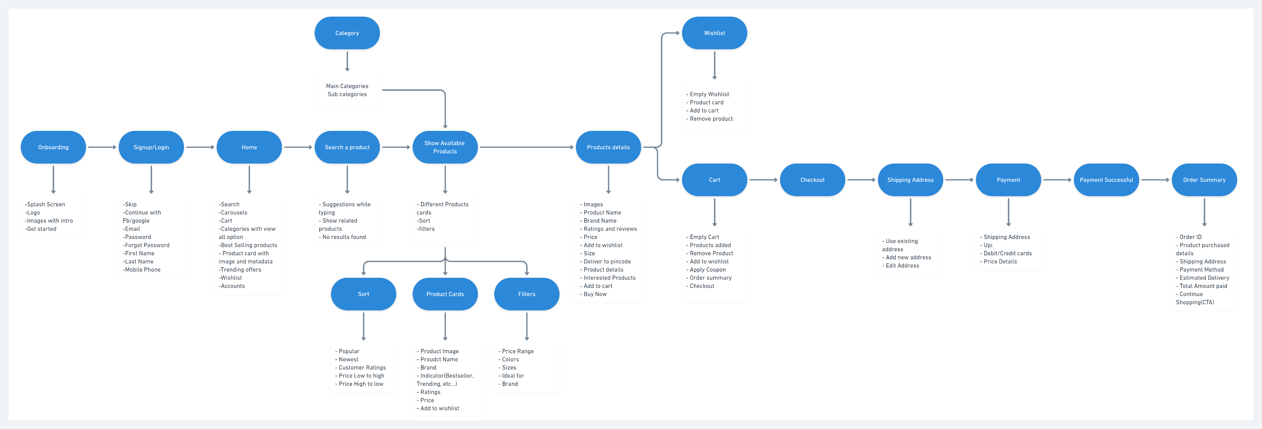
Information architecture is, like a blueprint, a visual representation of the product’s infrastructure, features, and hierarchy.
The Information Architecture helped me to understand the flow of an e-commerce app and to figure out what metadata to be shown at each step and what to prioritize for this assignment.
3. Wireframes
After IA, I had a pretty good idea of how to create the app, what and where to include. So I moved to the next step Low-Fidelity wireframes.

The next step was the High fidelity wireframes. During this, I performed a few iterations on different patterns.
Why I performed iterations during this phase?
Iteration helped me to create and test ideas quickly and more iterations lead to a more refined final product.
Due to time constraints, I performed only 2 iterations during High Fidelity wireframes.


Logo Design
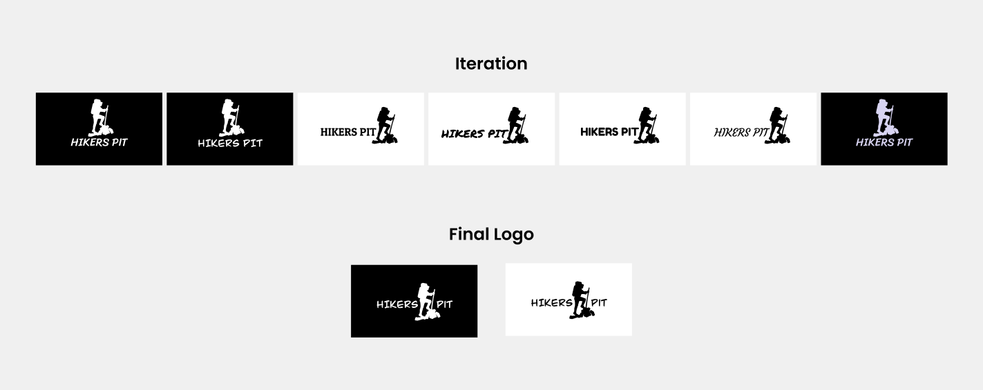
While browsing a website or an app the first thing the user observes is Logo. We all know the logo is much more than an image, it is a point of recognition and a well-designed logo is an easy way to convey to potential customers that your business is professional, trustworthy, and provides quality goods or services. So I gave the same importance to my logo as much as I gave to the designing process. Below are the iterations I performed on the Hikers Pit Logo.
4. Visual design and Prototype:
1) Browse Products:
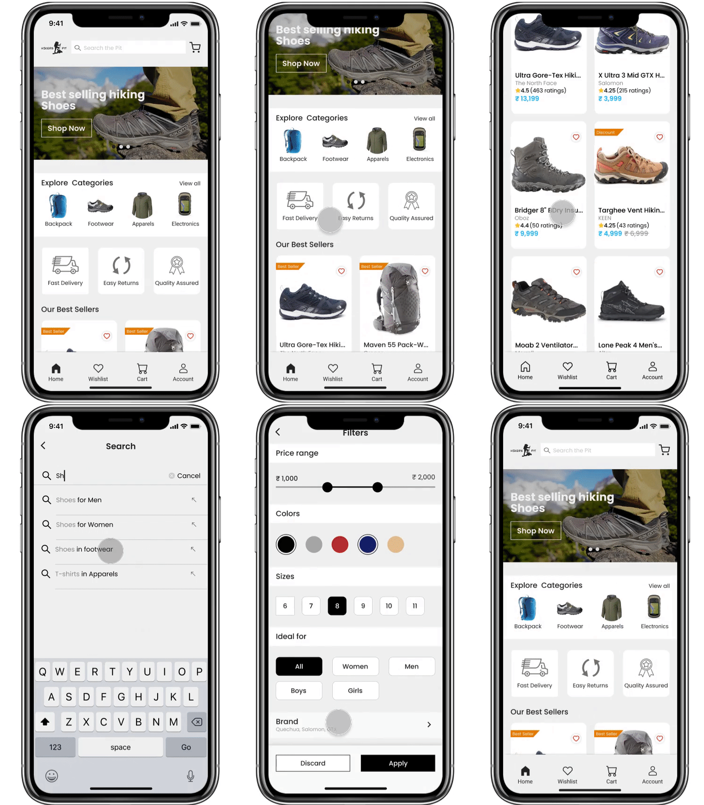
This is the home screen of the Hikers Pit. In this flow, users will be able to see all products, browse by category, search, sort, and apply filters.


2) Product details:
The user can view the complete details about the product here. It includes multiple photographs, product metadata, reviews, etc. and proceeds to checkout.


3) Checkout
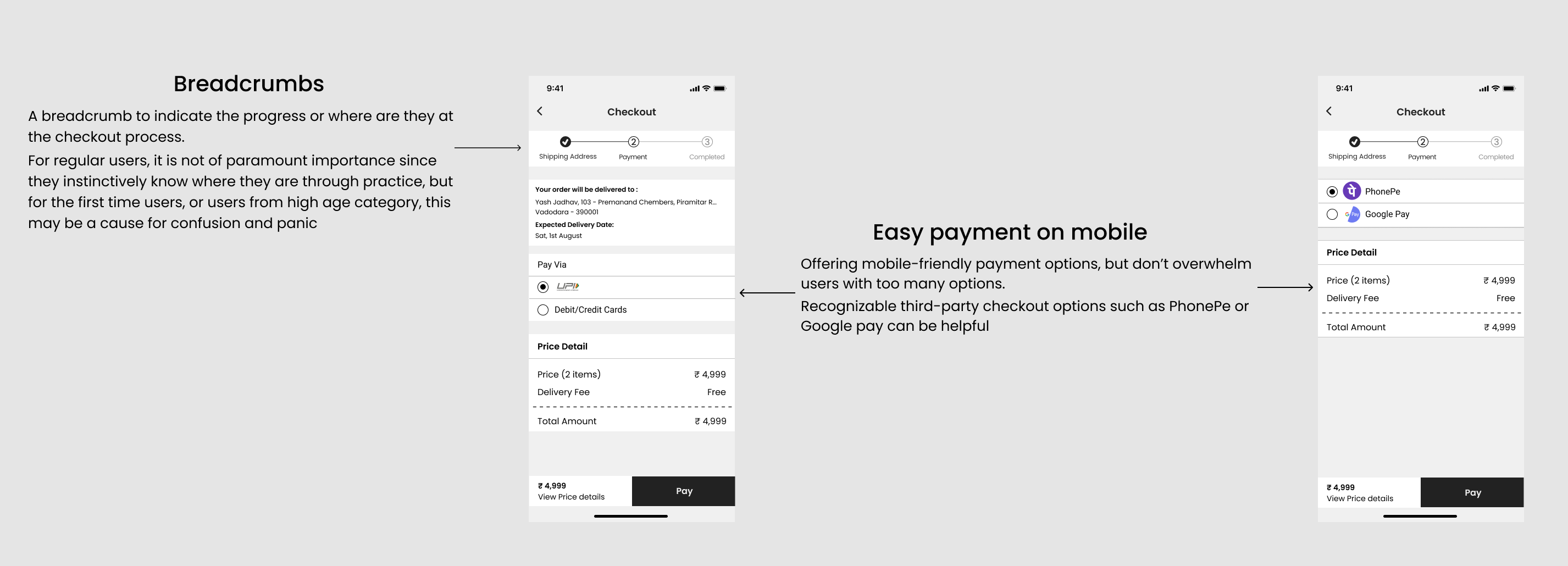
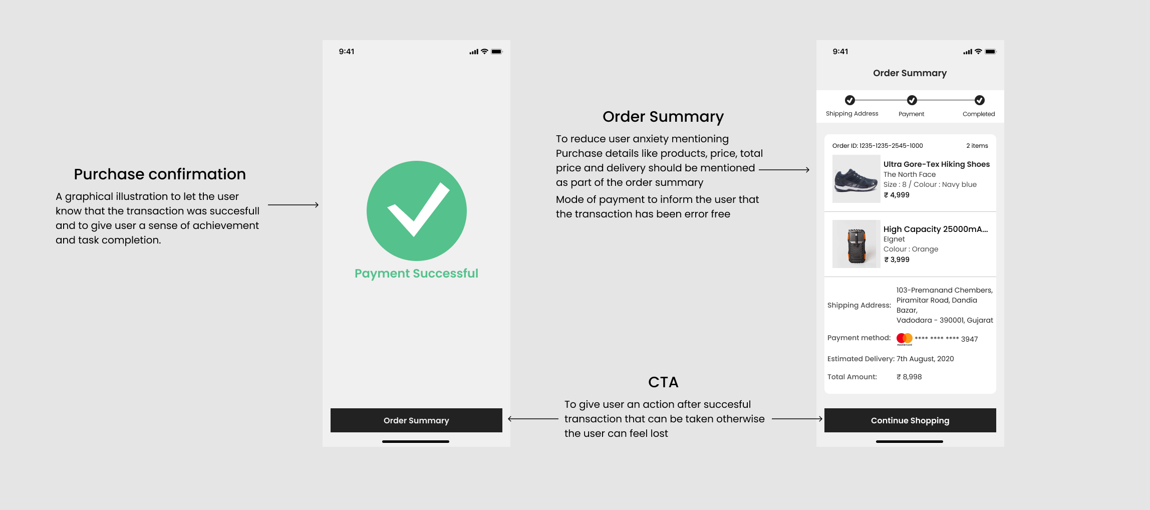
The checkout page is the nexus point of the entire site. It is where all the action happens and because of that, it is important to make it as effective and possible. How? By turning it into an engaging, instantly accessible, and streamlined process.

Some additional screens I designed:
1) Onboarding:
Onboarding is usually the set of screens shown during the first interaction with the app. Onboarding screens set the first contact between the user and the app. It is a sort of introduction that somehow imitates communication in the non-virtual world with a greeting. Another part of the onboarding mission is informing a user about the benefits they get with this product or basic operations they are going to do.

2) Login/Signup:
How many people like filling out forms? I think, not many. It’s not what users want from the service and signing up is somehow an unavoidable evil they have to deal with. That’s the reason I added Social Sign in along with conventional email sign up and log in.

3) No Results, Wishlist, and Empty Cart
What if the user do some spelling mistakes while searching for a product?What if the user’s cart or wishlist is empty? or What if he wants to remove the product from the wishlist?
Keeping the above scenarios in mind I designed the following screens for the app.

You could try out the prototype of the Hikers Pit app here.
Key takeaways from this assignment:
- Research is the starting and the most important part of product design if you mess up at that part everything will be messed up.
- If possible get feedback after every stage from your colleague or cohort members it will help you in the long run rather than taking feedback after the product is ready.
- In product design, we should ask ourselves “Why” more often before making any decision it helps.
- I believe there is nothing like a perfect app, there’s always something to improve. So the bigger lesson taken from this assignment is that we have to keep iterating.
Conclusion
Being my first attempt on designing an app from scratch was a pretty challenging and whole new experience.
I’ve learned the importance of good research, IA, wireframes and how every opinion can be relevant (even if it doesn’t make much sense or if it’s a little rough, it can end up giving you a new perspective) and will make sure to learn from the mistakes I made in this assignment.
If you have any feedback please let me know in the comments…
Thanks Abhinav Chhikara, Mayank Khandelwal and Chethan KVS for your continuous feedback and guidance.
Folks if you are interested to start your career as a product designer please check out 10kdesigners.
Did you know?
You can give up to 50 Claps for an article? Try it out 🙂


