
How a non-intuitive user interface can create a great user experience.
In 2007 people lined up for blocks to buy the world’s first iPhone. Those who were lucky enough to buy those first magical devices opened the box, turned it on, and…voila! They immediately knew how to use it and were off and running. They knew how to use a completely new product with new software and a unique user interface (UI), straight out of the box. How did Apple create such an intuitive UI? The answer, as it turns out, isn’t so intuitive.
“It’s an automatic process over which we have no control.”
Intuitive = Familiar
Dictionary.com defines something as “intuitive” if you can understand it immediately, without the need for conscious reasoning. It’s an automatic process over which we have no control. This old saying explains it in starker terms: “The only intuitive interface is the nipple. Everything else is learned.” The origins of this quotation remain foggy, and the accuracy of the statement is questionable, but the implication is clear: intuition is rooted in familiarity. What people regard as an intuitive user interface actually leans on their existing skills and knowledge from their previous experiences. This applies to products, services, and business models equally.
Even Jef Raskin, who pioneered the Macintosh project for Apple, has equated “intuitive” with “familiar.” That was Apple’s secret to the UI in its first iPhone, which felt intuitive to many people. Even before they got their hands on it, customers knew how to use the iPhone, thanks to an aggressive advertising campaign that featured demonstrations of the product. In other words, apple has created tutorial-commercials to show/teach potential customers how to use iPhone.
By comparison, Apple’s 2013 Christmas commercials shot an arrow straight into people’s emotions. The spot featured everything from teary-eyed grandparents to children kissing their dogs, but the iPhone screen didn’t appear once in the commercial. Why? Because by then, everyone was already familiar with the iPhone. It was already intuitive.
The Learning Process

Lets go back in time, to Windows 3.x. Microsoft added games to the operating system to train users how to use new interactions. As Jared Spool explains in his article, one of the conditions to make design familiar, is a condition where “The user is being trained, but in a way that seems natural.” Jared talks about the ‘gap’ between current and target knowlege and how training helps to bridge it. I think the motivation level of this training will excel the learning process therefor bridging the gap faster. This is why Microsoft’s idea of using games to motivate people to learn these new interactions was a good one. Each game taught and trained users a specific new interaction. Solitare taught users how drag&drop, Minesweeper trained users to left/right click super fast by making a game that required a user to use a lot of mental effort for the main goal, in which with practice, improved automatic motor skills.(James Hunt gives more examples about windows 3.x games, worth reading.) Think about driving a car for example. First you’re thinking how to operate it, but when your focus changes to safely reaching your destination, operating the car has become automatic. When the operation of a device becomes automatic, we can surely say that it has become intuitive(familiar).
This is a learning process that involves a lot of practice. What Apple did with the iPhone tutorial-commercials was a learning process through “thinking,” where the user sees something new, analyzes actions, searches for suitable patterns and assesses his behaviour. If we follow the potential iPhone customer journey in 2007, we can see how Social Learning Theory formulated by Albert Bandura applies here.
The Modeling Process developed by Bandura can help to break it down. There are 4 steps in the Modeling Process:
- Attention - You must pay attention in order to learn from the person that demonstrates the behaviour. Think about a person in a TV commercial that demonstrates how to operate the iPhone. At this stage we have a target audience learn how to use iPhone, even though the device isn’t available in stores yet.
- Retention - In order to retain what you’ve learned, you must to observe the behaviour again and again. With TV commercial and Apple’s budget you will surely be exposed to many observations of same demonstration.
- Reproduction - Here you have to demonstrate what you’ve learned. A person entering the store to play(demonstrate/practice) with the iPhone he has been watching demonstration of for months on TV. Practice of the behaviour is very important to retain the new knowledge.
- Motivation - Being motivated to repeat the behaviour is important to keep you practicing it. Think about iPhone owners that demonstrating the newly bought device to their friends and being rewarded by the positive attention.

Unique UI
User experience (UX) designers are often at odds with corporate decision makers about what makes a great UX. At design meetings, the word “intuitive” gets thrown around countless times in close proximity to the words “Apple” and “iPhone.” What many of the corporate suits miss is that if you want to create the next great UX, your UI can’t just be intuitive in terms of familiarity. You must identify the core of your product or service and find a unique, simple interface for it.
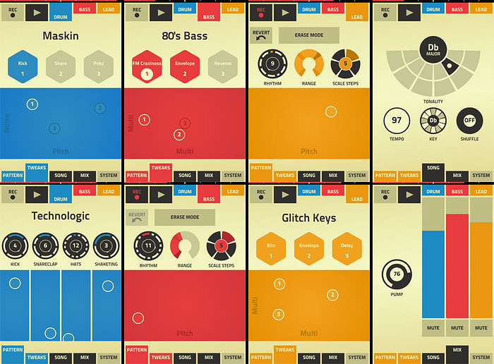
Once you have unique core elements and processes in place, the rest of the product will become intuitive. You don’t want to be an Apple look-alike. You want your app to have its own distinguishable markers and identifiers, so that anyone will associate it with your brand from a mile away. This is what Apple has succeeded in doing, and that’s what you need to do as well.
Finding the right balance between the familiar and the unique is part art and part science. Objective testing methods can help you find the right balance.
Know The Limitations Of Your MVP
This part isn’t directly related to the article, but it has a point that making new and unique product doesn’t mean creating MVPs or distorted solutions, it has to be Great!
As the lean and agile movements have taken over the startup world, consumer software products usually start small, with the proverbial minimum viable product (MVP). But an MVP is merely a learning tool; it’s something you use to research the market, not a finished consumer product. To reach the masses quickly, you need to define an initial product that’s flashy enough to get people talking, but simple enough to learn easily.
Your initial product definition should address every major aspect of the product, such as performance, quality, marketing features, and overall user experience. The first iPhone wasn’t an MVP, it was an initial product that evolved over time. Today’s iPhone would be overwhelming back in 2007.
Creating The Great Experience
When we see or use something new, we experience new feelings. So if you want your users to have new experiences you need to create something unique, but you can’t abandon the intuitive and the familiar altogether. Intuitive doesn’t mean old and worn. There are plenty of perfectly good, proven design patterns you can use to make your application look familiar right away. These patterns can help bridge the “gap” between current and target knowledge. Therefore I suggest a hybrid approach that combines familiar features to give users a basis on which to start exploring your application, and then build on those to introduce new, unique features that set you apart from the competition. Finding the right balance between the familiar and the unique is part art and part science. Objective testing methods can help you find the right balance.
When it comes to UX, a little “wow” goes a long way.

