How do 50 of the world’s biggest ecommerce sites use images in their listings page designs?

For a long time the listings page within ecommerce has remained a functional thing, where users sort through a database of options. It’s traditionally not been the most visual or inspiring place to spend time, despite the importance of great images for selling products.
However more recently I’ve noticed from the research I’ve done for clients (particularly in the fashion and travel space) that companies seem to be moving away from the small thumbnail image of products to more exciting approaches. By exciting I mean both bigger images and more of them, such as on rollover or scroll.
I had no idea if this was just something that smaller, newer sites or ones in certain sectors were doing. What about the big, leading ecommerce websites where most users spend their time?
I decided to do some original research! To find out the state of play I studied 50 of the biggest ecommerce websites in the world (full methodology and list of sites here) on both desktop and mobile. After gathering and data crunching I got the results below, where I was surprised by how old-fashioned most of these big players are.
I’ve accompanied this with some inspiration, via examples of some of the more interesting approaches amongst the studied websites.
What image dimensions and sizes are sites using?
On desktop the majority of big sites are using square images on their listings pages with 46% of them going this route. This is perhaps not surprising as square images allow for balanced grid layouts (most sites tend to display in a grid format). It also means that within this square bounding box the image can be whatever dimensions are required, so it works for a broad range of products.
After this more of them prefer a landscape rectangle design at 32%, while the remaining 22% have images that are portrait. Generally the landscape images are for row-based listings and portrait images are in the fashion sector where torso and body length images are shown.
This preference for square dimensions extends to mobile where 50% of the websites have them. 80% of the time websites have the same dimension images on mobile as they do on desktop, generally because they’re using responsive designs where elements are kept the same.
There’s a slightly different preference for rectangular images on mobile with 28% of them having portrait images compared to 22% using landscape images. This tends to be to squeeze more in and enable two listings per row.
When it comes to the actual pixel sizes that are being used, this is best explained in the graphic below. The average listings image size on desktop is 225 x 203 pixels, which typically allows for three to four images per row (for this research, desktop is considered to be 1280px wide). On mobile the average size is 153 x 161 pixels, which enables designs of a single image accompanied by text to the right or two images with text below.
Otherwise the graphs show a fairly normal distribution of sizes with them clustering around the average, other than when it comes to the mobile width where there is a gap representing the jump between images that are about half a screen wide to those that are full screen width. For the purposes of this study mobile width is 375 pixels wide.

Desktop examples
Home Depot are a fairly typical example of fitting four listings images to a page with filters running down the left side. They also show a site using swatch icons to represent different colours, which the user can click on to see the image change.
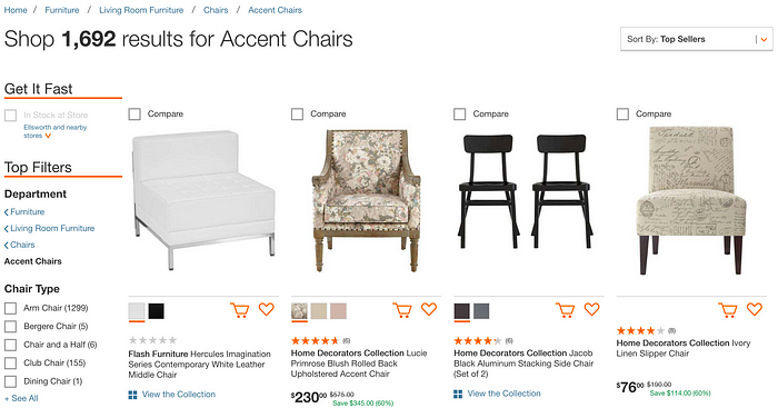
Gumtree use the smallest images of the websites studied at just 118 x 90 pixels, which is probably due to it being a site where not all the listings have images. This size is really too small to be of much use, particular when it is also covered in banners and icons.
H&M use the largest images of the websites researched — at 321 x 486 pixels. This is similar to other sites in the fashion industry, who seem to have realised that people make decisions about buying clothing almost entirely on how it looks.
Mobile examples
Surprisingly the smallest images in use were on Expedia’s website at just 75 x 75 pixels. The travel space is one where a user needs to see several images to get a sense of a property, location, room, etc and is where there has been some innovation in listings design as shown in the next section. However Expedia are giving users very little to go on.
Groupon are an example of one of the biggest mobile listings images, with them going full screen width, and pretty much half screen height. This allows lots of information and multiple shots to be placed in a single image.
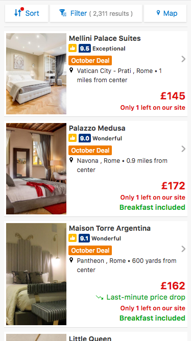
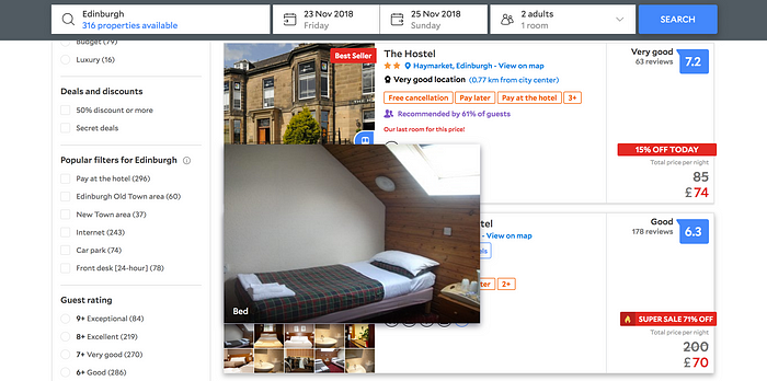
Booking.com are an example of a site doing something that not many do in the image space: having different sizes of images on their listings. This is true on desktop too where the images can vary from almost square to tall and thin. It seems to be to allow different amounts of text information to be shown next to them so they can promote certain properties.
How many images per listing on desktop?
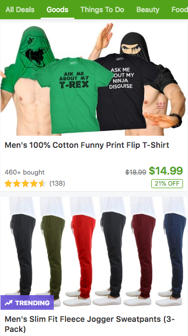
Every listing features at least one image but how many sites are going beyond this? Well not many, as 66% of the websites studied feature just one image per listing.
12% feature a single image with another (or more) appearing when the user hovers over it. Forever21 and Shutterfly had up to five extra images appearing on rollover, though in both cases no way of controlling how fast they changed.
10% had a single image with colour or variant swatches underneath, which when clicked would change the image to show the different colour (see the Home Depot example above). I was surprised by how low this was, with it being an important feature in fashion and clothing — there were more sites that had non-clickable swatches.
6% of sites allowed the user to scroll through many different images — often all the images available — and all of them were sites in the travel space. An example of this is Trip Advisor below, where it could go up to as many as 70 images to scroll through. Strangely on mobile they go the opposite direct with a single very small square image.
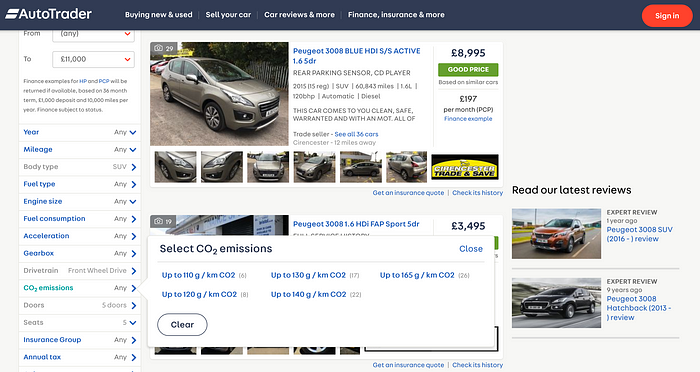
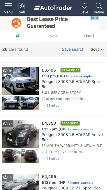
4% had a single main image with several smaller thumbnails below it. Both handled this quite differently, as shown in the Auto Trader and Agoda examples below.
Auto Trader show six very small thumbnails under the main image, which aren’t clickable but do make it clear there are more photos available.
Agoda feature a single main image with 10 other thumbnail images underneath. When hovered over this image would enlarge to be bigger than the default listings image.
Finally, only 2% (or one website) featured two equally sized images alongside each other. This can be seen on Rightmove and is a slightly odd pattern but one that shows how hard it is to pick a single image of a property to sell it.
How many images on listings on mobile?
When it comes to how many images per listing appear on mobile the story is a clear one: 94% just use a single image. This is no surprise as the page weight is important on mobile devices, especially when users have to pay for data. However with most ecommerce sites now seeing the majority of their traffic coming from mobile, users will soon expect just as impressive an experience as on desktop.
The remaining 6% of websites are made up of one site using a single image and two tiny thumbnails, and two sites allowing the user to scroll through multiple images.
The site with a single image and two small thumbnail ones is Auto Trader, showing a condensed version of their desktop website. This style is something they are able to ‘own’ across different devices with the tiny images unlikely to be too harsh on loading times.
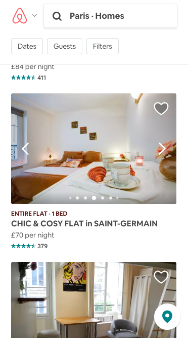
Airbnb are an example of a mobile site allowing users to scroll through many images, in this case it shows all of the pictures available for that property (even though the indicator only suggests seven).
In terms of how many individual listings are being shown on a mobile screen at once, 62% of the top 50 are just showing one per row. This is whether it’s a small image like Expedia or a large one like Groupon.
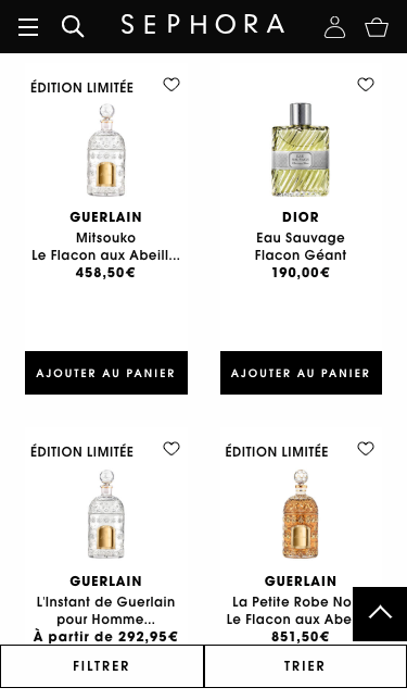
36% of the sites studied showed two listings per row (or a 2-up design), a typical example being the Sephora website below, where the user can see four products per screen. However their images are a bit on the small side, making some of the products look pretty similar.
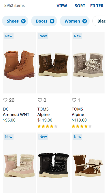
Just one website uses a pattern of three listings in a row and that was Zappos. It would be interesting to know why they went down this route as it does make things look pretty squashed, particularly when it comes to product titles.
Conclusion
I was expecting more variety and cutting edge from the biggest ecommerce websites out there and was surprised at how small the images are on average. There are practical reasons for this with websites selling large product ranges where decent photography can’t be guaranteed. Though now in a world of rapid fast computing, along with Instagram getting people used to stunning photography, users are likely to soon expect more to seduce them into tapping.
I think what’s most useful from research like this is not to see what the standard is so you can follow it, but instead to see where the gaps in the market are and opportunities to innovate. Some of the examples above highlight options for how do something more interesting with your listings page image presentation but there’s plenty of room to go further. If you’re a brand looking to offer an enhanced ecommerce experience, it doesn’t take a lot to stand out.


