How Graphic Design Improves your UX Design Skills
Product/UX designers find their way into the profession from all sorts of backgrounds. Some were engineers, some were self-taught, some were business majors who stumbled on product design as a profession after seeing Jony Ives introduce a shiny new Apple product.
I graduated from college with a bachelor’s degree in Visual Communications Design — which is the fancy academically accepted label for graphic design. However, for the last few years I’ve been a product design lead for a Series A startup.
Over my 10 year career, I’ve worked with designers from all sorts of backgrounds, but here are the top 3 things I’ve noticed about folks who come from graphic design that give them an advantage over others. Coming from other fields has their own advantages (engineers have strong logical problem-solving skills) but we’ll leave those for another day.
1. Designing for emotion
I once interviewed a design candidate who stunned me with his product thinking. His analysis of business problems, user problems, and solutions was deep, thought through, and clearly practiced. He knew how to dig into the functional problems people had and get clear answers that he could then use when proposing solutions.
The one crippling weakness the team brought up? He never once talked about people’s emotions.

Every problem that product/ux designers solve for people have two components — a functional one (something is too slow, tech doesn’t work, too expensive, etc.) and an emotional one (because it’s too slow, it makes me feel inadequate in front of my friends, for example.)
The candidate I was interviewing was amazing at making things faster, more usable, and less error-prone but was never able to create an experience that got users excited. His aesthetics skills were sub-par and he treated copywriting as an explanatory exercise that was only needed to tell people why something was there and how to use it. There was no brand, no storytelling, no emotion.
The best products don’t just tell us how to do things better, they make us feel more empowered, self-confident, intelligent, and more.
Think of your current go-to products. Maybe they’re a pair of Airpods, a Tesla, a black leather jacket or a liquid nitrogen-infused Nespresso. The feeling you get when it just works and you feel like you have superpowers and can’t wait to tell everyone you know about them? That’s design — it’s an emotional and functional experience that leaves you wondering how you ever lived before this product was invented.
Sometimes that experience even makes you forget about all of the times the product is completely unfunctional. Like trying to switch Airpod pairings between your iPhone and your Mac, for instance.
Graphic designers? They’re trained from day one to elicit emotion from people. Even if you’re self-taught, you’ve examined typography and the effects of letterforms in conveying emotion. You’ve investigated how colors make people feel, their associations, and how certain combinations will either calm or provoke.
Understanding emotion and how to control & create it is an indispensable part of great product design — and it’s often overlooked by folks from other backgrounds.
2. Craft
Imagine buying a shiny new Mac, only to find the keyboard was visibly off-center — not from a manufacturing defect but an oversight in design.
I’m not a meticulous person. But when I was studying graphic design, that carelessness got knocked out of me. We had to cut our designs out by hand using colored paper and scalpel, and glue it all together with something called rubber cement that was basically nuclear waste. Smelled like it anyway.
My first designs had glue stains and fingermarks, miscut and misaligned elements, and perhaps even a faceprint at some point when I was ready to throw in the towel at 4am.
What that taught me was the value of craft. Pixel-perfection is almost never shipped due to constraints, but it should still be the goal and only intentionally put aside — not mistakenly unnoticed. Especially with digital designs and layouts that respond to device sizes, taking pride in craft often comes with a traditional graphics background.
Folks from graphic design backgrounds will catch visual tension points, misalignments of visual elements, obviously incorrect font sizes, and more — without so much as a second glance. I once worked with a type designer who would kern by hand using printouts and tell you the exact font-sizes and what they should be changed to without ever glancing at a screen.
3. Visual Principles
Almost all designers, self-taught or not, can list off a set of visual principles that are important in product design. But if you’ve only ever designed for digital applications, your experience with form and its many possibilities is severely handicapped.
I’d find myself in a product critique giving suggestions like:
“The large dominant shape near the top creates a feeling of unease and anxiety since gravity also applies to what we see on a page.”
or
“The asymmetrical balance seems heavily skewed to the right, which leads me to focus all my attention there when the visual hierarchy should have me first reading the type in the top left”
While everyone in the room understood what asymmetrical visual balance was, few had the years of experience playing with a million layouts to be able to tell at a glance that it was imbalanced and/or what to do about it.
I’d strongly suggest any designer not trained classicly as a graphic designer to practice designing posters, magazines, and other print media — it broadens the horizon of what’s possible in a composition and shows just how restricted we still are with digital applications.
4. Ideation
I once had a professor that told me the best designs typically come from a problem so difficult you’ve tried a million solutions and just can’t get something to work. Then, after a period of banging your head on the wall, you reach a eureka moment and that’s when the magic happens.
Because of this, I remember having to create often over 100 thumbnails and 10+ comps (sort of like wireframes) before a solution was reached — all in black and white. I brought this practice to my work as a product designer and saw the immense value it added.
The product designers I worked with at startups used to start with an idea and that idea would carry through all the way to a pitch on the team. After bringing in the graphic design practice of brainstorming en masse, we’d have much more frequent conversations on much lower fidelity sketches.
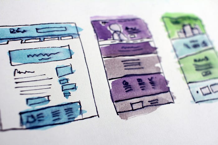
The team used to present only one design during a critique, now they would propose at least 3 so we could discuss the relative merits between each one. This significantly elevated the quality of discussion that ensued. Instead of people saying:
“I think the Information Architecture isn’t being represented properly”
They would say:
“The Information Architecture in version A is much stronger than B and C because of XYZ.”
The teams also used to try and get feedback from stakeholders by showing colored mocks. The feedback was all over the place — often times people kept commenting on the color, when the designer presenting needed feedback on the layout. Once we stripped out color and added a grayscale step the quality of feedback significantly increased and was much more focused.
These are just a few of the ways having a graphic design background helped me succeed in product design. I’m sure there’s more that other folks could add, and again I’m not advocating that aspiring product/ux designers should necessarily start with graphics — and that’s the beauty of it.
Design is a human-centered field, so as long as you are in something related, you’ll have your own set of skills to bring to the table!
I’m building a library of the best design patterns in the world. Stay up to date with the latest patterns from the best products on Shufflepop!
Join me for weekly product design insights where I share conversations I’ve had with top designers from companies like Dropbox, what I’ve learned from scaling a Series A startup into the millions in revenue, and more!