
How heat maps can improve UI design
Heat maps are a user testing methodology that can give designers valuable insights they need for better UX design
Using a heat map in your UX design process means you can make informed decisions about how you want your product to look as well as understand how your users are interacting with your website. They’re easy to use and your research can be put into practice when creating interactive prototypes.
What is a heat map?
A heat map is a method of analysis, which when used within UX design, tracks a user’s mouse pointer on the screen. The data is presented using colors so that the data is easily understood. The idea behind a heat map is to track where users are spending time on any given page. They’re a quick way to visualize data.
Heat maps are often seen outside of the world of web design when there is an election taking place. Usually, you’ll see a map of America with varying shades of blue representing the Democrat vote, and the same but in red to represent the Republican vote. The darker the red, the more Republican the state, for example.
When it comes to UX design, you can use the data gleaned from a heat map to do tests and further analysis as well as gain an understanding of which areas of your website need to be improved or changed.
A heat map will use a color spectrum made of warm to cool colors; the warm colors represent where your users linger most, the cold colors are where they spend less time on your webpage.
Types of heat maps
Aside from the more common heat map, which uses colors to show where users are on your page, there are other types of heat maps:
- Confetti
- Scroll map
A scroll map is like a heat map in that it uses a color spectrum but instead of telling you where your users are focused, it will tell you how far users have scrolled down your page. If you have important content too far down, a scroll map can tell you where your users get to on your page so you can change your content accordingly.
A confetti map is similar still to the heat map, but it will show individual clicks, often represented using a colored dot hence the name confetti. This information is more specific and can help show you where your users are clicking — especially if you see a lot of your users clicking elements which are, in fact, not clickable.
How heat maps can improve UI design
The heat maps listed above are very useful tools for the UX designer. They can help you understand your users’ behavior, which can lead to better designs.
They can also be used to understand the difference between how your male users interact with your page and how your female users do. These variables can be drilled down further to consider age and location.
Heat maps are also one of the most effective methods of increasing conversions on your website because they’re cheap to carry out but the return on investment can be massive.
Which other areas of UI design can heat maps help?
- Navigation
- Layout
- Content
- Buttons
- Images
Let us suppose you’re about to embark on a redesign of a website. Before you start crafting interactive prototypes, you may want to do a heat map analysis of your existing website.
From that, you’ll be able to know which parts of the website grabs your user’s attention as well as which call-to-actions get clicked most, if at all.
If you have a lot of content, a heat map will tell you just how much of that content is getting read.
Imagine you’re writing a product overview. If you’ve got 2000 words on your page and you find out most people zone out by 800 words, you’ll be able to cut up the content into smaller, more digestible chunks.
Or take your call to action button — are the colors enticing enough? Is it getting clicked? Is the position optimized? What about your images? Users will often click an image thinking it will take them somewhere else on your website.
If you have a high bounce rate, you might want to understand how users are interacting with the navigation of your website as well as its search functions. Are they visible? Easy to use?
A heat map can tell you a lot about how people behave. When you know how your users behave, you can design in a way to drive up conversions. Let’s look at the example below:
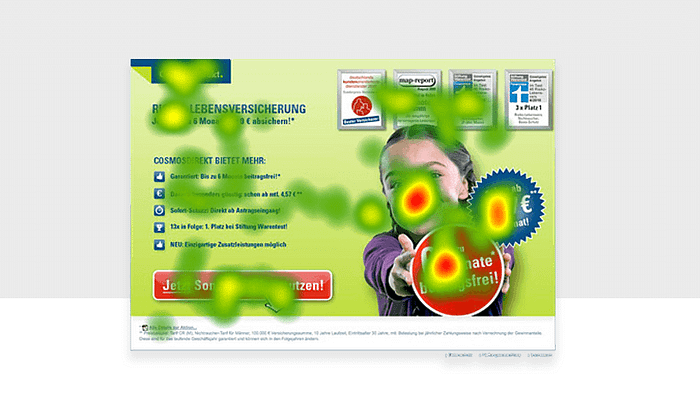
In this landing page heat map, we can see that the users are reading the text which is a good sign. They’re also lingering around the recommendations on the right corner of the website.
However, this page can do with some improvements and the heat map tells us where.
For example, there is a lot of red around the girl’s face in the picture as well as the two circles which highlights the price and offer but none around the call to action button, where we’d expect there to be a lot of red.
Understanding this map, you can see that the call to action needs to be improved or moved around to better accommodate where people are clicking.
In summary, heat maps can tell you:
- How people interact with your site’s content
- How far your users scroll down your page
- How your users interact with your website
How heat maps fit into the prototyping process
Heat maps are one UX design research method, among many others, that can be used to create better user experiences.
They are a valuable way of determining the engagement of design elements on your website and websites like CrazyEgg or Lucky Orange means any UX designer can get up and running with heat maps in no time.
Since they’re an inexpensive and quick way of getting data, it means you can prototype your solutions in a prototyping tool easily.
Conclusion
Heat maps shouldn’t be your only source of information. UX design decisions are only as good as the research behind them so combining a heat map analysis with other robust user testing methodologies will help you make informed decisions.

