
Avast Design Internship Case Study — Finding out how we can give children bigger value while keeping parents needs in mind
Introduction
I seemed to be a great fit for Avast parental control product because of my age, as I was the same age as the target group. The design team wanted me to see the problem and think about the problem for my perspective.
The problem
We identified that the children get a little value out of the product, as the main focus was placed on parent’s needs only causing that parental control was based only on monitoring children.
Parents love the product, but children want to uninstall it. As I am also the part of the target group. My key role was representing the child side while designing. The goal was to design an ideal concept of the product for children, that would bring them the value they really perceive.
Process
The purpose of the project was for me to handle all the steps of product development process, starting with a problem definition all the way to the final design.
The project was initially planned for two months before we decided to extend it to four months (2 months full-time on site + 2 months remotly as a side project).
I have conducted:
- Research (Market Analysis, User Interviews)
- Information Architecture
- Wireframing
- Designing
- Prototyping
- User Testing (1 on 1 Usability Testing)
- Presentation for the Design Director and Design Team
Target Group
We have identified the ideal target group as children between 10 and 18 years of age. The primary outcome of a value proposition canvas was that children want to feel safe while maintaining their privacy, retaining trust of their parents and having good digital well-being.
We have derived our target group from an existing parental control focused project of Avast. This gave me the opportunity to work with data Avast collected during their previous research sessions, to which I was able to contribute with my own insights.

Market Research
Competitors seemed to be oriented the same way. Most of them haven’t provided much value to children either.
Direct competitors are Safe Kids by Kasperky, LifeLock by Norton, Circle by Disney and Google Family Link. When it comes to location tracking market, the biggest competitor is Life 360. Looking at the market provided me with some interesting insights, but everything has its drawbacks I have adopted some features from the market research without thinking twice about the value they bring to the user. This turned out to be a mistake, however I was able to fix it in the following phase.
Information Architecture
After user and market research, I started thinking about potential features of the product using information architecture.
After a couple of feedback sessions and iterations with mentors, I came up with the first version of the information architecture.
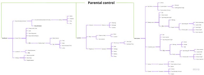
Recommended Activities
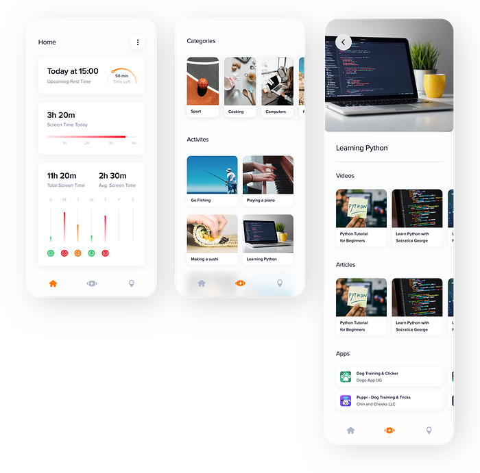
Recommended activities I chose as a main feature of the product. The main problem I have identified during my research with long time spent using the device is boredom. When children have something to do, when they have some free-time activities, hobbies, sports, they are not used to be using their devices that often because they have something else to do. This feature should help them address the issue of choosing an activity and engaging in it right now.
Recommended Screen time
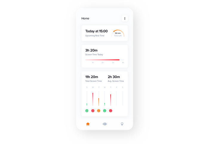
Children should see how much time they have already spent using a mobile phone and how much is recommended for them at their age. As found out in the research, children don’t know how much they should and shouldn’t spend using their devices. This feature will give them an overview of these things and help them with reducing it.
Internet Rest Time
Parents can set periods during which children can’t use their mobile phone. I think one of the biggest problems at the moment around young people is their focus. Children are constantly disturbed by notifications, etc. By adding a button for turning on the rest time, children can turn off the internet and focus on things that they want to do at a specific time.
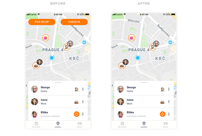
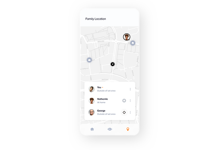
Family Location
Location was a tricky thing. I wanted to come up with something that would still keep children’s privacy while parents would know their children are safe. I came up with a concept which has the potential to satisfy both needs. Parents determine specific areas, which work like main points, where all members of a family can see each other, but when someone is outside of a set area (home, school,..), nobody can see him/her. They can view their location by clicking on a button, but the person will get a notification, that someone has viewed their location. I think the notification will ensure that no one will abuse this location feature, while if there would be a need, they can view it anytime, without the need to have some kind confirmation of the other side.
Pick me up
Pick me up feature would allow children to ask their parents to pick them up — Uber-style. Children could use it, for example, when they need to get picked up from a school.
Check-in
Many parents want to know when their children arrive somewhere, if everything is okay and if they are safe. They usually use call or text messages for this purpose. Check-in feature would streamline this process.
Omnie Game
A tough challenge, while working on this project was finding a way, how to reduce children’s screen time. I knew it will be difficult to motivate children to be less on a mobile phone or other devices. I came up with an idea for a game, where children would get points for being offline, by collecting points, opening surprise gifts and taking care of their character (for the MVP I used Pou character) they could compare with their friends & family, that would motivate them even more.
Wireframes
Wireframes helped me with thinking about the layout of the product and help me to fine-tune all the features.
Design
For the design purposes I used the Avast Design Library, supplemented by custom elements whenever I needed to create something specific to my case.
The design system really helped me and taught me a lot about how Material design works, how to work with shadows, colours, sizing, etc. Unfortunately I spent too much time on the design phase. The reason is that I moved on to the actual design before properly finishing my wireframes. This resulted in me having to go back and forth between these two phases multiple times to fix various issues that could’ve been quickly addressed during the wireframing period.
Desktop Design
I also designed a desktop version of the first concept to show that it is crucial to have the product on all kind of devices to be able to track the screen time of children and to ensure rest time feature to be meaningful. I couldn’t bring the desktop version to final design because the main focus was on a mobile version and I hadn’t had enough time for that.
Prototype
To validate the concept, I have prepared a clickable prototype in InVision.
My main focus was to prepare the prototype feel like a real app as much as possible, to ensure children would feel like in a real situation.
User Testing
I have tested the prototype with 5 children, between 10 and 15 years of age, who are active mobile users.
One of the children was already a user of a parental control app. Every user testing started with general questions about parental control products topic, to refine insights of the original user research and then continued with prototype testing. I have prepared my own session guide for it. I always tested the prototype with sound and screen recording. after each session, I played back the recording for myself so I could record the findings. This helped me to focus on the user as much as possible because I didn’t have to write insights during the testing itself. It was really enjoyable working with this type of target group. The main challenge was that some children weren’t much talkative.


Findings and Iterations
User testings brought many new findings and possible iterations that I needed to work on.
Key finding n.1 — Pick me up feature sounds like an order and is not necessary for children.
“I would use the feature pick me up, maybe just if I would be in the app and I would need it.”
“I don’t want to command my parents, I would rather text or call them.
Solution
I have removed pick me up feature. (preview in key finding n.2)
Note
I have chosen pick me up feature to the product based on American user research, and that’s the problem. I have been testing the prototype on Czech children. (more about this topic down below in the learnings sessions)
Key finding n.2 — Children wouldn’t use check-in feature.
“I usually call my parents, or I am already agreed with them at the location.”
“I often forget to write to my parents when I arrive somewhere.”
Solution
Check-in feature doesn’t seem useful for children, and also when I was thinking about this feature it doesn’t make much sense for me because parents can anytime show the current location of their children, so why would children have to send them the location.
Key finding n.3 — Location system is not understandable
“Hmmm, I don’t know if parents can see me or not, if yes, why there would be this send location button and if they can not see me all the time when they can see me? I don’t understand it.”
Solution
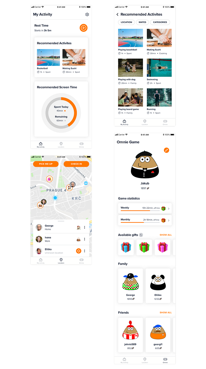
I have added children themselves to the list to help them to imagine the situation better by enabling them to see their status/how their parents see them.

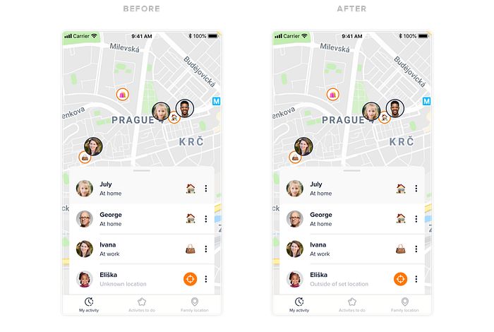
Key finding n.4 — Children didn’t understand why Eliška (family member of a user) is not visible on the map.
“I don’t see Eliška because we don’t share the location with each other or she is offline.”
“I think I will request her location when I click on the view location button, and she can accept or deny it.”
Solution
The word “unknown” wasn’t specific enough for them. So I exchanged the “unknown location” for “outside of set location”, which accurately described what does the state mean.
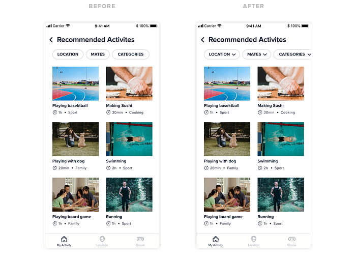
Key finding n.5 — Bad UX of the filter in recommended activities
“I thought that by clicking location button, there will be activities in my location.”
Solution
I have added arrows to hint that it is a dropdown.
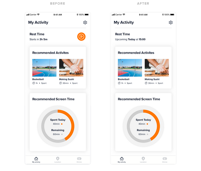
Key finding n.6 — Rest time is incomprehensible and not necessary
Some children didn’t understand Internet Rest Time, and they would probably not use the feature for turning it on.
Solution
I have removed the button for turning the rest time on because it, even more, complicated the tab and have modified the upcoming rest time indicator to a more understandable format. Children didn’t know if 3h 5m means 3 hours of using the mobile or 3 hours of real-time.
Key finding n.7 — Omnie Game was difficult to understand and against the overall vision of the product
“I don’t really know what this game is about, and how can I get those points, maybe how much I take care of my pou?”
Solution
After a few conversations with my mentors, we have decided to remove the feature of Omnie game. The main goal of the app is to decrease screen time of children, not to give them even more space to spend the time on screen by giving them a game. I have also changed the whole hierarchy of the app. I have moved recommended activities to the main tab instead of Omnie game.
Other interesting insights from research
- None of the children valued seeing their parents on the map, they don’t really care.
- Most of the children won’t mind their parents tracking their locations. (This one was probably the most surprising for me because it was one of my main goals to keep privacy in location between children and parents, but children don’t really care — maybe it was caused by lower age of the group I was testing the prototype on.
- The interviewed children didn’t know how much time they spend on the internet and how much is good for them, but they would like to at least try to reduce the time.
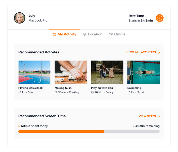
Final Design
The final design was the simplest version out of all previous iterations and was more focused on good visual appealing.
The internship was planned for 2 months, but I didn’t make it in the determined time, so I decided to finish it at home in my free time. The final product never exists, the concept would still probably need some more iterations, but it wasn’t planned, so this is the final version I was presenting to design director of Avast and the design team.
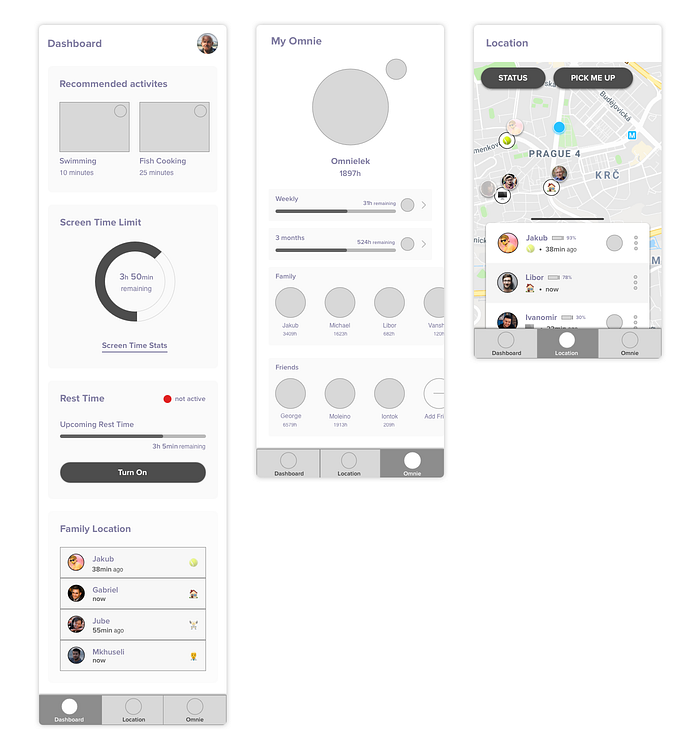
Home page (Internet Rest Time, Screen Time Stats)
The pre-iteration design contained just a recommended screen time indicator and statistics of one day, but children still couldn’t know how bad it is and what their overall statistics of the week were. Using smiles, children can see what are their stats and if their screen time is good or bad.
Activities to do
The aim of the product was to decrease children’s screen time, which they spend on useless things, like watching Fortnite on youtube(HAHA). I wanted to achieve this by offering them alternative activities they could do and help them build good habits or find a new passion. Children have access to different categories of activities, and for every activity, they have resources needed for starting with them and getting better.
Family location
Family location system wasn’t changed. It works the same as described in the first design, just visuall appealing was improved.
Feedback from Avast design team
Is there any actual value for children?
I was told that the app is missing something like recommended action and goal. Children can see how much they have spent on the mobile, but is this information of any value to them? It would be good to somehow connect it to recommended activities, show children the overall idea/goal of the product.
App design is not visually appealing for children.
Designing a visually appealing app for the whole target group between 10–18 years old can be tricky. If we would focus on children, who are 10, it most likely won’t be good, however 18 years old kids might love it. Is it right to have such a big target group, can we satisfy most of the target group? That’s the question.
Why have I removed the button for starting the rest time? Were the questions in user research asked the right way and with the right context?
The truth is I would find the button myself useful because I know how difficult it is, for example, to study while your Snapchat notifications are beeping. I have removed it because of user testing and children which wouldn’t find it useful and that’s the question, can we say that they would find or wouldn’t find something useful without them trying to use it in a real app? Maybe some of the fixes after user testing weren’t necessary and it should stay in the product for real development, which would give us real data and then we could conduct possible iterations.
My learnings and takeaways from the internship
Focus, dealing with distractions and work prioritisation.
My main problem during the internship was focus. It was my first time working 8 hours full-time, 2 months straight, and I didn’t really know how to deal with it. Avast office had a lot of places where to procrastinate and not spend time working. It was also my first time for a longer time in Prague, so I had a lot of meetings and was not 100 % focused on the internship. That was a big mistake, which I realised after the internship. I will keep it in mind next time., I will prioritise the work better, trying to avoid distractions, such as playing ping-pong, or chat with colleagues.
Document as much of the work process as possible.
During the internship, I wasn’t documenting my process so much, which made working on the final presentation, and this case study more difficult.
Choosing the right target group and knowing their needs.
I think this was the biggest problem of the whole project. Yes, we have determined the target group at the beginning of the project, but I was also working with my needs because I am a target group too. Finally, I tested the prototype on a different group of people. I didn’t know which way to go, there were my insights, insights from the people, who I tested, insights from American research, it was a mess… I also think it wasn’t good to set the target group as people from 10 to 18. I think we couldn’t satisfy this big target group. We had to spend more time on determining the target group.
It is important to prepare for meetings beforehand.
For the first meeting where I should present my work on information architecture and possible features I came with a bunch of papers, which didn’t really make sense and my speech was chaotic, I didn’t even know where to start. My manager told me that it shouldn’t happen.
We have determined the target group but haven’t determined the location of the target group.
As I said, I think the target group wasn’t settled the right way and also what came up as a problem during working on a concept was not determined location of the target group. I have been working with Avast research data from America market + working with my own insights + testing the prototype on Czech children. We found out that American and Czech markets have slightly different needs, causing incorrect selection of features during the user testing with Czech children.
It wasn’t good to stretch the project from 2 months to 4 months.
I have been working on the project 2 months full-time and then had to go back to school after the summer holiday. I decided to finish the project from home because I didn’t want to end the internship with an unfinished concept. It wasn’t probably the right choice to work on it from home because I wasn’t at Prague and couldn’t be in touch that much with people at Avast. I probably should have finished the internship with the progress I had after 2 months or assign 2 full weeks to it after the summer, but I was slowly working on it for additional 2 months which wasn’t good neither for me nor Avast.
Summary
I tried and learned many new things and gained understanding of working full-time. It is not as easy as it looks like. It changed my way of thinking, not just about the design industry, but in many other ways. I have experienced living 2 months alone in Prague without my family. Overall the internship was a fantastic and a really useful opportunity for me, and I am thankful for it. Biggest thanks go to my mentor Tran, who spent the most of the time with me and prepared the whole internship for me.

You can check out my new portfolio on www.zegzulka.com
or contact me on Instagram, LinkedIn, Dribbble, Behance or Twitter 👨💻👋

