Redesigning The Globe and Mail’s Subscription Ads
I’ve been a fan of the design-related content on Medium for a few months now and have finally decided to join the platform and post some of my own work. In this quick project I propose small visual tweaks that could be made to The Globe and Mail’s website, a Canadian newspaper I frequently read. As a quick disclaimer, I am in no way associated with The Globe and Mail, but rather a fan of the publication with a bit of free time.
A short while ago, while perusing The Globe and Mail, I noticed a new subscription ad that was fixed at the bottom of the screen. This ad is visually pronounced and drew my immediate attention, as I’m sure it was intended to do. However, I was not in the market for a new newspaper subscription and there was no way to completely close this ad.
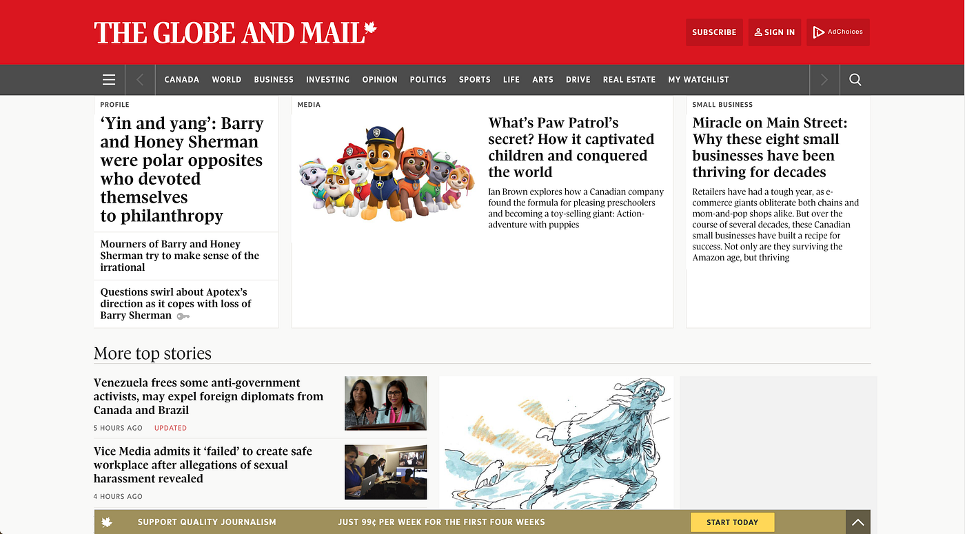
While this ad was relatively unobtrusive, as I scrolled through the page it expanded to take up more space and distract my attention from headlines at the bottom of the page. I was able to collapse the add, but it later re-expanded automatically when I continued to scroll.

This movement is particularly distracting and it made me wonder if there were better ways The Globe and Mail could promote subscription features. I looked to websites of other newspapers and magazines to see how they promote subscriptions.
The New Yorker has an attractively designed website and promotes its subscription feature prominently in various places on the top of the page.

These ads do not scroll with the user; however, they do reappear further down the page taking up space that could be used to showcase articles.

I am sure visitors would find more value in seeing three articles on this page rather than being reminded, yet again, that they could upgrade their wardrobe with a new tote bag if they subscribe.
Next, I looked at The Boston Globe, which has very simplistic subscription button. However, its use of colour draws the attention of the user and still manages to inform them of the cost of subscription.

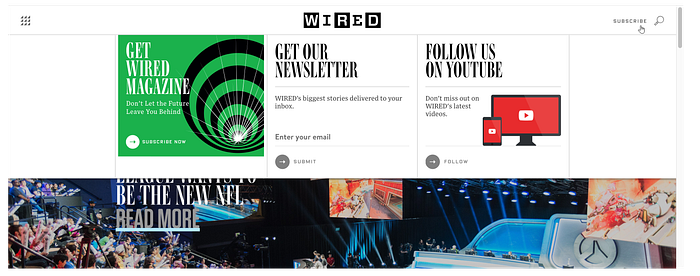
Wired magazine uses a similarly simple subscription button, but presents more details when the user hovers over it.
At this point, I would like to note that I have no data on the effectiveness of any of these subscription advertisements. It might be the case that after user testing and collecting data on the click-through rate of their subscription ads, The Globe and Mail has found its current design to be effective in generating subscriptions. Nonetheless, I felt the ads could be improved and I wouldn’t be surprised if others find them somewhat distracting.
My first idea was to use Wired’s approach and incorporate hover-triggered overlays to give visitors subscription details. What I personally appreciate about this is that it is self-selected. If I, the visitor, enjoy reading The Globe and Mail, I will click or hover over the subscription button at which point relevant information is provided.
Another option would be to follow suit with the Boston Globe, and feature a very simple subscription button that provides the most important piece of information for decision-making — the price of subscribing. This could also be coupled with the previous overlay if users hover over the button.

Alternatively, an even more minimalistic option would be to reveal the price only if interested users hover over the subscription button, and then reveal subscription features if users click through to the subscription page.
For most publications attempting to thrive in the digital age, online subscriptions are an essential part of their business model. However, there are a myriad of ways these subscriptions can be advertised. It is important that companies consider how these ads affect the users experience when trying to consume the news. With this in mind, I hope you enjoyed my ideas on how The Globe and Mail could better advertise digital subscriptions.

