How to Craft Effective Registration
by Nick Babich
Even though registration is so common thing, it’s also one of the trickiest parts to design. Ensure that your sign up page isn’t an obstacle for your users by following these tips.
1. Don’t use ‘sign in’ and ‘sign up’ together
How fast can you spot the difference between ‘sign up’ and ‘sign in’ on image below?

The problem is that ‘Sign In’ and ‘Sign Up’ are quite close. When buttons looks too similar and both use the same verb in their labels it’s pretty easy for users to select a wrong option. Users might click one while thinking about the other, and usually this problem frustrates the users who try to sign in because they click sign up. It happens because
Users don’t read, they scan
They scan screen quickly and assume that the first call to action that catches their attention is the correct one. But even when users select correct option, they’ll spend extra time to distinguish the two buttons.
Do not make users think! (Steve Krug)
Users shouldn’t have to pause and and think what button should they click. If you want to provide a good user experience during login, avoid using ‘sign up’ and ‘sign in’ together. Instead, make the button distinct from each other using different verbs in labels:

and different visual appearance for buttons (colors and styles) to make the difference more evident:

2. Eliminate as many fields as possible
When registering a new user, ask the minimum possible amount of information. The fewer form fields your users have to fill in, the less likely they will abandon the process. Consider what information you absolutely necessary to gather:
- Remove the double entry password and email field. A better solution exists for fixing mistypes (see section 4).
- Eliminate all optional fields. If a piece of information is not required for the registration there’s no point wasting a user’s time asking for this information. You will always have a chance to ask additional information later. Yet, if you decide to add some optional fields in your registration form, at least make sure to clearly highlight them with label Optional:

3. Visually differentiate login from registration
Many sites and apps use almost the same number of input fields (email/user name and password) for login and registration forms and show the two side by side:

It’s very important to clearly differentiate the registration from login to minimize the chance users accidentally attempting to log in via the registration form. For example, Twitter login and registration forms not just look different, but they also have different color for CTA buttons and proper help text (‘New to Twitter? Sign up”).

4. Let users see their password
Mistyping password is a common problem during login and registration. It’s relatively easy to make mistakes when typing a password because the field data is masked for security reasons. But typing is error-prone, especially on tiny screens of mobile devices.
Many sign up forms try to prevent mistyping errors using the confirm password field when creating a password:
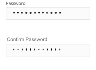
It’s not recommended to follow this approach. First, you introduce an extra field which contradicts the #2 point mentioned above. Second, users can make the same mistake twice (because they can’t see what they’re typing)
Don’t make the user fill in the same field twice!
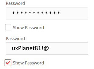
The only good solution for this problem is offering a ‘show password’ option. You can place a checkbox ‘Show password’ near the password field. When users click it, it’ll display their input unmasked.
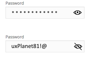
Alternatively you can use an icon button. When user click on the icon, display the eye icon with a slash over it to represent masking.
5. Provide support and guidance
Support your users during login — clearly identify and explain form field errors. If a field isn’t completed correctly, don’t just tell users they made a mistake. Show where the error occurred, and explain what they need to do to fix it.
User-friendly and Descriptive Error Messages
“For security reasons, your password must be longer than 6 and shorter than 10 characters, contain at least one capital letter, a number and a symbol.” This is a typical password requirement, but users can have a hard time following this instruction. Mailchimp found an elegant solution for this-the service validates user password in real-time and provides a visual indication of user progress. So the user will see what points from the instruction they will need to follow.

Real-time Data Validation
Real-time validation is a technique that informs users about the correctness of the provided data in real time. This approach allows users to fix the errors faster —users don’t have to press submit buttons to see errors. However, form validation shouldn’t only tell users what they did wrong, it should also tell them what they’re doing right. This gives users more confidence to move through the registration form.

Real-time validation works especially well for typing email address. Twitter can be used as a good reference. On the screen below you can see that the form informs me that this email is already in use and offer me some options (either to login or recover my password).

6. Use email or phone number as a username
If you ask users to create a username during registration, you create two problems for them:
- Since usernames have to be unique, users will need to spend extra time before they end up with a proper name (because well-sound usernames have already been taken by other users).
- Users end up registering with a brand new username that they are hardly remember after a while.

How to solve this problem? Do not ask users to create a username —allow them to login with their email address or phone number:

7. Offer log in via Facebook, Twitter or Google+
Why force users to create another set of login details when you can let them login via an external account, such as Facebook, Google or Twitter? This feature can alleviate registration headaches.

Comparing to the standard registration with email, it has both pros and cons:
- Pros: Users don’t have to fill out registration form, create another pairs of username/password, verify emails. The entire sign up will take a few seconds rather than a few minutes. And most important, users don’t have to remember a new usernames/passwords.
- Cons: Users will need to share the personal information from their social network account and this raises a huge privacy concern. Not everyone will be happy to share their profile data. That’s why login via social network is a nice addition to traditional login system, not a full replacement.

8. Keep users signed in when they register
Common issue with registration is requiring users to log in immediately after registration. This extra step usually frustrates the user. Design the app to make new users stay signed in immediately after registration. The only exception for this rule is banking apps where security is top priority.
9. Design painless password recovery
It’s very important that if users do forget their password (and they will) that this is well handled by the login process.
Always offer “Forgot password” option
And make it easy for users to reset their password so they don’t abandon your service. ‘Forgot password’ link should be visible all the time (not just after the incorrectly entered password).

Bonus. Follow a ‘Try Before You Buy’ Strategy
Many users won’t try an app/online service that asks them to create account upfront (especially, when the trust level of a service is very low). Forcing registration too early can cause more than 85% of users to abandon the product.
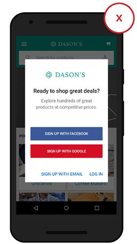
Always try to provide a limited set of features without registration rather than force users to create an account.
Follow a ‘try before you buy’ strategy. Give new users the ability to experience your product and they will be more willing to sing up. A try before you buy pattern doesn’t mean you cannot ask a user to create an account. It means that
You ask users to sign up after they get some value
For example, YouTube lets new users browse as much content as they’d like, prompting them only to sign up when they try to reply or create their own video content.

Thank you!
Follow UX Planet: Twitter | Facebook
Learn how to design better products
Interactions between computers and humans should be as intuitive as conversations between two humans. Interaction Design Foundation will help you to learn how to design for efficiency and persuasion.


