How to create a start page for your website that attracts attention

Your website start page serves as the entry point of your website, it is your brand’s first impression, a virtual handshake with your prospects and customers. it is so important that you do not want to screw it up, especially if your company is a startup — your website is your only online presence. If the design of your start page is not good, no matter how good the rest of your site is, your visitors would leave right away. In Google Analytics, you can check how good your start page is, based on the bounce rate. The lower the bounce rate, the better your start page is. Bounce rate is the percentage of single page visits, if your site only has one page, it is natural that your visitors leave your site without going to the other pages. However, bounce rate doesn’t apply to a one pager, i.e. website that only has one page.
If your bounce rate is high, there are a number of possibilities but I am going to focus on how to design a stunning start page that could help with your bounce rate in this article.
In my daily job, lots of my customers are photographers. I am neither a photographer myself nor have studied photography. However, I have learnt some tricks from them as to how to compose a good image, actually the trick I am going to introduce is something you can use in painting, book cover design and web design, etc.
Let’s start with the image below, what draws your attention?

Your answer could be the cup of coffee, another possible answer is the fruit cakes. OK, the cakes indeed look scrumptious or you may be craving for a cup of coffee but there is another reason.
Now look at the same image again, this time with a gird:

Can you see how the food lies along the grid and two of the intersections fall on the coffee and the fruit cake? The gird is not an ordinary gird, it has a name, actually it is a rule.
Rule of Thirds
Rule of thirds is photography 101. Your image would be more appealing if you follow this rule. Basically you compose your image by following a 3 x 3 grid as you see above. The intersections are the important areas and you should place your points of interest. You can also have your points of interest along the grid lines.
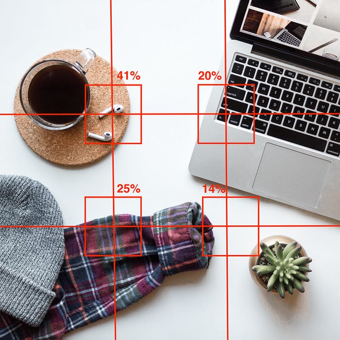
The image below shows the order of different intersections. The top left intersection is 41%, it means 41% of the viewers would look at this part of the image first. It is a perfect area to place your company logo, tagline and so on. The intersection underneath the 41% area is also important, it is great place to add a call to action button to convert your visitors. Then you have the 20% and 14% area on the right, you can make use of this space by inserting a powerful image or some highlights of your service / product.
How can I apply Rule of Thirds to my start page design?
That’s easy. Place the areas of interest along the grid and around the intersections, see the example below:
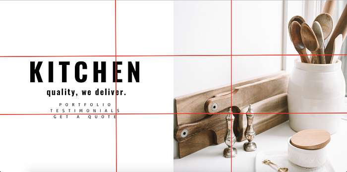
This is a dummy start page I created to illustrate how it works. If you have read my previous article about what makes a good website, you may remember that a good website should be clean and not busy, as the busiest it is, the more confused your visitors would become. So, I keep this dummy page clean and simple, with the logo, tagline and important links on the left, placing along the grid and the intersections (41% and 25%).
Famous examples
You are not convinced? Then look at a couple of famous examples.
Here is the landing page of Spotify. After you click on the link you will see there are two call to action buttons: Sign Up and Login as well as the tagline: “Get the right music, right now”. These important elements are located around the 3 x 3 gird and they get your attention straight away.
Another famous example is Slack. Their tagline “Where Work Happens” and the call to action button “GET STARTED” are strategically placed along the grid line. Neither of the above examples has a busy design nor too much information, as a visitor, you know where to click right away.
Takeaways
There are different rules when it comes to designing a good start page. Rule of Thirds and Golden Ratio, to name a couple. Rule of Thirds is the easiest to understand and the simplest to apply. Simply take a screenshot of your start page above the fold, use this easy to use tool to apply a 3 x 3 grid on the screenshot. Instantly you will see if you need to rework your start page or not. A final suggestion, if you are going to rework your start page, pay attention to the change of your bounce rate in Google Analytics, this will help you understand if your new design is working or not.