Member-only story
How to design a better bottom navbar (Tab bar)?
Tips, best practices and important points for creating a navigation system.
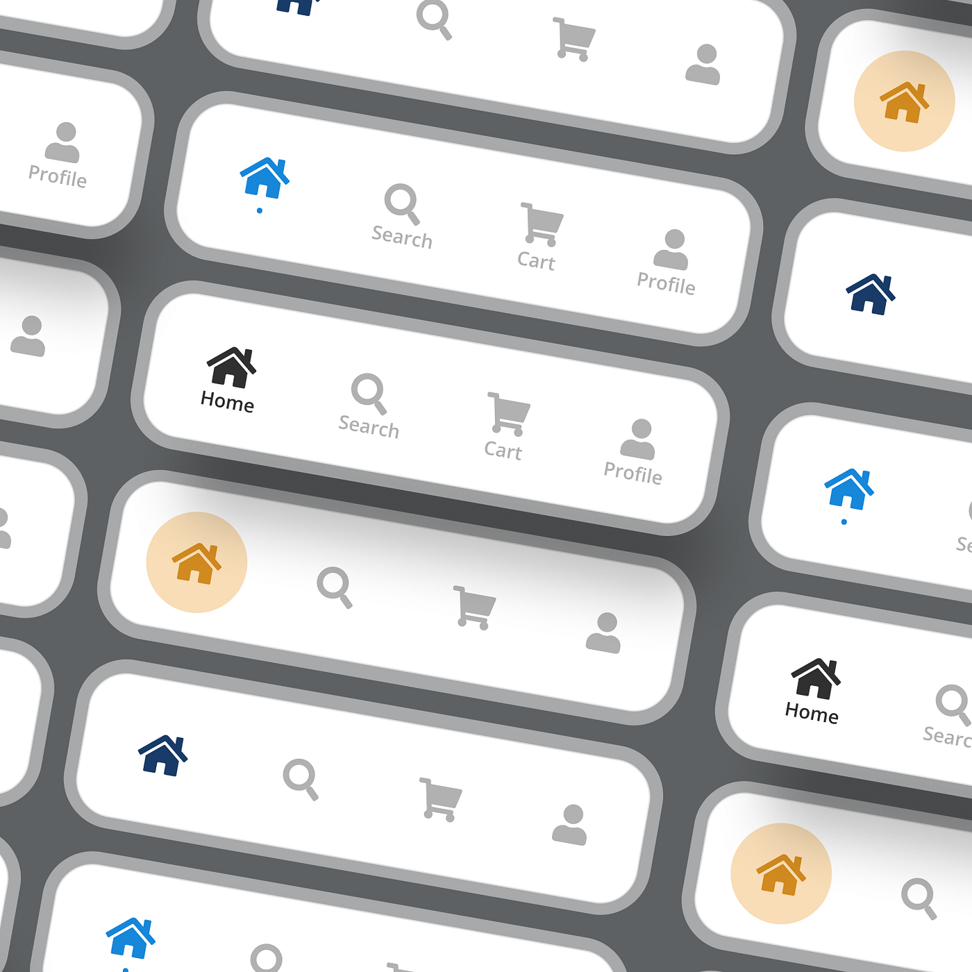
There are considerable ways in which you can style, list, and showcase your app menu or navigable items. One of the popular styles is the bottom navigation bar.
It has elements named as icons, sometimes accompanied by texts, that are well-known and important enough to be highlighted. Upon selecting the bottom navigation bar icons, users can switch to a chosen view or refresh the currently active view.
This brings their app usage experience smoother and expedites navigability. It also makes the app content more discoverable, thereby giving a boost to engagement, interactions, conversions, responses to CTA buttons, and more.
Why do we need a Bottom Navigation Bar?
- The user can check which screen are they on at the time.
- It allows the user to change to distinct activities/fragments easily.
- It makes the user informed of the different screens functional in the app.
Importance
The bottom navigation bar aligns with the “thumb rule of design”. It acts on the principle, that most app users scroll and navigate apps using their thumbs. Hence, the primary and significant screens and pages within an app should be easily accessible by a user’s thumb.
This exhibition makes the bottom navigation bars a more important aspect of app design. It settles most of the essential sections of the app within the reach of the users’ thumb, thereby making it more convenient.

Instead of using just the hamburger menu, or any other menu design, one must also add the important items at the bottom of the app, in an easily navigable format. This bottom navigation bar can be kept constant across multiple or all screens on the app.

