Member-only story
How to Design a Perfect Date Picker Control?
What Is A Date Picker Control?
A user interacts with different UI controls while working on a software. Providing the right control at right place is a challenge for UX designers.
An input of Date format is a common type of input while interacting on a web form. Adding a good user experience for a Date input control is as important as for any other input control on UI.
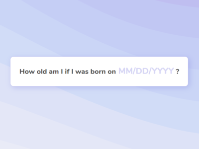
A Date input control is a text control where user can insert Date in required format. It is helpful for user to provide him guidance about the required format.
To avoid an invalid format, usually a Date Picker control is provided along with Date input control where user can select the required Date easily by navigating between days, months and years.
When To Use A Date Picker?
A Date Picker control is used where a date is required as input from user. For example, Date of Birth, Joining Date, Range of Date for searching required items etc.
Date Picker Control: Best UI Practices
Following sections present best UI practices to design Date input and Date picker control.
I. Date Input Control
1. Split Date control into Days, Months, Years or provide one control?
A Date Input control can be displayed in multiple ways on UI.
Date input control can be a text box that takes Date as input. Such type of control displays a Calendar icon that user clicks to see the Date Picker control, a calendar. User can enter Date inside text box in the required format or click on Calendar icon to open the calendar and select date from it.


Date input control can display as a group of multiple drop-down boxes where user provides three inputs: day, month…


