Member-only story
How to design and style better slider?
Allow users to make selections from a range of values.
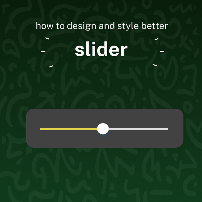
A slider is a user interface element that represents an volume slider or control. It allows the user to move a knob or bar from left to right and vice versa in a straight line.
The slider provides excellent navigation for websites and applications where there are only a few elements to explore. The slider feels natural to the user and provides a fun way to change settings or explore features.
The slider is easily recognizable to the user, making it easy to use and making them a very practical choice for designers to explore.
Benefits of slider
- The sliders are easy to understand and learn.
- It makes them feel intuitive.
- Touch devices with small screens and sliders are great choices because they don’t take up much space.
- Sliders help users move next and back, increase speed or volume, and create a sense of urgency.
Problems with slider
When users use sliders, they often do so when they are distracted or in a rush, which often means the slider is pushed too far in one direction while trying to lift their finger from the screen.
With too much pressure, it can be difficult to get your slider to work the way you want it to.
Senior users with shaky hands may have difficulty with sliders. When using a slider, it is difficult to guarantee an accurate result. In these cases, users may feel helpless while trying to navigate the website.
Issues with usability
After you’ve researched your audience and decided that using a slider might be appropriate, think about your composition. Touchscreen users often use their thumbs when working on their devices.

Therefore, it is important to examine the area of the screen that will be occupied by the user’s finger or thumb. This will help you position the slider on the screen so that…


