How To Design Case Studies that People Don’t Skip?
Design case studies can be lengthy. Often, recruiters and others may not spend more than a second glancing through them, deciding if it’s worth a full read.
The truth? Many won’t even click on your case study’s thumbnail if it doesn’t grab their attention.
So, how can we craft case studies that captivate readers, compelling them to explore further and potentially convert into a job or freelance lead?
While I don’t claim to be an expert with the definitive solution, I’ve picked up valuable insights over the years that have earned me leads, whether through my website or Behance. Let’s dive in!
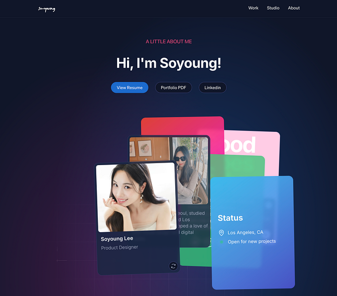
1. Thumbnail Importance
Many designers overlook the power of thumbnails, but they play a pivotal role. Why?
- They’re the first impression of your case study. If it’s intriguing, readers are more likely to engage.
- Thumbnails set expectations. An exceptional thumbnail suggests the content is equally compelling.
- They showcase your attention to detail and design skills.
You might think these factors are minor, but they influence decisions, even subconsciously.

Links to all the above case studies
Kensho | Mobile App Design, Cradle, Moonie — Go to sleep happy and relaxed, Scott-Be Your Own Bank, Limerick, WebMoney Redesigns
I have curated a list of 100+ such amazing Behance Case Studies if you are interested in checking them out. Here is the link.
2. Accompanying Information
The details you present alongside your case study thumbnails can significantly impact a viewer’s interest, especially if your audience is recruiters. This could be product metrics influenced by your design or intriguing project facts.
Note: While platforms like Behance or Dribbble might not allow for this, it’s a great addition to your personal portfolio.

3. Storytelling Over Listing
Instead of the standard approach of detailing research, insights, and designs, weave a compelling story. Share how the project began, your inspirations, collaborative moments, design decisions, and their impact. Frame your story keeping in mind your target audience — whether it’s recruiters, enthusiasts, or stakeholders. Ensure your narrative resonates with them.
4. Mind the Reading Time
Consider the time someone might spend on your case study. With potentially hundreds to go through, recruiters appreciate brevity. If you have extensive details to share, offer two versions: a concise one and an in-depth one. This way, readers can choose based on their interest and time. This approach might be best suited for personal websites.

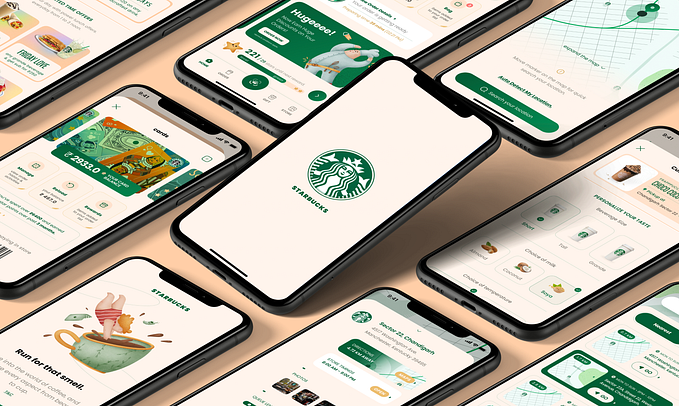
5. Emphasize Visuals
“A picture tells a thousand words.”
This is especially true for designers, visuals can communicate complex ideas quickly. Ensure your case studies are visually rich, making them engaging and easy to digest if you’re skilled in motion graphics, even better!
One of the best case studies I have come across with a good combination of visuals and videos.
🍪 Cookie Tip: Your portfolio is always evolving. The best way to ensure people don’t skip your case studies? Have one to begin with! 😉
I wish you success in your case study journey!
👋Hey there, If you are interested in more UI/UX-related design topics do follow me on LinkedIn and Medium.
Also here are some great free UI/UX resources on Gumroad & Figma Community. Do check them out :)