How to Design Great UX for Sign Up Form

How many people like filling out forms? I think, not many. It’s not what users want from the service — they just want to buy tickets, chat with friends and so forth. And signing up is somehow a unavoidable evil they have to deal with. So what’s the problem with submitting forms?
- It’s time consuming.
- Complicated forms can be hard to figure out.
- Forms may ask for the information users are afraid to share — credit card details, phone numbers, addresses.
Forms are crucial for business success and they may lead to low conversion and clients abandonment. But it’s also the place where users struggle the most. So how a designer can help in this case? How to design a really great form? Here are some advice.
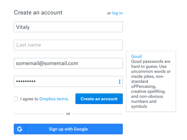
Allow Sign Up and Log In via social services — Facebook, Google etc.
A social sign-in is an extremely powerful tool which facilitates the fields completion. Remember to assure people that their social data is secured and explain what information you need.

Save entered data
One of the most useful features in forms — remember input data a user has already filled in. In case something goes wrong, the user doesn’t need to re-enter all the information again. This function is specially useful for long forms. Garlic.js allows you to automatically persist your forms’ text field values locally, until the form is submitted.
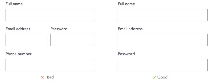
Keep form as short as you can or split it into multiple steps
Add only essential fields in your form — it’ll save time and reduce errors. If a field is optional, it’s better not to show it at all. Limit the form to only 1 or 2 optional fields, and clearly mark them as optional. Also remove any confirmation fields but those you really need. If you can’t avoid a long form, split it into multiple steps and group the related fields.

Auto-focus the first input field in the form
Autofocusing guides users to the starting point of your form. Emphasize the first field with an accent border color, background color or both.

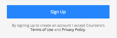
Avoid checkboxes for Privacy Police agreement confirmation
Instead of checkboxes use text with links about acceptance of the terms and policies. UPDATE: in some cases (in the EU for example) checkboxes are only allowed instead of auto-accept, so it’s better to check with legal (thanks Thomas Leitermann).
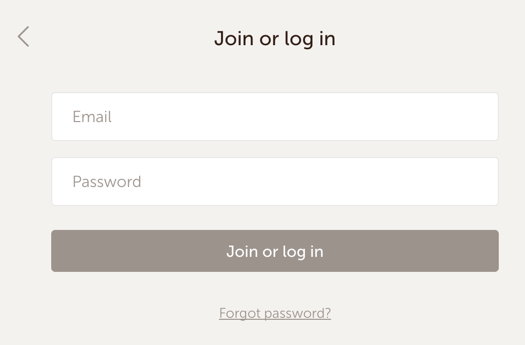
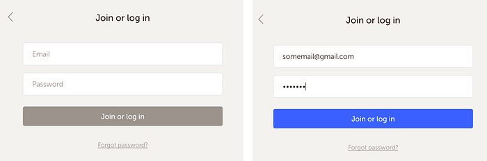
You can use one form for Sign Up and log In (but be careful)
It’s a good point to create one universal form for signing up and logging in. After entering email and password, the service checks if the email is already in it’s database. If yes, you will log in, if not — the service will create a new account for you. But take attention, that this approach has some issues — if you enter wrong but valid email, the service will create an account with this email.
Present fields in a single column layout
Keep users in the flow by sticking to a single column to avoid reorientation.. (Exceptions: short and related fields such as City, State, and Zip Code).
Provide clear heading
A good design starts with a text, a good form starts with a title. Short and smart CTA shows users the benefits of completing this form and motivates them as well. For trustworthy, show that the user’s information is secured, provide security badges.

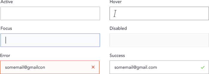
Setup the input
An input field is a basic element of any forms. A simple input consists of several parts — Input Field, Label, Placeholder.
Input Field
Generally, a textfield has 6 stated — Default, Hover, Focus, Error, Success and Disabled.
Label
A good thumb of the rule is to use top aligned labels as they are quicker to read. In short forms it’s OK to use meaningful icons instead of labels. Another way is using floating labels like in Material Design. Labels should have a short and clear microcopy. A sentence case or a title case — it’s your choice, but keep consistency in the label naming. Group related labels and fields — place labels close to the fields they are related to.
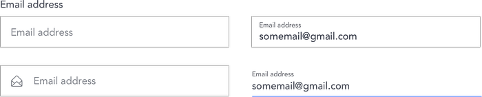
Placeholder
Placeholders are hints that help users to understand what type and format of data can be entered. Avoid using placeholders as labels thus it makes the form compact. It works good for short forms with 2–3 fields, but not for longer forms. When the user enters information into the field, the placeholder disappears and the user may not be able to check if they enter the right type of data.
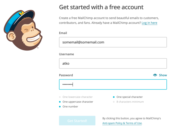
Be careful with the password field
I pointed out the password field because it has its own constraints and tricks.
Let users see their passwords
It helps users to check their passwords before submission.
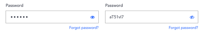
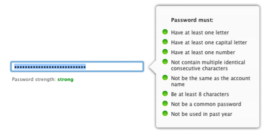
Show the password strength
Good passwords are hard to guess. Display the users how strong and secure their password is and if they need to make it more complicated.
Show the password requirements before submission
If your service needs specific requirements for passwords, show them before submitting the form.
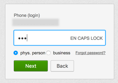
Warn users that Caps Lock is ON
It helps to prevent such a common error as suddenly pressing Caps Lock key of Shift key.
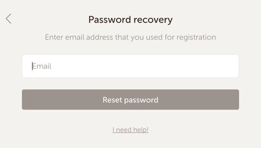
Design a ‘Forgot Your Password?’ flow for log in forms
People often forget their password (and so do I), so make it easy to remind or recover the password.
Create powerful buttons
Name buttons properly
Instead of using a general Submit label, a form button should describe exactly what the user is doing in their task — Create Account, Log In etc.

Make the button disabled until all the required inputs are completed
This is another way to visually validate inputs before submission.
Use primary and secondary buttons properly
If you have two buttons — primary and secondary, you should visually differentiate them to reduce potential errors. Being more important, the primary button should look more noticeable.

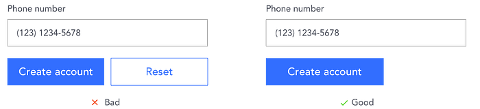
Avoid Reset and Clear buttons!
Think about error prevention
Error prevention is one of the most important parts of a good form. Think how the system can prevent and fix common errors, instead of just showing users error messages.
Input Automation
Automating the user’s input prevents their mistakes by cutting down the fields they need to fill out.
- Auto-fill city and state textfields based on ZIP code or geolocation data.
- Select the card type from the entered credit card number.
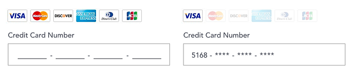
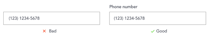
Format Your Fields with Input Masks
To fix input problems use input masks on formatted data fields. Input masks automatically insert the correct format in the field.
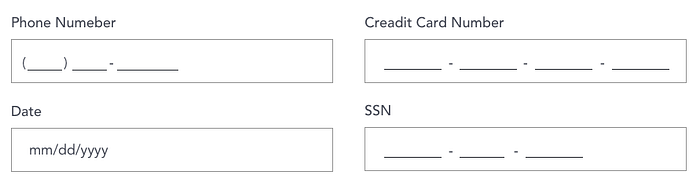
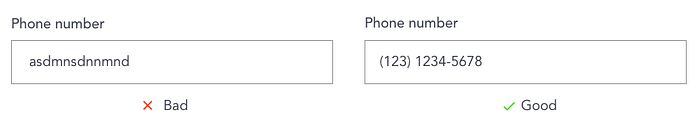
Field Constraints
Another technique to control user input is to add field constraints. Allow numbers only for phone & ZIP code fields, for examples.
And remember about the errors validation
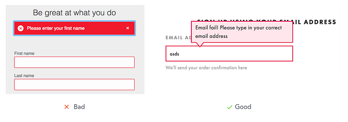
1. Use inline validation
Avoid error summaries, place error messages next to inputs. Show error messages one field at a time.
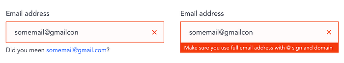
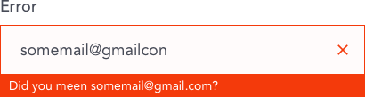
2. Use a clear microcopy for the error message
It should tell users why their information gets rejected and how to fix it. The tone of your error messages should feel polite and professional.
3. Validate fields with multiple requirements before submission
4. Highlight error fields with color, icons and text
Make the error message clearly visible, use different ways to emphasize it — color, text and icon.
Conclusion
As we can see, a good sign up form is a tricky thing, it isn’t just a nice UI design. To improve users experience, a designer needs to think about all the details of the process. A properly made form can increase conversion and decrease clients abandonment.

