How to Design UX for B2C Business Models?
Always deliver more than what is expected ~ Larry Page

Businesses are unremittingly under pressure to maintain the brand name and customer experience above and beyond the competitors. One of the larger views of everything that goes into your customers' experiences with your business, services, and products = User Experience.
What is a B2C Business Model?
Business transactions in a B2C business model happen between companies that sell products or services directly to personal-use customers. A consumer goes to the website of the business he wishes to interact on, selects a catalog, orders the catalog, and an email is sent to the business organization.
Key Features of B2C Model:
- Heavy advertising required to attract customers
- High investments in terms of hardware/software
- Support or good customer care service
The Need of UX for Business
In the rapidly expanding world of today, technology has become an inseparable part of human life and everything is digital: on phones, tablets or desktops. It is therefore quintessential to design the screens of the business and the User Experience in lines with the goals, needs, and demands of the business itself.
Any business would primarily focus on to increase its sales and grow bigger and larger. UX Design plays an indispensable role in achieving this goal. I’d say the Conversion Rate Optimisation (CRO) is directly proportional to the User Experience of the web app they perform transactions on.
And therefore, I’ve collected a list of UX Best Practices to design UX for the B2C Models.
1. Don’t overwhelm users with information: prioritize content

Information is what everyone covets. In the age of information, it is really important how you present it to your readers and users. For the conversation to be fluent and effective, the User Experience must concentrate upon prioritizing the information.
Websites or apps that overwhelm the users, with color, content, typeface or layout of the screen is unacceptable. Every user, of different age, geography, mindset, knowledge level must get the context of your information presented. No information should get wasted!
2. Activate color psychology

Brand values should play a key role in creating a color palette; designing in accordance with the theme of your business. Color palettes, typeface fonts everything to match up with your brand. Being cautious not to use a color palette that is nearly identical to a brand’s primary competition avoids the breed of confusion and ensure the brand stands out. (Example or Exception: McDonald’s and Wendy’s)
Visual Learning Center has curated the perfect palettes for your web apps according to the themes of your business. Be it food, clothes, stationery, organic products, pottery, and much more. Find it here.

Understanding color psychology is a key aspect to work it in digital design. UX Designers sometimes think of color as a purely aesthetic choice but, it is, in fact, a key component of the psychological impact of design on users.
The emotional impact of interface colors shouldn’t be overlooked. And while some colors are universal in UX design. Knowing these basic color meanings gives designers a solid basis on which to build color palettes for any brand or product.
Color theory is science, plus art. A color is generally associated with a particular feeling or mood and combining it with different colors, altering the exact hue, or varying the proportions changes the entire way of how it is used amongst the design elements.
3. Consider promo video content

Video is everywhere; Videos are the lighthouse to a lost user on a boat in your Meditarrian. Video content helps when the users have control over what they wish to watch, the content, understand what’s contained within it, and have an alternate way to access it.
By putting the video out there, you create the environment. Pins to remember:
- Use video only when necessary
- Give control over the video to the user
- Users should know what’s next
- Never leave your users amiss or lost
- Time counts! Try shorter length videos
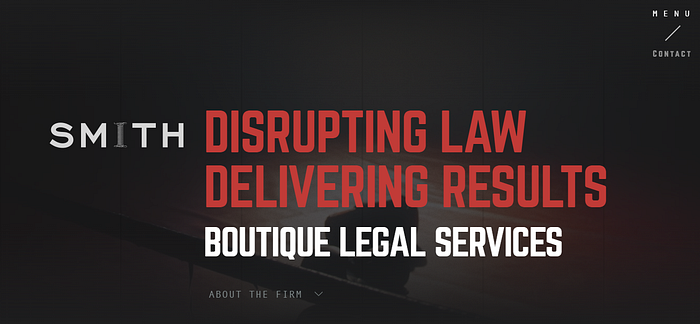
References worth checking out: Wishpond, Standard Films, Smith, Speckyboy
4. Use Landing Pages and Parallax Scrolling
Landing Page
How do you convince your visitors that your website is plunge-worthy? Or your website is the one they've been looking for! What makes THE CUT for your website? The answer is a Landing Page.
A landing page should have a single purpose and thus a single focused message.
A good landing page must be a congruence of every element of your page aligned conceptually to the topic and goal of your business.
References for a good eye: Smith, Slack, Shopify, Airbnb, Unbounce
Parallax Scrolling

The cool parallax effect has been around in video games for years, but it is now that it has become a popular trend in the web design world.
Parallax scrolling uses multiple backgrounds which seem to move at different speeds to create a sensation of depth — creating a virtual 3Dand interesting browsing experience. The website layout sees the background of the web page moving at a slower rate to the foreground, creating a 3D effect as you scroll.
Parallax scrolling is never bad but if misused, it can turn the tables on your business!
References for good parallax scrolling: Awwwards, CreativeBloq
5. Use illustrations or catchy visuals sending a message

Illustrations and visuals communicate what requires lengthy words. The principal purpose of exhibiting creativity on your screens is to help your customers/ users to understand or imagine something better. It enhances usability, emotional and visual appeal of the interface.
Why should you use illustrations and visuals to convey information?
- Attract user’s attention
- Deliver the most critical information in an easy-to-understand visual format
- Delivering the main point faster
- Demonstrate the difference between service plans or convey errors
- Add clarity to a complex idea without verbiage
- Engage the users interested in a product itself
- Play with users’ imagination in a constructive way and merge reality and imagination by using an illustration
References on using illustrations: Tubik Studio
6. Display Testimonials and Signs of Trust
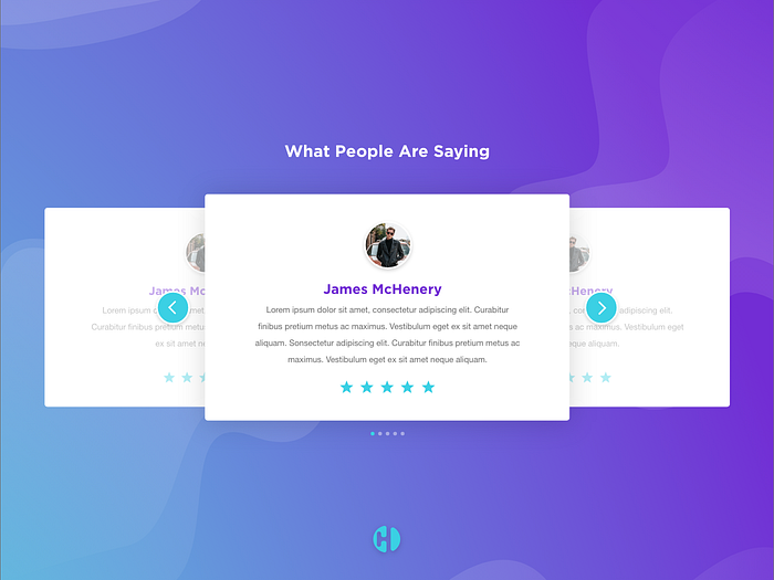
When it comes to all business, large, mid or small, the success of the business depends profoundly on word of mouth.
Testimonials are formal forms of expression that support that concept. They are extremely powerful tools when it comes to strengthening your branding. Good or bad testimonials affect the business like no other! You gotta trust me on this 😀
Instagram looks new every few days but the same strategy went haywire for Snapchat when its redesign cost it a drop in its daily users by 2% to 188 million users from 193 million. Ad views and revenue went down by 36%. All thanks to this millennial tweet!!

These techniques definitely lend a hand of help when designing business for the B2C Models where users are the core to your business.
I hope this read helps! Happy UXing! Cheers!