How to improve an E-Commerce Checkout Experience: UI/UX Case study
The checkout process is an important aspect of any e-commerce website. In this case study, I will explain how I revamped the checkout process to improve the sales and conversion rate of the users.

In order to boost the sales of an e-commerce website, we want the users to have a hasslefree experience from cart to checkout in order to have a higher conversion rate.
Here are few things to ponder about an e-commerce website when we talk about conversion rate..
- Why do some users face problems in performing a successful checkout at an e-commerce website? According to Baymard Research — the global average cart abandonment rate currently sits at 68.8%.
- What motivates them to make a purchase?
- What causes frustration in a new or a frequent user which can negatively affect their conversion rate?
- Are you asking them too many details during the checkout process??!
Your customer has decided to make a purchase from your website. Come on! You need to make their experience simpler.
Okay, now that I have put across some thoughts about how important the checkout process is, let me walk you through this case study for improving the experience for the users who use the e-commerce platform.
Alright, let’s get started!
Project brief
I had worked on this project from research to designing the final visuals earlier in my career. The client was primarily facing the problem of low conversion rates on their existing e-commerce website where they sold books and other stationery items in the US and Canada.
Note: For this case study, I am not going to cover the entire e-commerce experience of the users. I will be addressing the issues faced by the users after they have chosen and added their product to the cart for checkout.

Existing problems on the website
There were two major concerns on the website:
- High user drop off rate: There were user dropoffs from the cart page to the shipping page. There was a further dropoff of users from the Shipping page to the Payment page. This leads to a low conversion rate.
- Concerns regarding payment security: There weren’t any visual cues to address how secure the payment of the website was to ensure that the customer's money is safe and is sent through a secure payment gateway.
- Long checkout process: The checkout process took a lot of time which also led to low conversion rates.
Research: Uncovering the problems in detail
I observed the analytics data, user research data which was collected by the client from their users. It was important to understand WHY those problems existed on the website.
I wanted to do my research as well to get into the root cause of the problems.
How did I start?
- I started off by doing a heuristic analysis of all the pages that the user has to go through to complete a checkout. This was done to uncover the problems during checkout, calculate the number of clicks required to place an order and find out potential usability issues.
- I did some competitive analysis to understand the common trends of a fast checkout experience.
- Conducted multiple interview sessions with stakeholders who directly spoke to the customers to understand the problems they are facing with the current checkout process.
Okay now, let’s dive into the redesign solutions page by page.
Cart Page
The content on the cart page needed visual rearrangement to emphasize on important product details like product name and price along with quantity as those are the most important details that the users are concerned about while reviewing their order in cart.

The following were two major problems spotted on cart page:
First: Saving the cart for the future- Saving the cart functionality was provided right below the order summary. It looked like as if it was equally important as the order summary section. It seemed like it was fighting for attention along with the order summary section.
Saving the cart for the future is de-emphasized and shown in smaller font next to each cart item. Users can opt for this feature on each cart item. This was a common pattern for saving the cart functionality seen on other popular e-commerce websites like Amazon, Walmart.

Second: Use of coupons- Offers related to the cart products were flashing on the cart page but there was no provision to apply coupons. In fact, the coupon application was available only at the last step of checkout. This means that users have to memorize the coupon code and use it in the last step.
Solution: By having the coupon code option at the cart page itself we allow the users to see how much discount are they saving at their order. If a discount is shown on the cart page, we must make it easy to enter and apply those codes.
Login and sign up page
- My intention on the login page is to clean up the interface and arrange the layout according to the importance of each element on this screen.
- Login is the main focus here which seemed to be de-emphasized as it was on the right corner. Order subtotal was not required on this page and I decided to move it to the checkout pages.
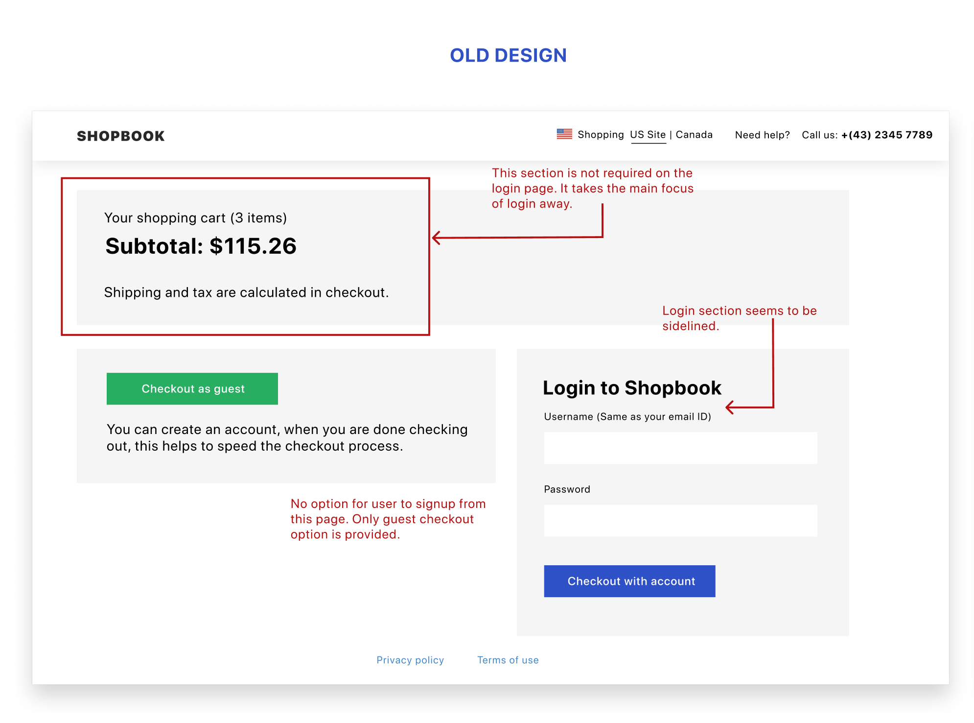
I have added 2 more features on the new screen to make it more complete as a login/signup page. First, signup feature: to cover the scenarios for the new users who wish to sign up from this page. Second is the forgot password feature.

Shipping page
In the old design, the shipping page had 2 major problems:
- The shipping form was extremely long, users had to scroll through to fill in all the details regarding the shipping.
- The order summary was placed both at the bottom and top of the page along with the order breakup. This created some sort of redundancy of information for the users.
Similar content can be combined together for improved user understanding.

Solution: The shipping address form was shortened to keep just enough details in order to make successful shipping. ex: organization name, was skipped as it was not relevant here.
I have combined the order subtotal and order break up and placed them towards the right of the page. This not only saves the number of scrolls but also combines related information together.
Payment and delivery support seals were placed below the order summary for the users who were skeptical about security concerns.

I have also redesigned the progress bar, to optimize the space better and give better visual hints when the user completes a particular step.

Payment page
- Continuing on the similar layout of the shipping page, I have maintained UI consistency on the payment page as well.
- I have added a feature of saving the card securely for faster checkout when the users return back for another purchase.

Review and order placement
- According to Baymard Research on common checkout pitfalls, 68% of Sites Don’t Allow Users to Edit Data Directly at the Review Step. While editing the review information, we do not want users to navigate back and forth the checkout flow rather allow them to edit it on the same page itself.
- In the old design, the users have to wait until this last step to apply the promo code. This means that they have to memorize the promo code to use it here. This can be really frustrating for the users.
Solution: I have moved the promo code entry/selection at the cart page itself as I have mentioned before.
If the users wish to update either shipping or payment info, they can do so using the edit option provided on the review page. This would allow them to edit that information on a pop-up screen.

The final order amount is displayed when they about to make the payment. I have changed the button text from “Place order” to “Confirm and pay” so that they are informed that at the next step they would be directed to the payment gateway.
Measuring UX Success
To understand if the design solutions have solved the user problems and have improved the overall checkout experience I advised that the following Key Performance Indicators(KPI) must be reduced to measure the UX success:
- Time to complete order: The total time it takes for a user to complete a purchase should reduce.
- Shopping cart abandonment rate: No of people who are able to add the products to the cart but leave the website without making a purchase.
- User drop off from checkout: No of people who entered the checkout pages after login but dropped out and did not complete their order purchase.
Review and feedback
This case study has been reviewed by @kingsidharth (Product and Design at Headout) on his YouTube Channel. Check out the video here.
And that is all for this case study!
Thank you for reading my case study☺️
What do you think are some of the ways to improve the checkout experience for the users? Have some ideas? Do let me know your feedback and comments section below.