How to Pack And Where to Store Your Brand Identity Kit
At Pics.io, we are lucky to support dozens of creative teams, offering digital asset management solutions. When we chat with designers, marketing managers, or videographers, we hear a lot about the issues teams face (drowning in multiple revisions, running out of storage, finding the right version of the logo, etc.) when creating corporate designs.
Since we understand the importance of getting branding right, in this post, we decided to share creative tips with fellow designers and marketing managers on:
- What is the brand kit?
- How is it different from brand guidelines?
- Why is it important for a company’s brand identity?
- What are the essential elements you have to include in it?
What is a Brand Kit?
The brand kit is a resource pack that determines what design elements differentiate your company from others. It includes the following elements:
- All versions of the logo
- Logo placement on social media
- Brand fonts
And sometimes:
- Font sizes and typography. (Base fonts).
- The brand’s color palette.
- Graphic and illustrative elements.
- Packshot elements.
- Sound cues used for advertising.
Having a brand kit is convenient — you can use it both within the company and share it with external parties, such as press or partners. Some companies even distribute brand kits publicly, as these lay out the brand’s identity and can help attract more customers. Using the brand kit you can be sure that every teammate and every external partner is on the same page concerning the visual elements of your brand and where to find them.
Brand Kits as We Know Them: How We Got There
In 2020, sharing your logo, typography, and other visual elements doesn’t seem that out of the ordinary. However, the journey that got us from paper-based booklets to PDFs and open-source brand kits was long and full of milestones.
- Paper-based brand kits became more common in the 20th century. These were huge — with 50+ pages and describe the philosophy of the brand and the reasoning behind its visual identity in huge detail. First brand books were rare even among top companies — small business owners wouldn’t be able to afford printing one.
- PDF-based kits were the next milestone we reached when the Internet became a thing. Some companies still use them — but are these inconvenient! Developers and marketers could easily lose track of a single PDF file, designers, on the other hand, struggled to update it after new logo revisions.
- Publicly available brand kits. In the world of corporate design, publicly available visual assets are a definition of best practices. Now companies no longer think of logos and other identity elements as something confidential — instead, they are sharing them openly to make sure designers, developers, marketing managers, and partners can easily find a needed visual online. Top-notch brands like Toyota, Google, Facebook, Instagram, and many others make it easy to access brand assets — SME owners should, too!
Why Brand Kits Are Important?
Designing a brand kit might seem like a lot of unnecessary hassle. However, it is one of your company’s key reference documents, something you and your partners will be relying on for years to come. It is no coincidence that all top brands have fleshed-out visual identity kits — here’s why these are important:
- They promote consistency. Having a clear corporate color palette, typography, and logo placement all increase the memorability of your marketing materials. With these branded elements, a website visitor or a customer will be able to tell the company apart from others in a glance.
- They make you ask yourself the right questions. When creating a brand kit, you will face topics like “Why did we choose this color?”, “What does this font mean to the company?”. Answering these questions helps business owners work out their positioning and set of values, improving the effectiveness of your marketing activities.
- They save time. At Pics.io, we are all about efficiency — that’s why we can’t help but notice the difference a brand kit makes in improving your creative team’s work. Without one, it’s harder for designers to decide on the right color palette for marketing materials, logo placement, or a packshot for a video. By creating a set of standards for creators to follow, you will have to answer fewer questions and will work more productively.
- They tell you apart from a fake. As the company becomes more popular, the risks of somebody wanting to use your name for something shady get higher. However, as long as you have a branding kit, it will be easier to differentiate a fake letter or business card from the real one. Thus, as long as all of the company’s designs are documented, calling pretenders out will be a piece of cake.
Brand Kit vs Brand Guidelines: The Difference
Since brand kit and brand guidelines are similarly-sounding concepts, it’s easy to confuse them. Keep in mind that there is a difference between the two, however subtle it may be.
The fundamental difference between the brand kit and brand guidelines is that the brand kit speaks more for the set of visual elements of your brand, while brand guidelines are a set of standards for how your brand should communicate itself. To make it simple, a brand kit is simply a set of ready-to-use design elements. Guidelines and brand books present a detailed description of your brand. It’s worth noting that, typically, a brand kit is a part of the company’s brand guidelines deck.
Let’s take a look at the several other distinctions between brand kits and brand guidelines.

Anatomy of a Brand
Now that you understand why the brand kit is important for businesses, let’s take a look at what elements you should add to your brand.
There are no set-in-stone brand kit components — some companies have more than others depending on the range of their marketing activities. Besides, the brand kit is in most cases the part of brand guidelines, as a result when any member of the company or external partner uses its elements, he/she has to follow certain guidelines. Below we describe several popular elements of the brand kit, as well as brief guidelines on how to apply them in marketing activities
1. Main logo and all possible variations
The logo is the most important part of a brand’s visual identity. Attaching a memorable image to the company’s website, marketing materials, and products helps prospective customers remember the brand and differentiate it from competitors.
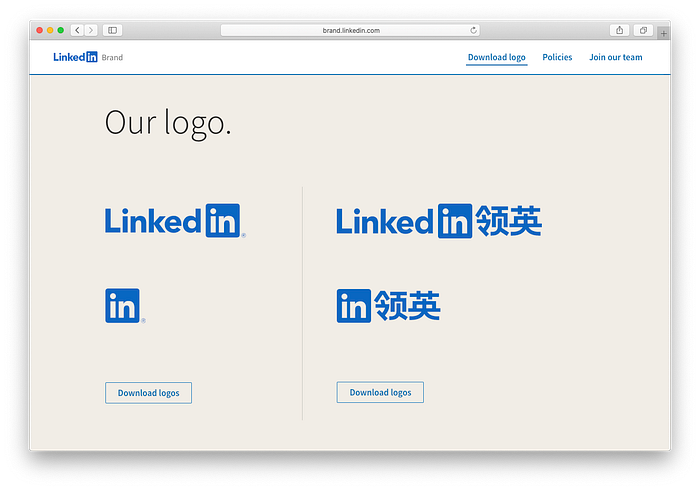
Since there are different logo placement types (as a favicon, a watermark, an element of website design, etc.) brands rarely have a single logo for all marketing purposes. Some, like LinkedIn, have multiple design variations in different languages and dimensions.
Here are the details about the company’s logo you should add to the brand kit:
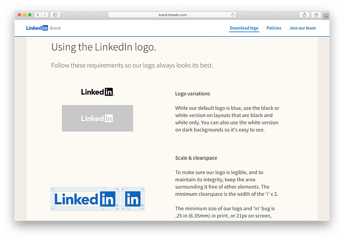
- Logo colors plus CMYK & RGB tags. You can add alternative palettes as well (LinkedIn, for instance, has black and white logos, other than the main design). The typical brand kits include colored versions of the logo and black&white versions.
- Logo variations for different placements (specify which design fits which type of materials) — in most cases brand kits include vertical and horizontal versions of the logo.
- Download links to high-resolution logo versions in different formats (PNG (for web), TIFF (for printing). vector SVG (for web), and EPS (for printing).
- Scaling and clear space requirements — the size of the logo in marketing and printed materials and the spacing between the design and the main content of marketing materials.
- Trademarking specifications (if any).
2. Branded color palette
The background colors or font colors of your marketing materials shouldn’t be random — make sure a user can easily associate them with the brand. Once you choose the palette that sets your company apart from others, include these colors to the brand kit.
Take a look at how Adobe lists all colors the company uses for marketing and advertising. To make sure your brand kit is just as convenient for designers, add the following about the company’s corporate color palette:Color names, CMYK and RGB tags
- Specifications which colors can be used as background.
- Example of the uses of corporate colors in promotional materials.
Making sure the colors read the same across media is key to having the brand kit appear cohesive. After you have established a primary color palette you can also include the secondary palette. The secondary palette is what compliments and supports your primary brand palette. It provides a set of colors that can be easily paired with your brand’s palette. Depending on the look and feel of the brand you’re trying to achieve, you can combine different colors and choose the combination perfect for the overall distinction of your brand.
3. Typography
Other than sharing images, your marketing materials contain at least a few paragraphs of copy. Rather than settling for a standard font like Georgia, make typography a part of the brand’s visual identity.
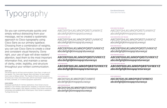
Add all fonts and styles to the brand kit so that designers know how to style and format copy. Take a look at the way Cisco lays out the brand’s chief typography styles.
To make sure you don’t miss a thing when explaining the brand’s typography, here’s a structure for this part of the brand kit:
- All font variations (bold, light, regular).
- Link to the font pack.
- Cyrillic and Latin typography versions, the fonts for digits, and special characters.
- Font size and color.
4. Graphic and Illustrative Elements
In this section of the kit, you can include information about the type and style of images associated with the brand. If certain kinds of photos are preferred, include that information here. You can also include a grid of examples of the kinds of photos to include. You can also include styles of illustrations or artwork as well. If the brand has a hand-drawn feel, include how the illustrations paired with the logo should also have a hand-drawn feel, for instance.

Top 3 Brand Kits to Take Inspiration From
When designing a brand kit, it’s helpful to draw inspiration from the way large-scale companies are guiding designers, partners, and press. To make sure you are never out of creative ideas, take a look at these brand kit examples:
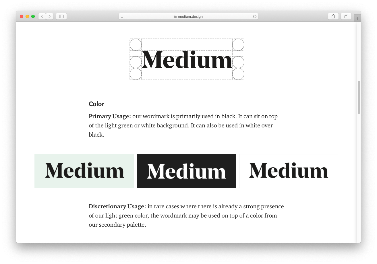
1. Medium
The platform explains its identity in a concise blog post that takes about three minutes to read back-to-back. Here, you can find the rules on logo usage, as well as the corporate color palette. The post covers the dos and the don’ts of featuring the brand’s visual elements online and is very comprehensive.
2. Netflix
The world’s leading streaming platform shares its brand kit publicly as well. Here, designers can get pointers on how to use corporate symbols and logos in their work. Other than that, you can download and explore the brand’s high-resolution assets.

3. Slack
The Slack brand kit is one of the good examples of the simple and clear visual elements pack. Whether you are a manager or a designer, this one is definitely worth checking out. You’ll find out their logos, fonts, icons, images, and other visual elements.

Where Should You Store Brand Kits?
Creating a brand kit is not easy — there are dozens of elements to keep track of. That’s why business owners and marketing teams need a way to organize their visual assets comfortably.
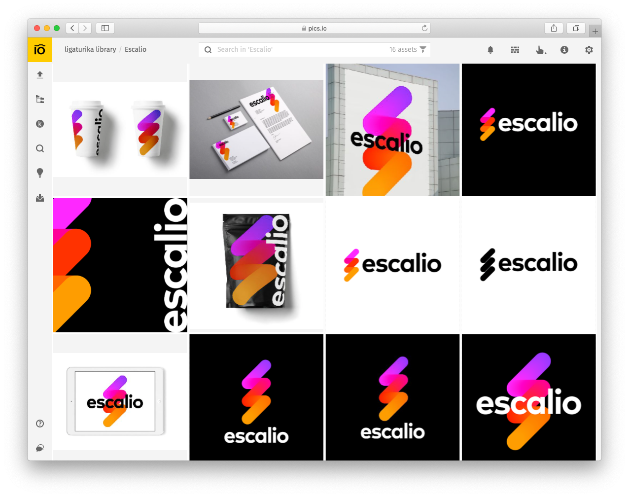
At Pics.io, we noticed that using digital asset management makes the world of difference when working on brand kits. Here’s how our photo and video management platform helps teams keep track of brand kit elements:
- Centralized hub. The main advantage of DAM is that it provides a centralized hub where all teammates can easily find up-to-date branding materials (logos, typography…).
- Intelligent tagging — if you don’t remember file names, find photos based on what’s in the fame.
- Custom websites — share brand kit elements with teammates, partners, and press in just a few clicks.
- Collaboration-friendly platform — approve of logos, images, and other assets in teams.
- Version control — track and approve revisions of your designs.
- Auto backup — you will not have to worry about your teammate accidentally deleting a file.
Finding a new home for your visual assets and brand kit materials has never been easier. Just incorporate the digital asset management solution into your workflow.
Although branding kits are an extremely important document for business owners and marketing teams, a lot of creators still ignore them. Since offering designers, marketers, partners, and presses your company’s design elements will cut feedback loops and improve brand awareness, take your time to create a detailed identity kit. Granted, it takes a lot of effort — yet, at the end of the day, the pain is worth the gain!

