How to Save UI Designers & Front-End Developers up to 50% of Their Time
And why it’s Christmas in January
Warning: This article has a lot of funny & unfunny memes, as well as detailed graphics. Hook up to some of that WiFi stuff first unless you want to haemorrage data. It’s also really long, so grab some popcorn & a cold drink.
Christmas in January?
When you were a young child, Christmas was really, really exciting. Literally I-am-going-to-pee-myself-with-excitement exciting. Contemplating what presents Santa would bring, as well as opening them, constituted a month of unimaginable excitement & joy.
In my life as a UI Designer, I enjoyed a similar child-like excitement when exploring the Sketch App for the first time:
“Are you serious?! I have probably wasted 90% of my time over the last 3 months fucking around with silly little pixelated symbols in Photoshop that don’t even look like I want them to look. Why did no-one tell me about this before?! This is incredible.”
As a designer, there have been two stages in my professional life: Life ‘Before Sketch’ (BS) & life ‘After Sketch’ (AS).
Let’s not talk about life BS. BS was, as the name suggests, bullshit. Everything looked a bit different, a bit off, a bit pixelated. It took about a week to create a header, let alone a single screen.
Life AS has been great. You could probably get a team of toddlers together to make up a design team in the AS world.
You can re-use stuff. It’s all beautifully vectorised. Nice & organised. It’s quick. Intuitive. Easy.
Well, my friends, if you are a product manager, designer or developer, today you are that little child again.
It may be early January, but Christmas has come early this year. Welcome to the world of object-driven design.
N.B. Whilst writing this in Jerusalem & the West Bank, I saw a number of Christmas trees still up… It has since come to my attention that Christmas is, in fact, in January in some Orthodox Christian calendars. And there I was thinking my headline was absurd & attention-grabbing…
In this informative & fun-filled article, I will identify:
- What object-driven design is
- Why the problem has not been solved already
- Why not adopting it is such a big risk
- How to implement it in your design process
By implementing my methodology, your design-to-development (what I’ll refer to as ‘D2D’) process will genuinely improve ten-fold, allowing your UI Designers to spend more time designing for delight & your Front-End Developers to nerd out on actually building stuff, rather than editing pixel distances.
Why should you care?
Many a Product Manager & UI Designer will read this & think,
“Tell me something I don’t know. I’ve been using Sketch’s Symbols feature & typography classes for 3 years. Stop with your silly Christmas metaphors.”
And they wouldn’t be wrong. I imagine most designers do create re-usable Symbols (‘objects’ in programming terms) in their Sketch files to some extent.
However, not a single UI Designer I have worked with in the last 2 years has created a comprehensive approach to neutralising inefficiency in the D2D handover process.
3 Reasons Why The Problem Exists
Before delving into the D2D problem itself, it is important to clarify precisely why D2D inefficiencies exist in the first place when there are so many design tools out there.
1. Benchmarking to Mediocrity
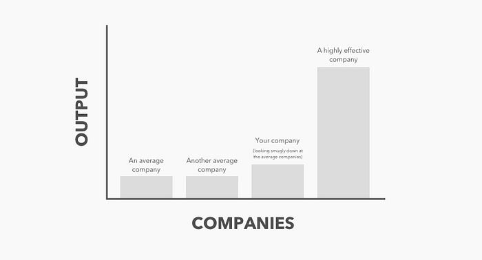
Unfortunately many readers will confidently assume that this is not a problem they or their company suffer from.
This is because productivity & efficiency are relative. Very few UI Designers & Product Managers are aware that there is a better design process than their current one.
We tend to benchmark off other startups & UI Designers around us. If everyone is working the same way, it’s probably the most efficient one, right?
Wrong.
It is a common human bias to base our conception of anything — efficiency in this case — off the information available to us.
An example:
Say I am overweight, but all my friends are obese. Because those around me are obese, I will think that I am a healthy guy because my points of references (i.e. my obese friends) are less healthy than I am.
However, just because they are less healthy than me does not necessarily mean that I am healthy. I am still overweight.
Therefore, to overcome benchmarking & potential mediocrity, always try to innovate in order to make great leaps in efficiency, rather than small, incremental changes.
“If I had asked people what they wanted, they would have said faster horses.”
— Henry Ford
2. Unwarranted trust in product development methodologies
D2D inefficiencies also tend to occur because we assume that whatever product management methodology we work with in our company has already nullified any major inefficiences.
This is not the case with the D2D process.
Firstly, regardless of whether you follow agile, lean or design thinking — or a mixture of these — there will always be inefficiencies. Particularly inefficiencies that you are never even aware of.
Secondly, you will inevitably find that, as projects start, as Jeff Gothelf, author of LeanUX, states, teams immediately start “pulling away from each other, as opposed to collaborating more effectively” due to lack of alignment or to competing methodologies.
This tends to mean that a designer’s resources are stretched, shared out between a few PMs & a horde of developers. It means that everything tends to be chaotic & disorganised. The UI Designer therefore rarely feels able to stop & apply the design thinking necessary to accelerate their design process & lend it greater agility.
Only by following an object-driven design process is this velocity & agility possible.
3. Designers & Developers are Different
Furthermore, we all tend to assume that weekly design reviews, retrospectives & omniscient PMs effectively align everyone. True, alignment on what is being worked on is achieved, but not how it should be worked on.
And this comes down to a fundamental misunderstanding — or knowledge gap — between UI Designers & Front-End Developers.

UI Designers tend to consider themselves artists. Their work is a work of art. If only users could understand the beauty of their work, they would have millions of users.
They tend to love typography & be passionate about artesanal, hand-crushed coffee. Their favourite colour is #FEB4B1.
Developers, on the other hand, just want to programme cool stuff. They don’t care what it looks like. ‘Style’ to them is an elusive concept left to the artists, as alien to them as ‘dating’. They don’t really understand why that shade of red is too red or why that header text should be just a little bit to the left.
They are happiest when left alone to programme some weirdly complex new project.
In essence, they are different people. With very different skills. Different ways of thinking. Different interests.
They each think that each other’s area of expertise is mind-bogglingly complex & completely incomprehensible. They therefore avoid each other’s domain at all costs.


Both groups tend to be unaware — or, quite frankly, don’t care — that the visual work of a UI Designer & a Front-End Developer nowadays shares a lot of cross-over.
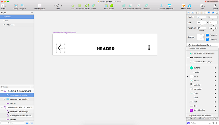
If both groups therefore aligned over a definitive design language (i.e. the objects (‘Symbols’ in Sketch)) that they used, the D2D process would be incredibly simple & fast.
However, because each group remains siloed & uninterested in each other’s craft, there remains a significant knowledge gap between them that leads to inefficiencies in a team’s D2D process.
It therefore makes sense to align your UI Designers & Front-End Developers to nullify these inefficiencies:
“Patterns that yield good outcomes should be amplified. Those that are causing problems should be remedied.”
— Jeff Gothelf, Author of Lean UX

4 Reasons Failing To Follow Object-Driven Design is a Big Problem
1. Not creating a design system wastes a huge amount of designer & developer time
The UI Designer
Theoretically, a D2D handover should be fairly straight-forward.
Theoretically, the UI Designer will have already aligned with the Front-End Developer & they will seemlessly work together on a simple solution.
Theoretically, both will re-use elements from a predefined design language that both know well. A quick copy & paste in Sketch; a simple line of code.
However, theory rarely translates into reality.
The reality is that the majority of UI Designer’s spend a lot of time designing custom, new elements.
Firstly, this is because they are not developers & therefore do not understand why it is a lot more work to actually implement something new.
Secondly, many UI Designer’s consider their work an art, rather than a science, & are therefore unwilling to sacrifice perceived beauty for pragmatism.
Rather than shipping something quickly — as well as something that is easy to implement — they will spend the majority of their time making small tweaks to existing elements.
They focus too much time on the minor (e.g. moving text a few pixels) rather than the major (e.g. building & testing that big new feature).
The minutiae is important, but it is difficult to justify when an existing UI element would serve well already.
This problem is also aggregated by the fact that a UI Designer focusing on the minutiae slows down any iterative process in place. Design reviews are pushed back, the PM isn’t up-to-date & the designer tends to spends a lot more time siloed in their own work.
The Front-End Developer
By the time the Front-End Developer receives the final design he or she is expected to implement, there have likely already been a few meetings to ensure everyone is clear on the expectations.
However, we tend to still see a number of inefficiencies here because:
- Front-End Developers tend to assume that there is some very important reason each design is exactly as it is. They assume that difficult-to-implement clock dial has to look exactly like that initial design because they view all the UI Designer’s work as that of an expert. They therefore don’t try to simplify or discuss. They just assume there is some clever reasoning behind everything & that the UI Designer will create the perfect solution on the first attempt
- Front-End Developers tend to hate meetings more than most. Therefore, rather than wanting a long, drawn-out debate about whether the font size should be 12px or 14px, they just want to agree on a design, finish the meeting ASAP & happily go back to programming
- Front-End Developers tend to be introverted and/or timid. They are therefore unlikely to stand up to the more confident PM & more egotistical UI Designer
Therefore, despite the meetings & the design reviews, they still end up implementing something that is new, something that is difficult to implement & something that has not been properly critiqued.
2. D2D inefficiencies compounds over time
The longer you leave D2D inefficiencies, the greater the waste of resources over time for existing, as well as future, team members. This seems obvious, but is usually over-looked.
We focus on short-term goals (finishing the sprint or getting through the backlog), rather than investing in our long-term success goals — and ultimate success.
We don’t stop to solve the inefficiencies in the race to fulfil our sprint goals or to get through that long list of features & bugs to build.
Because it’s easier to focus on the short-term. Because we are stressed. Because we rarely ever stop to think in our pursuit of ‘being busy’ & the sense of purpose it provides us.

3. No design system = design debt
The less structured a UI Designer’s approach to the design process is, the more design debt you are building up.
Let’s take an example:
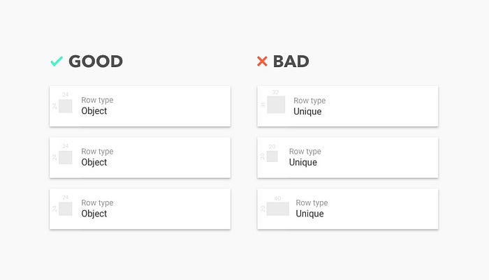
Say I design all of my icons in different sizes. Some at 24x24, some 40x24, some 12x16. Not only is this wasting a developer’s resources (as highlighted in my first point), but it also means that any future development changes are impeded. That is because, if we want to then change these icons in future, they have to be designed at the exact same size for each case in order to not cause mis-alignment or stretching in both our design file & our final product.

Furthermore, within a UI Designer’s Sketch file, by not creating very strict typography & colour classes, as well as re-usable Symbols (e.g. all buttons being 24x24), we impede our ability to edit existing elements.
Rather than being able to make a major change to a text style throughout the product with one click, for example, we need to manually go through every single screen within Sketch to make that change. For an app with more than just a handful of screens, going through & making such changes can waste the majority of a UI Designer’s time (and that is no exaggeration).
4. Not creating a design system impedes collaboration
Without a design system in place, the majority of a UI Designer’s time is spent creating new designs or painstakingly editing existing designs.
This means they have less time to brainstorm & try new ideas within Sketch with a PM or Front-End Developer.
Having a design review where the team can test out different options — or edit the designs being discussed live — is great for getting the entire team’s input & support for a design.
“Teams with a continuous exchange of feedback will build better products.”
— Jim Semick, InVision
Furthermore, it avoids the need for the UI Designer to go back to the drawing board & to organise another one or two design reviews to discuss the same thing again. This saves the entire team a lot of time.

How To Implement Object-Driven Design
Hopefully I have convinced you of the importance of implementing a design system by now.
In the following section, I will discuss the importance of changing your UI Designer’s approach to their work, before delving into the specifics of building & maintaing a design system.
Step 1: Taking ownership of the D2D process
Before committing to following object-driven design, it is essential to ensure that the UI Designer is properly motivated.
If they are doing this because of some vague idea that it will make the team more efficient — or they are just being told to do it — then don’t bother.
If, however, your UI Designer considers the D2D-handoff a key part of their role & entirely their responsibility, then they will be motivated enough to not only complete the work of building a design system, but to maintain & build upon it in the long-term.
Let me emphasise an important point: Building a design system is not just a one-off task. Every time you create new designs or test out ideas, they should all be properly structured & organised within your design system for future use.
Taking full responsibility for the D2D process must be something the UI Designer believes in completely. If not, then they will never learn enough — or ask enough — about how designs are programatically implemented to help them improve their design process.
They need to be reading articles such as this one, doing a basic programming course, reading Material Design guidelines, watching a Front-End Developer work for a few hours a week, learning from the PM, developers, other designers, etc.
In short, they cannot retreat back into Sketch & Dribbble, sacrificing important learnings in order to focus on what they enjoy & feel comfortable with.
Step 2: Building a Design System
Building a design system’s purpose, at its core, is to create a comprehensive list of elements based on the principles of object-orientated programming. The desired outcome is to closely align designers with programmers around the design system you create in Sketch to radically increasing their velocity as a team.
Better communication between these two groups leads to a better understanding between them, which in turn leads to your team creating better products.
1/7 Start with the basics: colour & typography
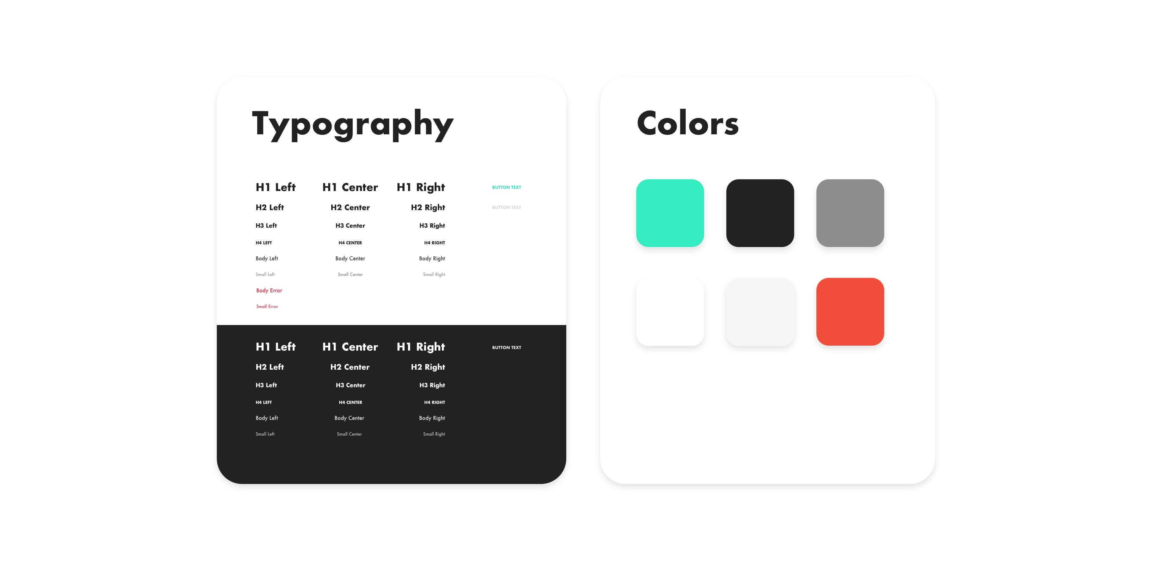
Object-driven design requires starting with the basics, namely defining your colours & typography classes. This is because other elements will require this information: A button needs a colour, a row of text requires a typography class.

2/7 Create objects for one screen
By building an example screen, you will rapidly understand how the principles of object-driven design work in practice. In my experience, only by applying the theory in an iterative manner can you effectively learn how to create a full design system.
On your first attempt, don’t worry about being too comprehensive. This is because you will quickly realise how creating elements* works once you try to build a few example screens.
Maybe start with a header (with text & buttons), some text rows & whatever else you want to experiment with. Remember that consistency requires minimalising how many elements you create.
*Elements refer to a group of Symbols, such as a row or a header
3/7 Overrides (changing the information within an element)
You’ll see on the right-hand panel (under ‘Overrides’) in Sketch that, if you select a Symbol, the information within that object can be changed, such as the text within a header.
Notice how the style does not change, however. This is essentially how front-end programming works:
You define the visual UI (e.g. font-size, position, left-align) but you pull the information for the actual content (a name, address, icon, etc.) from your database.
You can define where a button goes & its size, for example, but you pull the actual image from a data-base where all your button images are stored.

4/7 Create a few example screens
Now that you have seen the power of Overrides, you see what types of Symbols you will need to create, as well as how Symbols can fit within other Symbols (such as a button within a header).
Hopefully you also realise how much organisation & thoughtful planning this process requires. You may have defined some typography classes, for example, but I doubt you created a variation for left-, center- or right-aligned.
Try to create 4–5 screens now, all based on pre-defined Symbols. Don’t worry if it’s still disorganised & some screens don’t quite work: Realising your errors & learning from them is essential to the learning process.

5/7 Naming your Symbols correctly
By now, you should have a good understanding of how to build a full design system.
Before diving in to complete your full design system, however, I recommend spending some time on the information architecture.
Information architecture essentially refers to structuring information in a logical, optimal manner.
In the case of a design system, this means structuring all of your objects so that the commonly used objects are easily accessible, they are named logically & there is a clear hierarchy.
To do this comprehensively, make sure you go through the entire product & identify all the Symbols you need to create & how best to organise them. What do you use most often? How would another designer find these Symbols? What would they expect each Symbol to be called?
Failing to do this correctly will mean a huge amount of time wasted finding objects, re-naming them in future & an inability to add Symbols in future in a logical manner.
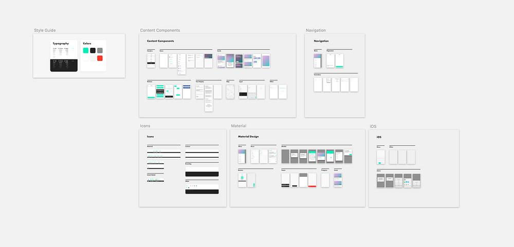
6/7 Creating a comprehensive Design System
Now that you’ve created a few Symbols, have identified which Symbols you will need to build for your product & have created a naming structure, it’s time to complete the entire design system.
Set aside a day or two to fully focus on this task in order to immerse yourself in it & to keep the design system’s structure clear in your head.
As you work through it, you are likely to realise errors in your naming structure. Therefore keep checking your naming structure, building test screens & checking for consistency as you go.
Your product is unique, so the Symbols you need to create will be unique. Therefore you will have to think for yourself how best to structure your design system, as well as what to include.
7/7 Design Review
Organise a design review with your PMs, UX/UI Designers & Front-End Developers to present the new design system.
You are likely to find that all members of the team will instantly see value in it. The Front-End Developers are happy because they have a definitive document to work from, PMs because they can rapidly prototype with the designers, designers because they can all work off the same design system within Sketch.
Once you’ve finished high-fiving, popping bottles & generally celebrating in a exuberant manner, save your design system as a ‘Template’ under Sketch & share with the other UI Designers.
Step 3: Maintaining your Design System
Once completed, you will also need to maintain your design system moving forward.
Any new design ideas should be correctly built & organised as Symbols, even if they are unlikely to be included in the final product.
This is because you are most likely a busy person with a lot on your plate. It’s therefore pretty unlikely you’ll remember to go back, re-design the final designs as Symbols & name them correctly. It’s also going to waste more time than just doing it right in the first place.
Remember: However busy you are, working as fast as possible in the short-term will build up long-term technical debt.
Furthermore, if you work in a team of more than one UI Designer, you will all need to contribute to the design system moving forward.
This requires every member of your team to be organised. It also requires somebody to take charge of the design system, adding any new Symbols to your product’s ‘Library’ within Sketch so that all team members have access to all pre-existing & new Symbols.
This UI Designer should also regularly update the master file online, so that all team members have access to the most recent version, as well as avoiding any wasted time with losing unsaved files. I would recommend using Github for this or Sketch Cloud. You can also pay for Abstract, which is a more visual, designer-friendly way of tracking your file versions.
Being so organised may seem unnecessary if you’re in a small team, but at some point you are likely to scale your team. If you don’t have an up-to-date design system in place, how will new UI Designers even know where to start? How will you be able to onboard them? Why waste their — and your — time?
Step 4: Innovation never ends
As I stated in Step 1, a core ingredient to this process is taking responsibility. It’s easy to just stick to what’s expected of you. It’s hard to take responsibility & to be an entrepreneur yourself within the company.
But it’s essential to success.
You must be vigilant, constantly learning, constantly looking for new tools to skill up & improve your workflow.
Sketch App is constantly improving. The community is constantly making cool new plugins. Other platforms are emerging as competitors, such as Adobe XD. Test these tools out. Actively search for them.
Top companies spend 5–15% of revenue on training employees. If you are a UI Designer, insist on spending an afternoon each week on new technologies. Test products out with a free trial or ask for a budget.
Always remember that the short-term, the urgent, the seemingly important — that’s not the key to success. A failure to invest in yours & your company’s long-term future is.

About me:
I’m a freelance UX/UI Designer based in Berlin, looking for potential co-founders. If you’re looking for a product founder, hit me up through the comments below.

