How to Stop Enraging Your Users & Start Getting More SaaS Customers
To your users, small annoyances in your app are like flaws in a romantic partner. They can handle one or two, but if more and more pile up they just end up miserable. If you frustrate your users with small inconveniences too often, they’ll react the same way they would to a bad spouse — they’ll move on to something better (see: Does User Annoyance Matter?).
Good UI design minimizes the number of annoyances in your application and boosts your product’s business value, and is worth investing in. You’ll get more users from word-of-mouth, your sales efforts will be smoother (because your sales team will believe in your product more), and keeping paying customers will be easier.
It’s not possible to generalise and cover every potential annoyance — each application has its own particular subtleties and sticking points. However, I’ve compiled a short list of the most common annoyances which I’ve seen over the years I’ve been designing user interfaces, and the appropriate UI design pattern to combat them.
Don’t assume your users know what your app’s terminology means
If you come up with new terminology (think labels, features, or button text) that isn’t self-explanatory, or contradicts what your users have probably experienced on other products, you’re going to force people to make small mistakes. This will likely block them from completing their goals successfully, and a user who can’t do what she wants is only going to get frustrated.
Additionally, if your users don’t understand your app’s language, they’re effectively unable to use that entire feature as you want them to, denting the value of your product. Imagine a fridge which has a brand-new door design that actually doesn’t make sense to fridge-users. Nobody can open the door, so they end up flipping the fridge on its side and use it as a desk instead. Nobody wins.
For example, back when I worked at Ushahidi, the product team was redesigning the company’s flagship crowdsourcing software. They created a feature which allowed users to create and save a curated group of posts, and called this group of posts a “Set”. But it wasn’t until going through testing and talking with users that they realised nobody understood what a “Set” was (because nobody had encountered a “Set” in software before, and the phrase wasn’t self-explanatory). They quickly changed it to “Collection” which people grasped immediately.
Even though it can sometimes be difficult to come up with the right term to describe a new element or feature, try to use terminology people are already familiar with, or that are very obvious (but test your assumptions too!). Think about it; which is better — calling a user-generated collection of songs a ‘Mixtape’, or a ‘Playlist’? I’d definitely go for ‘Playlist’.
Make sure that your app’s terminology is consistent with what users are familiar with. If you need to call a feature of your product a ‘cart’, it should behave like the other carts users are likely to have encountered (e.g. Amazon’s). Also, never call the same element in your UI by two different names — keep it consistent in all your touchpoints with the user.
Principle of Consistency and Standards in User Interface Design goes into more detail on this topic.
Don’t make your application speak like a computer
This is a common problem (especially for older software), and most frequently seen in error messages. Your user makes a mistake, or something unexpected happens, and an application proudly presents something like this:

Why is this frustrating? Because it interrupts and confuses users. Which error occurred? What should I do? Will it happen again? Was it my fault? Can I do what I want? Is this the right application for me?
One of the main causes of this issue is letting developers write error messages. Developers (more often than not) see things from a programming perspective, and aren’t used to putting themselves in the user’s shoes.
How can you make error messages less infuriating? Use these guidelines from the usability canon:
- At the very least, include some kind of error message. The most enraging error is one that the system doesn’t even acknowledge.
- Explain the problem accurately. What caused the error? Was it the user or the software?
- Be constructive. Tell the user what to do next — give them a path out which makes them feel confident.
- Make error messages sound like a friendly, polite human. The most common web error (404 Page Not Found) doesn’t sound like this — it sounds like a boring server.
- Use plain language.
- Don’t blame the user! Their workflow has already been interrupted — don’t throw salt on their wound by making them feel incompetent.
- Test your application with real users. This will help you anticipate common errors and plan helpful messages.
This error message in Mailchimp observes these guidelines:
Many well-known platforms get some of these points right but mess up on others. For example, here’s an error message I see frequently on SoundCloud (and which makes me want to punch the screen sometimes):
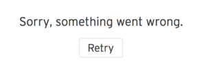
While it doesn’t sound like a computer, it tells me nothing about what went wrong (SoundCloud acts like it doesn’t even know) and offers me no alternative but to “retry” (how do I know the same thing won’t happen again?).
Don’t validate forms badly
Forms are normally a critical part of your app. Usually you’re getting visitors to sign up to become users, or input their payment details to becoming paying customers. When you confuse and waste user’s time when they’re filling in forms, you’re not just annoying them — you’re potentially draining the lifeblood of your business.
The #1 rule is to avoid allowing your users submit a form with errors, only to be taken back to the same form with an error message. Validate forms inline and save their time. Here are some more form usability guidelines:
- Put your validation messages in the right place. This is usually as close to the source of the error as possible — for example, right next to or above an input field.
- Make your messages the right colour. Red is universally “error” or “warning”, and green is almost always “correct”. Make your app accessible to users with disabilities by not only relying on colour to provide feedback — include a symbol or icon as well.
- Make your messages appear at the right time — as soon as the user makes an error or tries to progress.
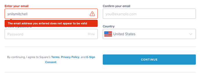
Here’s an example from the signup process in Square. The message appears as soon as I move to the next field, turns the whole field and label red, and even adds a little warning sign. It’s hard to miss.
For a more detailed look at handling errors and exceptions well, have a look at Error Messages Are an Anti-Pattern.
Avoid bad or unconventional interactions or layouts
Unusual terminology isn’t the only thing you should avoid. Whenever you stray from established UI design patterns and layouts, or choose bad ones, you slow your users down and confuse them. The more you force users to figure out how to use your product, the more frustrated they’re likely to feel.
Why make users work harder? They’re paying you to make their problems smaller or disappear, not to make them think about what to do.
A great example are drag and drop interactions. I used to add these to interfaces I designed before realising how bad they are. Drag and drop needlessly complicates actions that could take one step (a click) by turning them into many (click, decide where to drag, drag, release).
Users often find it difficult to figure out the correct place to drag something to. Moving your mouse while holding down the left-click button or moving your hand around the trackpad are both awkward. There’s no point in making your users go through the extra hassle — pick a simpler UI design pattern.
Also see: Drag & Drop: Think Twice.
Similarly, don’t try to innovate with your layout (let your features and UX do that). You should keep layouts consistent with what users are familiar with. For example, keep your navigation menu in the top or left part of the screen, and your logo in the top-left corner or the top-center. Forcing your users to figure out how to navigate your app is only going to annoy them, just like making them drag and drop.
What’s the solution? Use straightforward design patterns that users are already familiar with. A great resource is UI-patterns.com (which also has a guide to some common UI design anti-patterns — bad patterns that get often and inexplicably reused).
Don’t assume new users know what they should do when they get to your app
Enterprise-level SaaS apps can be bewildering for first-timers. Your users want to learn to use your product as quickly as possible (after all, they’re paying for it), and it’s vital that you support them during this phase. Abandoning your first-time users in the middle of your application with no guidance will only aggravate them and make them more likely to leave.
How can you support new users? Don’t give them too many details/options at once. Either cut down the number of features and elements in your interface, or use progressive disclosure to gently lead users to the actions they want to complete.
“It takes at least one second and often two seconds to decide between two possible interaction techniques which is why it is usually better not to offer users a choice. (A second may not seem like much, but it translates into about $100 million in lost productivity per year world-wide.)” — Jakob Nielsen
It helps to try boiling down your app to its essence. Think of the #1 function or milestone you want users to succeed at, and help the user get there.
For example, Twitter’s team attributes their massive growth and user retention to focusing on helping new users manually follow 5–10 accounts in their first day, and helping people follow back people they knew.
Better yet, walk them through how to use your application by designing for the ‘empty state’. When a user first signs up to your app, they’re likely to see empty screens (since they haven’t populated them with data yet). Think about how to guide and direct the user here.
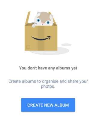
Provide helpful messages telling them explicitly what to do and how. This doesn’t have to be complicated — here’s an example from Amazon Photos for Android:
Sometimes words aren’t even necessary. In the 80s, when Apple changed the default empty state in MacWrite from a blank screen to an empty document with a blinking cursor (indicating that you could write), users got to grips with the product much faster.
Here’s a great case study of how effectively planning for the empty state increased conversion rates 30–40%.
It also helps to get users invested in your app as fast as possible. For example, when I sign up to Trello, the first thing I’m asked to do is to name my team and choose people to invite to it:
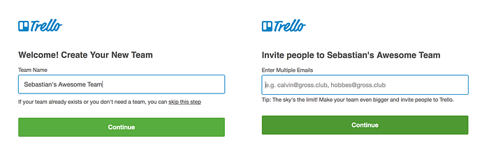
After coming up with a (frankly, really good) team name and sending out invitations to my team members, first-time users like me are much less likely to abandon Trello in frustration.
You may have already tried to deal with this problem with a long tutorial — don’t do this! In-depth tutorials can kill a users’ momentum and enthusiasm. Instead, focus on supporting discoverability by letting the user explore your application on their own (with your helpful hints), rather than shoving a manual in their face.
Listening to users as they navigate your app is the best way to learn whether or not it’s too difficult or confusing. I recommend usertesting.com if you’re starting out.
Don’t make the interface slow or unresponsive
Users find it very unpleasant when they have no idea what’s going on. You need to tell them where they are, what’s happening, what’s going to happen, and what just happened — as much as possible. This information needs to be clear and highly visible.
Apart from progress feedback (what is the app doing? How long until it’s finished?), the interface elements in your app need to clearly indicate how to interact with them. For example, when you hover your mouse over a button, on most interfaces it changes in some way to let you know that it can be clicked (changes colour, state, etc.). These are called affordances (definition: a characteristic of an element that implies how it is used, e.g. a door handle).
If you fail to provide feedback on affordances, you slow down how quickly users can discover how to use your application. If you fail to provide proper feedback on processes, users will feel like you’re stopping them from completing their goals.
Consider the timing and delivery of your feedback too. Don’t interrupt a users’ experience to tell them what the backend is doing — do it asynchronously, in a different part of the interface to the one in which your user is working.
Your product’s response time should be as fast as possible. Some guidelines:
- To users, if anything in the app takes longer than 100 milliseconds to react, they will lose the feeling that they are manipulating the software in real-time.
- For delays between 100 milliseconds and 1 second, users don’t need to be alerted about the app’s progress, but they’ll feel like the app isn’t responding quickly.
- For delays over 1 second, it’s best practice to provide feedback. Aim to provide progress (e.g. a percentage done) than simply an activity indicator (e.g. spinning ball).
Also, I’d recommend avoiding gratuitous animations (like the ones that are popular on Dribbble) — they needlessly slow down your users and offer nothing in return. If you must use them to indicate progress, follow these Best Practices For Animated Progress Indicators.
Don’t Avoid Designing for Edge Cases
An edge case is a bug or problem that occurs very infrequently and only at the extreme ‘edge’ of an interface’s parameters. For example, what if a 101-year-old wants to use your app but the input field for age only supports two digits?
It’s very difficult to plan for edge cases because they happen so rarely, but when they do occur they inevitably annoy the user. If you want to create a well-rounded product, it pays to anticipate as many of these potential snags as you can.
User testing often doesn’t help you to identify edge cases, since testers are given general instructions and their interaction is time-limited. It helps to have more developer input here, as designers are usually more concerned with core functionality.
My advice is to have your designers working especially closely with QA engineers and developers, and ask your devs to be especially analytical when brainstorming potential edge cases.
Dealing with Edge Cases in Product Design has a good example of the tradeoffs designers of large products face (HubSpot in this case).
In summary:
- Use terminology that users will likely be familiar with.
- Make your application sound like a friendly, polite human when talking directly to the user.
- Stick with established interface patterns and layouts.
- Guide first-time users through your application with friendly prompts.
- Make your product as snappy as possible, and let users know what’s going on if interactions are likely to be slower than 1 second.
- Validate forms inline, using the right colors and message placement.
- Plan for as many edge cases as you can.
These guidelines should help you to smooth out your app, improving user satisfaction and the business value of your product. My final piece of advice is not to skip talking with your users — every product will have frustrating details that you can only identify and fix by getting direct feedback.
Thanks for reading! If you’d like to collaborate on a design project, reach out to me at snmitchell.com.