Member-only story
Color Scheme 3
How to use a complementary color scheme in design?
Opposite to each other.

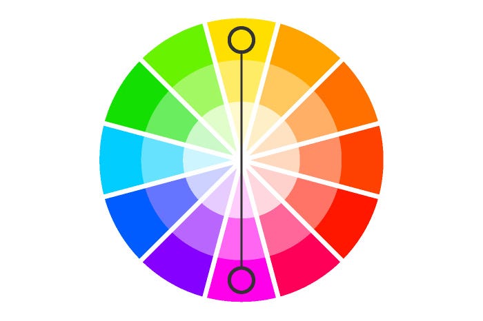
A complementary color scheme is composed by using two colors opposite each other on the color wheel. This is the particularly contrasting of all color schemes which attracts the most attention and one of the primary challenges when working with it is to fulfil a harmonious balance.
The powerful contrast of complementary colors can be very sharp, especially if you use every color in its full saturation. Because this scheme is a combination of warm and cold color when it comes to design you need to carefully examine which of the two colors will be the dominant one.

Usually, when using a contrasting color scheme, it is important to choose the primary color and use the following one for accents. This choice will set the impression of the final result — your design will look warm or cold.
Handful designers choose to reduce the saturation of the colors and use soft, warm shades, which makes the contrast softer but still retains the balance of the composition.
This color scheme is useful when you need to emphasize something as it focuses the attention towards a particular object. Often, a design with a complementary combination of colors looks more traditional.
As we said, in their most basic aspect, complementary color schemes are based on two colors but can be expanded by adding shades with different saturation and intensity.
Easy way to create complementary color scheme:
Step 1: Pick any color
I started with color “#1E3CC3”. And we’re going to change it to HSB, which stands for Hue, Saturation, and Brightness.

Step 2: Hue value
Copy the first color and then increase or decrease the H (Hue) value by 180 points. It…

