Member-only story
color scheme 2
How to use analogous color scheme in design?
Adjacent to each other.

Analogous colors are a group of three colors next to each other on a color wheel, such as violet, red-violet, and red. When these colors are grouped we call it an analogous color scheme. The color in the centre of this group of three is sometimes called the mother color since the other two colors contain that centre color.
Analogous color schemes create a visually pleasing and calming display. For instance, the color blue can pair nicely with both teal and green.
They usually match well and create serene and comfortable designs. Analogous color schemes are often found in nature and are harmonious.
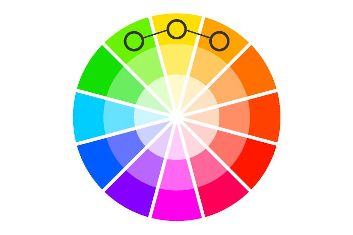
It always looks very elegant and clear. There is no tension in the palette, and typically it’s uniformly all warm, or all cold. If a base color on the warm-cold border is chosen, the color with opposite “temperature” may be used for accenting the other two colors.
However, analogous color schemes provide a low-contrast experience, since all colors fall in line with one another.