How to use color to improve user experience
Top five handy techniques for UI designers
Color is one of the most powerful tools in a designer’s toolkit. It can serve much more than a decorative purpose, it can reinforce the design.
In this article, we will review five techniques that can help designers.
1. Express hierarchy of content or elements
Color can help designers draw attention to specific elements and create a hierarchy of elements on the page/screen. When an element’s color contrasts with its surroundings, that element stands out and immediately captures user attention.
If you want to indicate that one element is located on top of another, you should use stronger color contrasts between elements. This approach can work both for individual elements such as call to action buttons and surfaces:
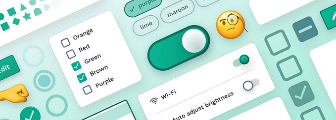
Color can also help you provide visual continuity. When color is used intentionally, it can give the user a few focal points so that the user’s eye gaze will travel naturally from one element to another. In the example below, the user’s attention will be focussed on the call to action button “Analytics” and then moves down to the chart and circle element of the AI assistant in the tab bar.
To create a solid visual hierarchy, it’s recommended to limit the total number of colors used in your UI. Generally, the less color you use in your UI, the more attention contrasting elements will receive.
2. Indicate the current state of an interactive element
When users ask the question, “Is this button enabled or disabled?” It means that the designer failed to indicate the element state. Designers can indicate interactivity by using color together with whitespace. When users see a bright, contrasting square element, they immediately assume it’s a button in an active state.
Ideally, you should choose a particular color to indicate interactivity throughout your app. If you need to show a few buttons with different priorities (say, primary CTA and a few secondary CTAs), you can play with tones of your interactive color and create a variation of this color for the secondary buttons, just like in the example below.
3. Reinforce the sense of state change
Color can give users feedback in response to the actions. It’s possible to reinforce the sense of acknowledgment by using shape and color together. For example, once a user taps on the call to action button, the color of the button and its shape can be changed to indicate the success of the operation.
4. Emphasize brand presence
Using brand colors in a product is a fairly typical design strategy. Yet, it’s possible to make the most of this technique. For example, brand colors can be used in specific moments, such as the color of the call to action button on the payment confirmation screen. By doing that, you will create a condition for users to associate those colors with specific actions and information.
Here are a few things to keep in mind:
- Try to avoid using brand colors for states like loading, especially if the loading takes more than a couple of seconds. When you color your progress indicator in your primary brand color, your users will subconsciously associate this color with slow loading.
- Be careful with red and green colors. Red and green are typically associated with failure and success, so when your brand color palette has green or red, you should avoid using exactly the same colors to convey an error state or success state.
5. Communicate meaning
It’s a known fact that people associate colors with specific things, and while the meaning can depend on the context and culture, it is still possible to find a few universal meanings for colors. For example, when it comes to city traffic, red is typically associated with ‘stop,’ while green with ‘go.’ If you design a navigation app, you can use this approach and color busy roads with red.
At the same time, don’t rely solely on color alone to communicate important information. Use other elements such as text labels or iconography to help visually imparted users to comprehend information.
Follow me on Twitter
This article was originally published at whitelight.co
Want To Learn UX?
Try Interaction Design Foundation. It offers online design courses that cover the entire spectrum of UX design, from foundational to advanced level. As a UX Planet reader, you get 25% off your first year of membership with the IxDF.
This post contains affiliate link(s)