How to use UPPERCASES in UI Design (Correctly)
The forever and ever story, it looks like everyone hates using capitalization everywhere, and that’s for a fair reason related to readability and accessibility.
But when they are well used and applied in the proper scenarios, they not only look good but could work pretty great, helping to convey specific messages on visual details of the user interface.
In this article, I’ll show you six different ways to use them correctly, yeah, six ways — promise!😉
1. Titles & Strong Copy

We can use capitalization to give some emphasis to a certain area of texts. For Headlines and catchy text, it could work pretty great, depending on the typography you are using. For this specific case, I highly recommend using Sans Serif.
The key here is to keep it short and never apply them in a long piece of text. Don’t forget to play with your character-spacing. It could look excellent in titles and quick and strong copy of your above the fold.
It also helps to generate better hierarchy and make the entire area more clear, getting rid of visual clutter.
2. Nav Options / Menu

When it comes to navigation, more specifically sidebars (both mobile and web) or horizontal categories at the top or a Landing page of Dashboard, you can definitely do good use of capitalization.
If your options are not more than four or five, navigation or menu with uppercase can look great. (It’s better if they are only one word)
The key here is to keep the options as short as possible, selecting specific words that work for each category the better way.
If you use them in a sidebar panel, along with some icons, they could even work better than regular Title Case format. Because of their fixed x-heigh, they work pretty great with related icons along to them, cleaning up the layout and generating more balance and visual geometry.
3. Short Subtitles

As I mentioned above, capitalization helps to build a better hierarchy between elements.
When building a landing page, a dashboard main screen, or even a settings page or pricing list, having a clear hierarchy of the panels is vital for the optimal user experience. You need to be able to guide the user in a smart and simple way so they can found and identify an option quickly.
Using uppercase in short subtitles can generate a perfect hierarchy among the contents, which looks and works great.
4. Table Headings
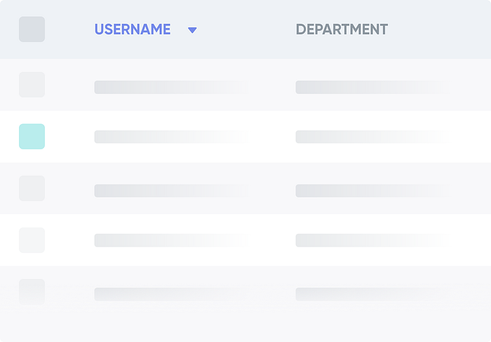
Tables are a headache regarding data. When we use uppercase for column headings we can determine a quick, clear, and beautiful hierarchy.
When we are using simple tables with simple data, maybe there might not be any visual issue to scan the items. But when it comes to complex tables with lots of rows and columns, it can be super tricky to make a visual balance and sort data. This, not only talking about the alphanumeric options but also tables with components and more custom items, like user avatars, status badges, option icons, etc.
Using titles with capitalization for each column heading could clean up a bit the entire table structure, making them more scannable and easy for the user.
5. Buttons & Badges
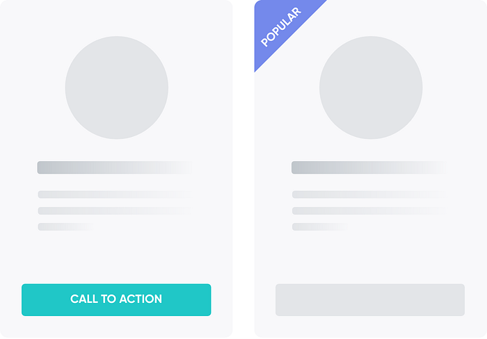
What is more important than a Call to Action? What is more important than a featured product? Those short texts can be great scenarios for using uppercase.
When we talk about buttons and the different hierarchies, there’s always a winner. The primary button, or its closer friend “Call to Action” button, are perfect scenarios to use capitalization. (If not, ask in the marketing area) Nah, not kidding. The thing here is that Primary Buttons and mostly CTAs are made to convey some primary actions that need to be clear and concise from the first time the user visit or explore the page, helping landing pages to convert more, and making the whole site more scannable.
The same works for featured products or discount badges that try to generate some “urgency” for the user to they should buy as soon as possible before the “offer” expires. Yes, capitalization works cool also in small badges fixed to cards.
6. For Decoration
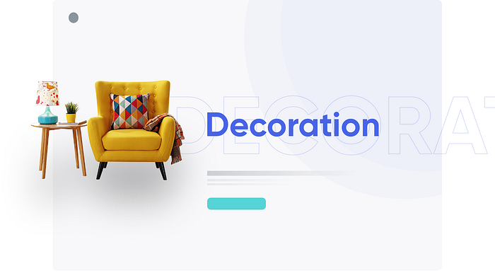
Last, but absolutely not least: we arrived at the side of the ornament of design. Decorations are everywhere, and they could, for sure, transform a good design in a complete disaster if not applied correctly.
That’s why you need to use them carefully, depending on the site style and audience.
For some sliders, headings, or just to give some touches of “minimalism” in certain areas, we can apply uppercase with soft transparency or with only-border to give some depth.
In conclusion,
The key rule here is to experiment with your typography and play around the different options of generating a clear hierarchy in the layout. No matter if you do it for making your site more scannable or just adding some decoration to make it more “fancy”, please make it subtly.
The only rule for capitalization is not to apply them in large blocks of text and every scenario at the same time (Because, you know, the eyes could cry)
Always play with letter spacing and never use many of them in the same scenario.
Keep it simple and short and it will look good.🤞