How We Redesigned a Website Without Alienating Our Audience
Is it possible to redesign a website that doesn’t alienate its core users, when there is no way to (sneakily) roll out a redesign bit by bit?
While working at New York Public Radio (NYPR) as the Lead Product Designer, Gothamist was acquired. It was part of a larger strategy to focus to create more hyperlocal news. As long-time fan of the website, I was excited. The website had been a great resource for me when I first moved to New York City around 10 years ago, and I was glad to be able to contribute to such an important news source. Six months earlier, it had been shut down by it’s previous owner. The existing audience was so distraught, they created their own message board to be able to keep the community alive, and keep sharing hyper local news stories.

Problem
After taking ownership of Gothamist, a task was brought to the Digital Product Team: we needed to turn the website back on, and attempt to get the unique visitors back up to pre-shutdown numbers. As part of this integration process, we also needed to treat Gothamist like the other products that existed under the NYPR umbrella. It needed accurate and in-depth analytics, and a maintainable back-end. Severely lacking in both of these areas, it became difficult to maintain the existing site as is. The only option to accomplish these asks were to move it to a new back end. This also required a minor face-lift in the process — there was no way to maintain the existing design as part of this back-end move. (Also of note: the site hadn’t had a redesign in the last 8 years or so…). There were a few caveats, we had to maintain the existing user base, and there was no way to roll out the redesign template by template. It had to be all at once. The reason we couldn't roll out one-by-one was again, because of the overhaul being done to the backend of the site. (One other major influence, was also the fact that leadership had just bought a new product and wanted to update the look of the site as well)
Persona Creation
To kick things off, the product design department had very little information on the current user base, outside of reading comments, comscore data, and stories from existing staff about how users interacted with the current site. Analytics data was very minimal, and it wasn’t super helpful to get a better understanding of user behavior. There were a few surveys sent out by product managers post-acquisition, but this still didn't answer a few assumptions that the existing staff had (and I had) around who these users were.

So, we ran a few design workshops with the existing Gothamist team, which included editorial, product, membership, sponsorship, and various other staff members to get alignment and sketch Proto-Personas.
We discovered a few reoccurring themes, along with a few hypotheses of who these users might be. These were not true personas, but they were still very helpful in helping to determine next steps.
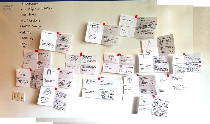
Because our design team is so small (consisting of 1 designer — me, and 1 design director), I had found and reached out to an AMAZING UX Contractor to help validate our proto-personas. Throughout the process, we involved various staff members to help create awareness in our org around our design process.

Audits & Competitive Analyses
Parallel to the persona work being done, the Director, Product Manager, and I started on an audit of the existing Gothamist site. We categorized and broke down various templates into a spreadsheet, using an atomic design structure (atoms, molecules, and organisms).

This helped us to better understand the product, along with helping to determine pain points and easy fixes that we could leverage during the redesign. As part of the audit, a snapshot of the current analytics pre-launch were included for the site, and commenting platform. These snapshots would be our baseline of measurement on how to measure website performance.
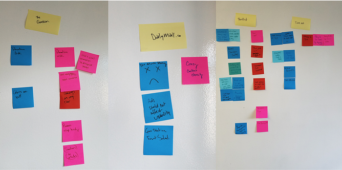
We also had a a few quick workshops with the team around various competitors, to align on what stakeholder expectations were for the product. We went around the room and critiqued competitors with pros and cons around each.

As part of this process, we also completed an in-depth analysis on feature sets to find patterns across various competitors as well. We wanted to be sure that if we introduced new features, that these were patterns that were consistent across multiple news orgs, and would not be jarring to our Gothamist users.

Mood boards, Wireframes, Prototypes, Usability Testing, Sketch Libraries and … Design System Creation
Now that we had a good grasp on who our users were, and what types of news sites they were consuming on a regular basis, we could start building. We started out with a few different versions of mood boards to determine the look and feel of the website. This went through multiple rounds of feedback. Once moodboards were approved, sketching out wireframes was the next step. Because of the limited timeline, once these were OK’ed, we needed to jump into designing the actual pages and creating prototypes. Once in sketch, it became convenient start to build out the sketch library to help streamline the process. This helped greatly reduce the amount of time to make tweaks to the design, along with helping develop the Design System being implemented. This way, to our developers could understand how the front end was going to be styled before the actual templates were design complete.

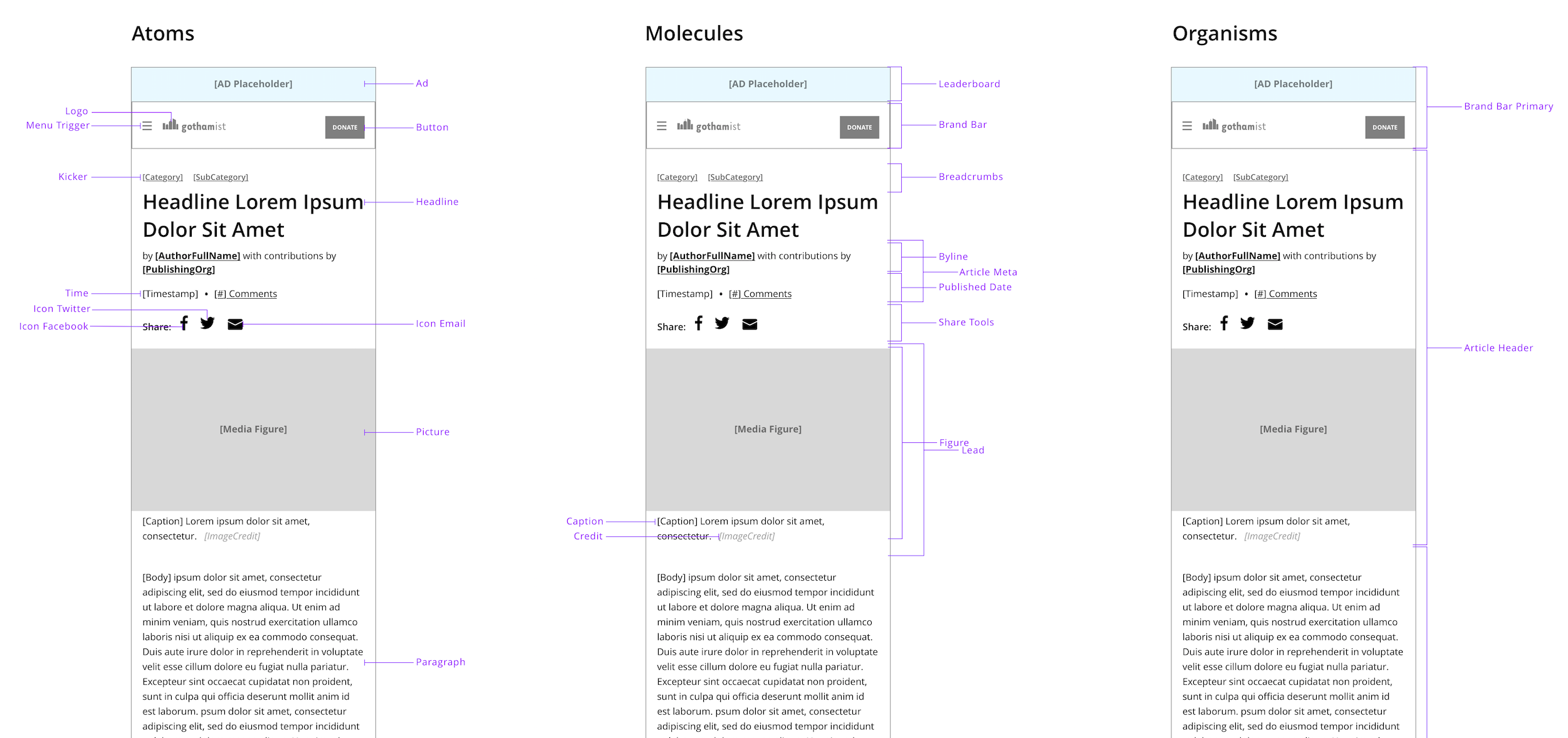
The expression “Building a plane while you’re flying it” captures perfectly the amazing amount of work that was done in such a short amount of time — basically our developers were building the atoms and molecules, while I was still fleshing out the actual templates.
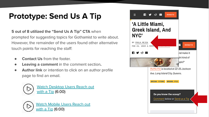
Once I had the designs in a good place, and had sign off from various stakeholders, I needed to double back and make sure that we had designed something that was actually usable. We ran a series of quick usability tests to validate that what we had created was on-brand, and usable by the current audience. (We used usertesting.com for recruiting and testing, which allowed for us to complete this task very quickly.) After writing the test plan, we put the test into action, and were able to see results immediately. I used Trello to help synthesize the findings, and was able to quickly leverage everyone’s mis-matching schedules … this process of affinity mapping allowed various team members to contribute at their leisure. After presenting the findings, we only had a few minor tweaks to make before launch!
Takeaways… How did we do?
So, after all that work, how well did we do post launch? Well, after a few bumps (… “bugs”, I should say) in the road, the few months post launch have gone very well. We didn’t see an uptick in visits, but the numbers remain consistent with the numbers that we had obtained post-shutdown (Yay!). The new redesigned site has been up and running for the last 2-ish months and everything is stable! I’m very excited about that.

But… how did the audience handle it?
With a lot of moaning and groaning! We had over 200 comments on the website around the design (the Gothamist audience is known to be very vocal), but overall, the majority were curious and excited about the new website. We made sure to send out a survey post-launch, along with publishing an article explaining the reason for the changes. We wanted to make sure our users were heard, even if we knew that the feedback wouldn’t 100% positive. Neilson has a really great article on why users will always resist change, regardless of whichever avenue you take… And rolling out a redesign all at once (instead of piece by piece) doesn’t really help with that. However, the amount of time and care spent studying, surveying, and interviewing our users helped us avoid losing our audience. We were successful at retaining our audience numbers and now can work on improving the product and potentially increasing our reach!


