They are small but vital for the efficiency rate of any application or website. They look simple but take loads of time and effort to feel that way. They follow you on any step of interaction with a product although users rarely — say never — think how important they are for the success and speed of this interaction. They have the power to do anything with a user: help, support, engage, encourage, clarify, simplify or vise versa confuse, annoy, disorient and so on and so forth. They are iconic in effective user interface. They are icons.
The vital role of icons is not a secret for web and app designers now, it is mentioned in numerous articles and books on design, presented in workshops and webinars, shown in numerous case studies. We decided to add our two cents to this bulk of knowledge about icons, as this theme seems really constant and demanded.
The Essence of an Icon
Basically, app or desktop icon is an image which having a kind of symbolic and methaporic potential becomes the element of navigation in the process of interaction. In deeper explanation, icon is the visual symbol representing some action, thing, person, real or virtual.
In many cases icons are able to stand up for the text, and this ability makes them so popular in the world of modern design. If you replace the stretch of copy with an icon, it saves the place for other elements of interaction on the app screen or webpage, therefore making it more functional without being overloaded.
Also, it makes the interaction faster as in most cases people need less time to see and understand the icon than to read and understand the piece of text.
Moreover, the icons efficiently move the limits as they enable people who have the problems of copy perception and recognition, such as those who suffer from dyslexia or other similar problems, to interact with the product.
And finally, icons can successfully combine the functions of navigation and explanation with being the aesthetic element of the visual representation of the product, supporting the general style and having their own character.
Being so multifunctional and comprehensive, icons of the apps and websites can be:
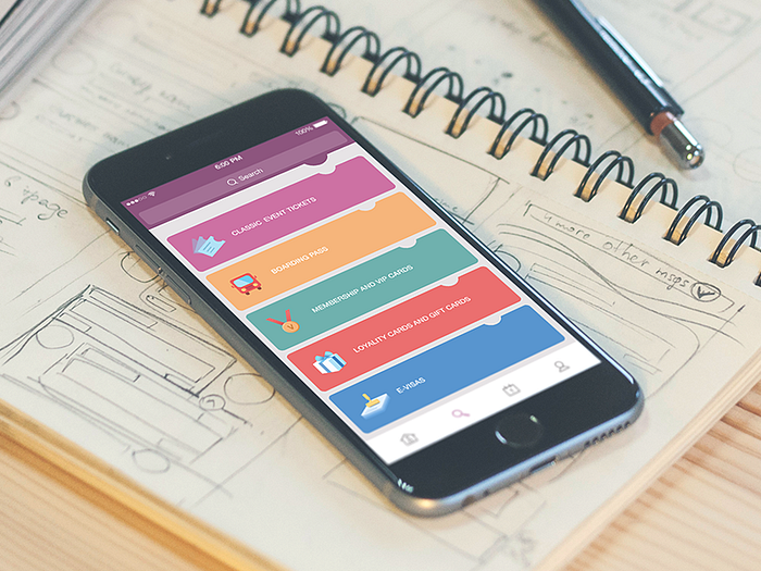
- interactive, i.e. directly representing buttons, controls and any other elements of interaction
- clarifying, i.e. visually explaining some functions, categories, actions, not being the direct element of interaction themselves
- decorating and entertaining, i.e. having lower functionality and higher aesthetic potential, providing decorative addition to general style, for example featuring some seasonal celebrations etc.

The Features of Icons
Some basic features of efficient icons include being:
- meaningful
As it has been mentioned above, icon is graphic element which has high symbolic potential. It means that creating the icon, first of all a designer should define what is its role and meaning as the separate element and as the part of general layout. Talking about more earthy things for a kind of metaphor, the best chefs always say that everything that is put on the plate should be edible. According to the latest trends, we support the same idea when it comes to icons as well as the other elements of layout: everything that is put on the screen should be functional.
Therefore, any icon used in the interface should have its meaning and function. Without it, an icon is just a kind of empty stub, making the layout of the screen or web page dirty with the unnecessary elements.
- clear
Behind the clarity here we mean making the icon understandable. That is one more feature supporting icon’s being meaningful. In fact, what it the point of being meaningful if nobody except the creator understands this meaning? For the icon, lack of clarity is the death knell. Instead of speeding up and easing the process of interaction, such icon will confuse the user and bring out poor user experience.
- simple
Simplicity of icons is still a kind of debatable issue. Actually, designers agree that icons should be simple but still argue about where is the level of simplicity needed. Anyway, here in the studio we support the idea that any icon should be as simple as it is required for its particular aim and function and the designer working on it should stand on the foundation of following the existing guidelines for icons design omitting any unnecessary details that can overload the image.
However, at the same time it’s important to remember about the general style and other elements of visual representation of the whole app or website concept. Successful consideration and combination of these factors will result in efficient icons.
- recognizable and unique
To make the icon recognizable, the designer needs to become a researcher before starting with the task. Taking the time for exploration and analysis of the existing icons and thorough investigation of the competition can create the significant basis of making the icon easily remembered and catchy. If a designer finds the way to make the icon recognizable not losing its main meaning, it will become the first step of attracting the user in conditions of active competition as well as will provide positive feature for user experience as the user won’t be annoyed losing the time on looking for the necessary icons which aren’t recognizable at once.
The feature of uniqueness mentioned here doesn’t mean creation of absolutely unique stuff every time you need the icon, but thinking on some even slight flavour of uniqueness via small changes or details can make the icon more recognizable both in the AppStore or PlayMarket and on the screen of user’s device.
- aesthetic and attractive
For sure, remembering that icon is a visual representation of the meaning, it’s important to take the graphic and aesthetic side of the issues into account. Visual appeal is the first step to encourage the user get into the meaning you represent behind the icon and at the same time it is the important element making the product regarded as attractive, beautiful and stylish. Following the principles of coloristics, proportions and other features making the result of graphic design successful is always very helpful in creation of great appearance for the icon meaning.
- flexible
As nowadays more and more various sizes and resolutions get into the game, flexibility and scalability is included into the list of key features making icons efficient. Good icon should be seen, readable and recognizable in different sizes and environments, so it is one more process that should be thoroughly considered while creating icons.
- consistent
Icons as well as the other elements of layout have to feel consistent as they often become the most powerful conventions and signifiers. For instance, if there are several icons in the app — as it usually happens — they should follow the same style, concept and correspond to the general design solution for the app, supporting the harmony of visual representation and interaction instead of breaking it with non-consistent elements.

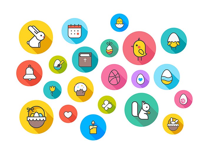
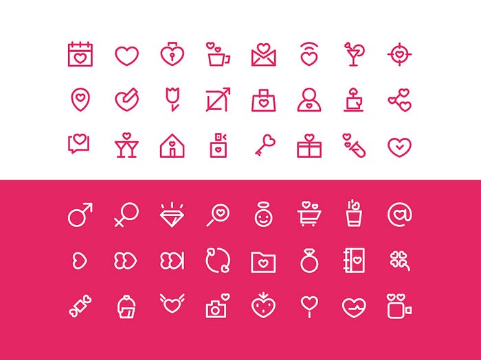
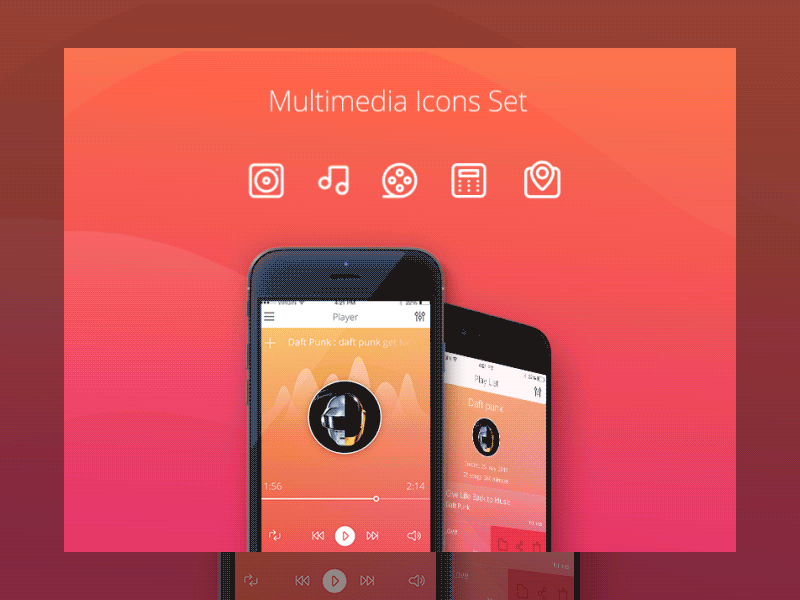
Creating icons for various design projects in Tubik Studio, we try to keep the principles mentioned above carefully combining them with every piece of unique design we work on. Except creating handcrafted icons for projects, we have also presented several packs of icons on Dribbble, Behance, Creative Market, Envato as well as our own online shop for designers Tubik Lab. There you can find the sets of seasonal icons such as the ones devoted to St.Valentine’s and Easter theme, and more universal ones such as Office and Multimedia icon sets.
In our next posts we are going to tell you about the process of designing icons in more detail, from the rough sketching to polishing digitized version.
Originally written for tubikstudio.com
Welcome to see the designs by Tubik Studio on Dribbble and Behance
Welcome to Tubik Blog